the world is beautiful.
Albert Renger -Patzsch - The World Is Beautiful
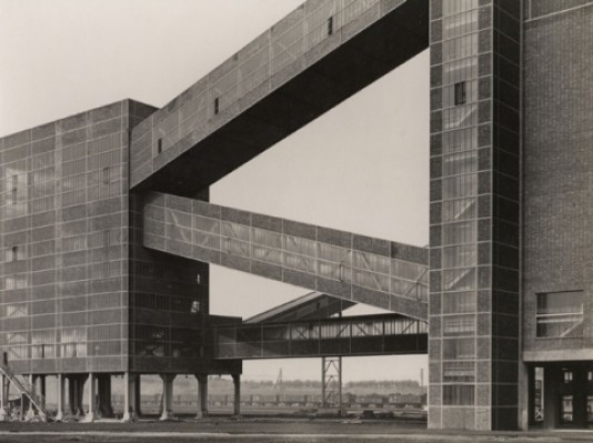
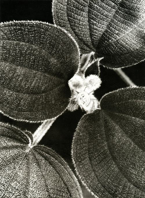
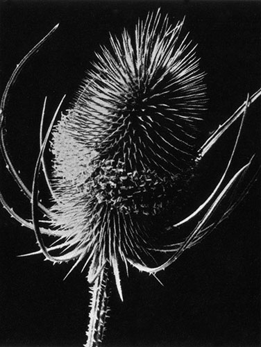
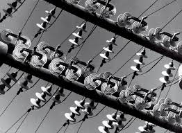
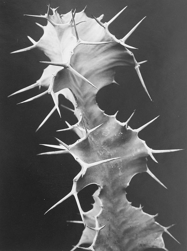
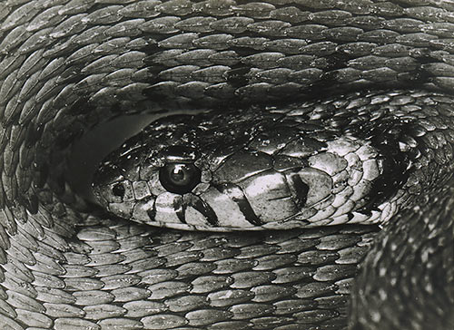
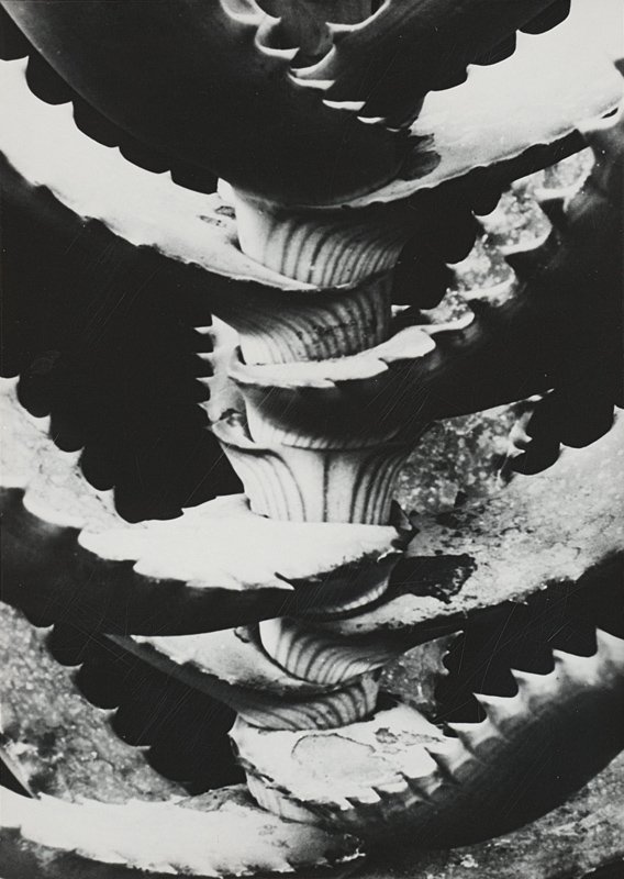
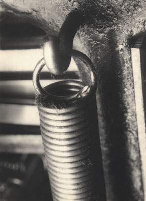
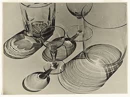
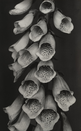
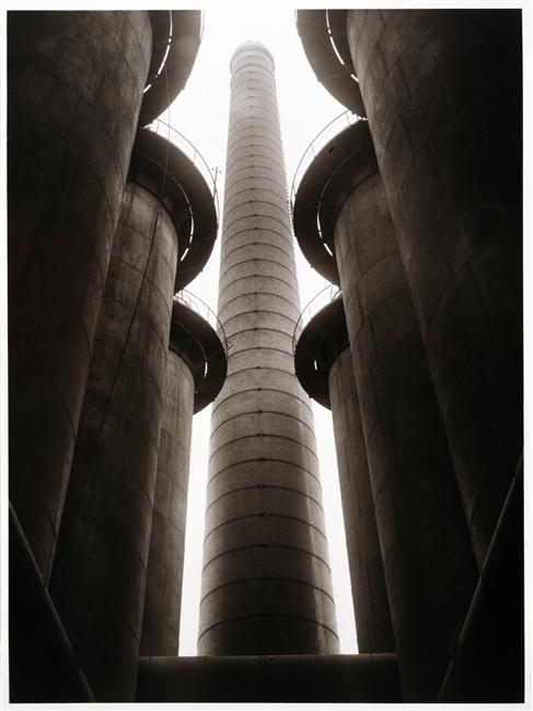
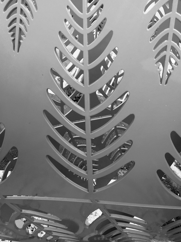
Albert Renger-Patzch was a photographer, who was part of the movement of "new objectivity". Rengers photography seems to be bases around the elements of shape. He focuses on geometric shapes form man made objects, such as buildings and other objects. Also he focuses on organic objects, capturing geometric shapes from plants and animals. Capturing the specific shapes on plants and animals, Rengers photographs seem to be zoomed in and also clarity and contrast are main factors to allow the viewer to clearly see the different shapes and line in the organic objects. Albert creates photograph with meaning and is a way to express certain topics, focusing on elements relating to geometrics and organic.
The new objectivity is a movement that describes the public life in Weimar Germany; the movement also involves literature, music, art and architecture. Renger creates processes the movement by using and showing everyday objects and zooms them in to focus on parts that people normally aren't capable to see, or allows the viewers to see them in a different light and environment.
The new objectivity is a movement that describes the public life in Weimar Germany; the movement also involves literature, music, art and architecture. Renger creates processes the movement by using and showing everyday objects and zooms them in to focus on parts that people normally aren't capable to see, or allows the viewers to see them in a different light and environment.
Analysis: comparing and contrasting
|
|
compare and contrast:
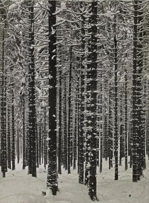
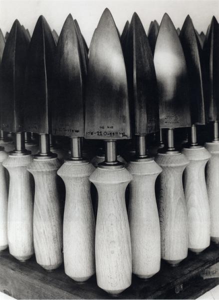
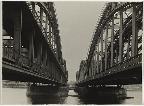
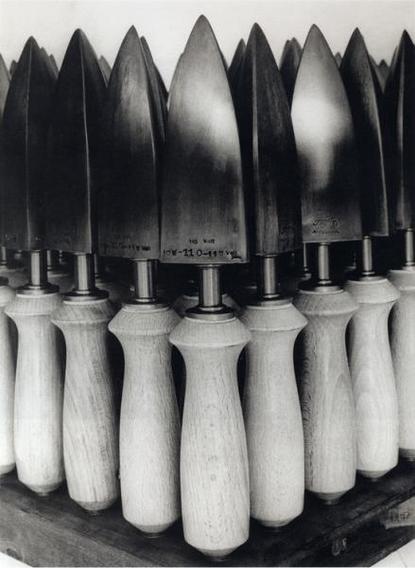
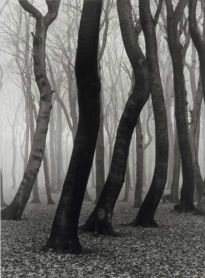
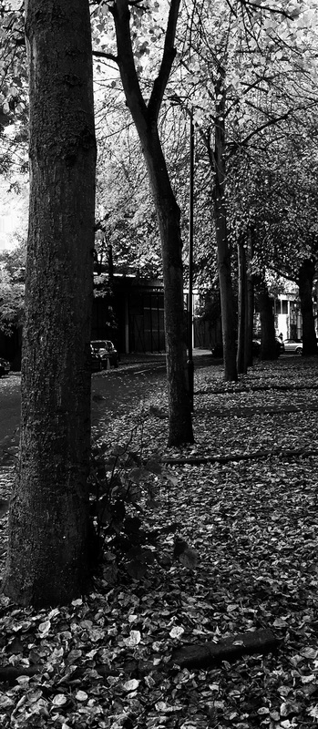
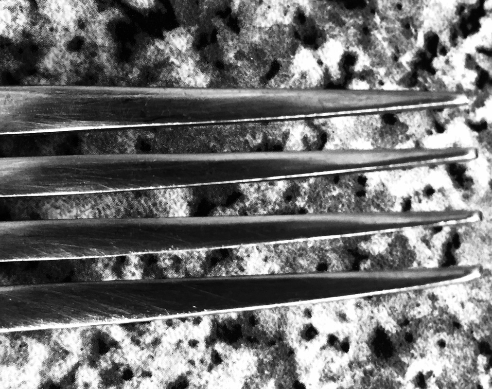
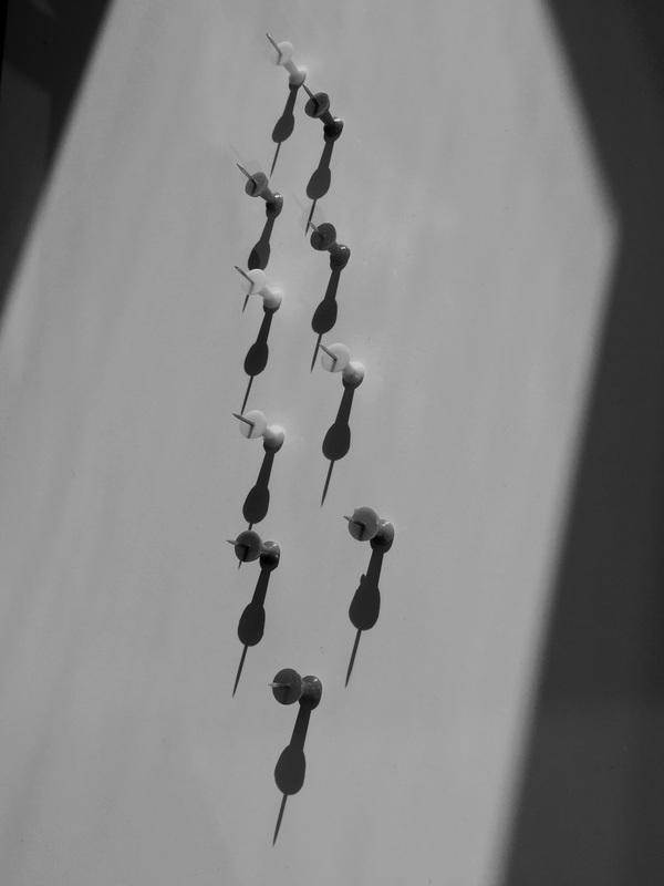
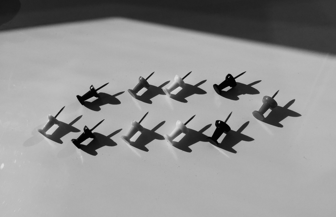
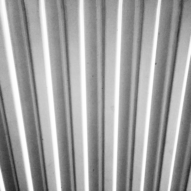
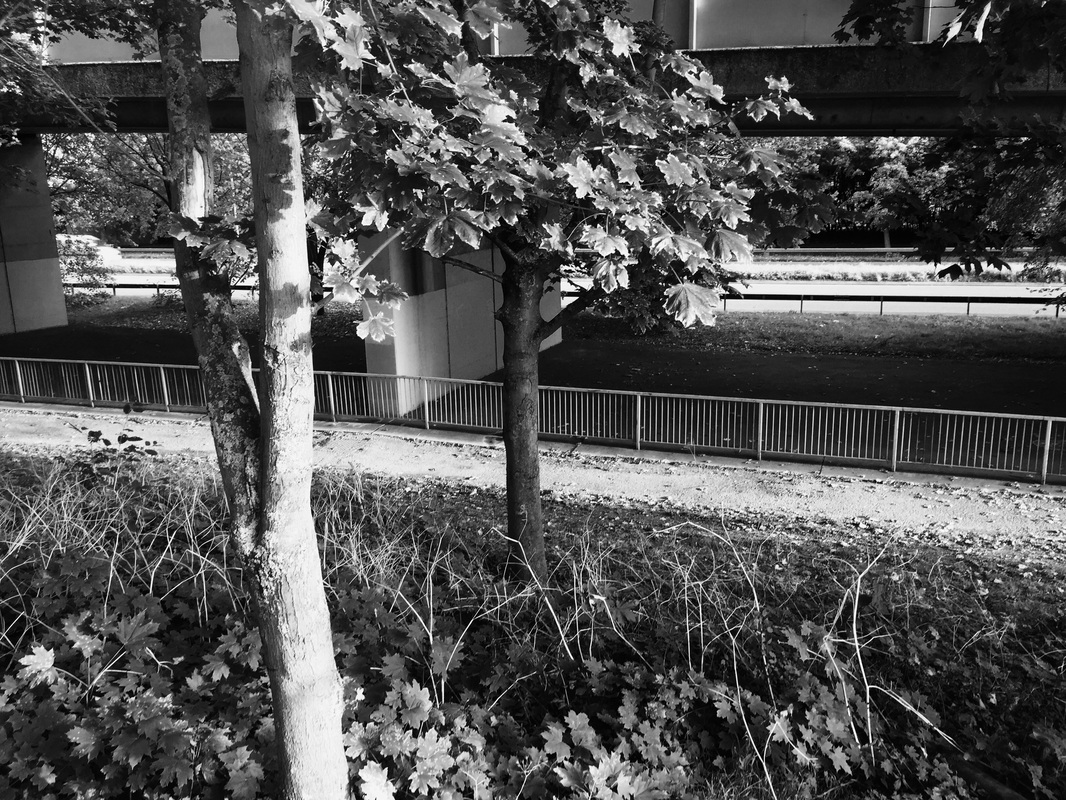
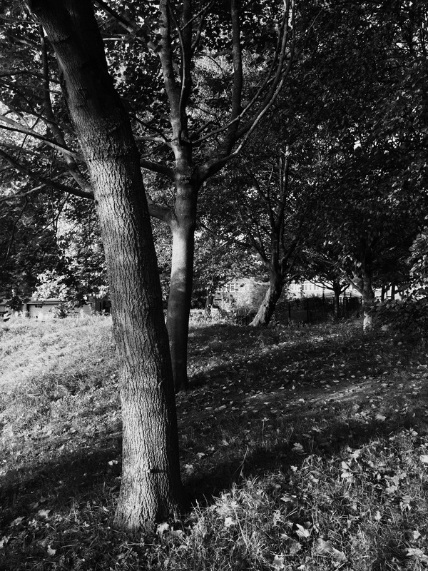
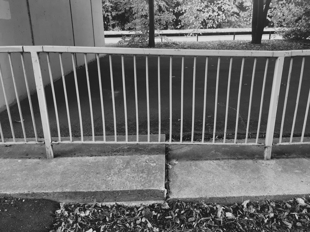
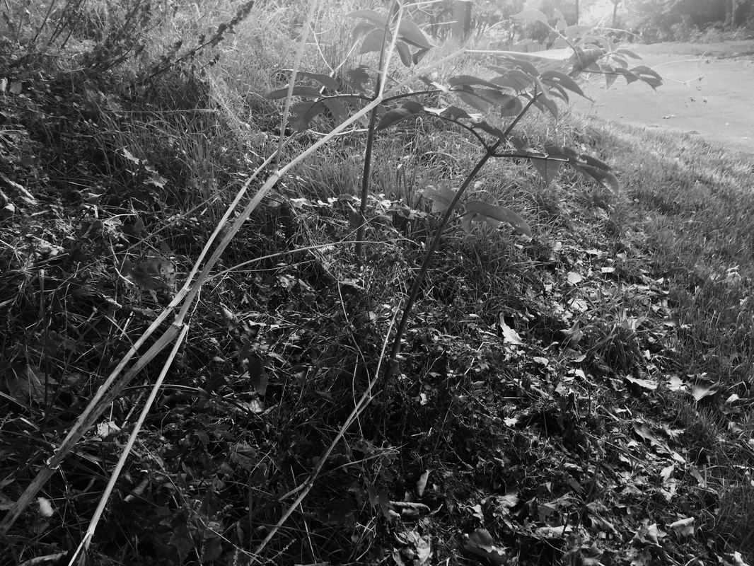
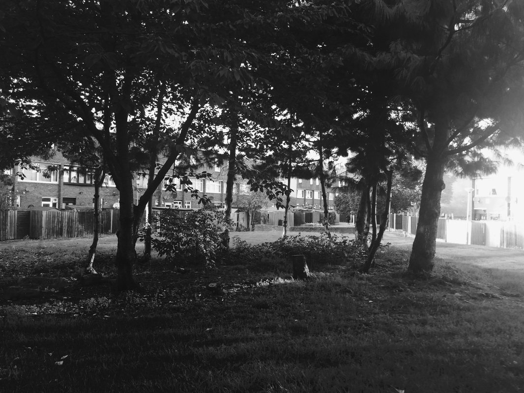
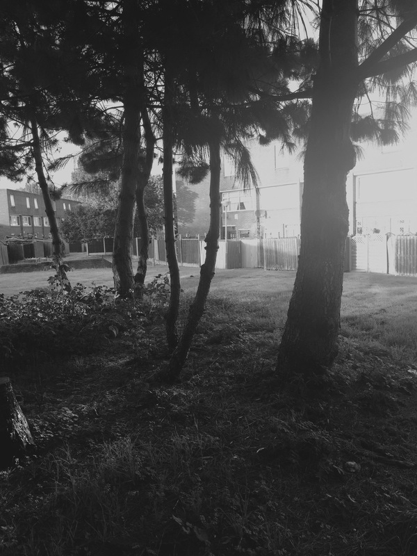
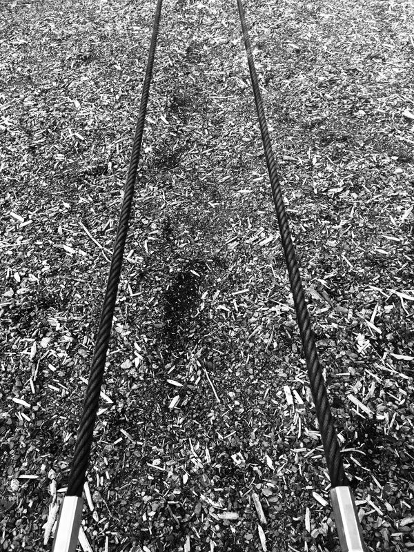
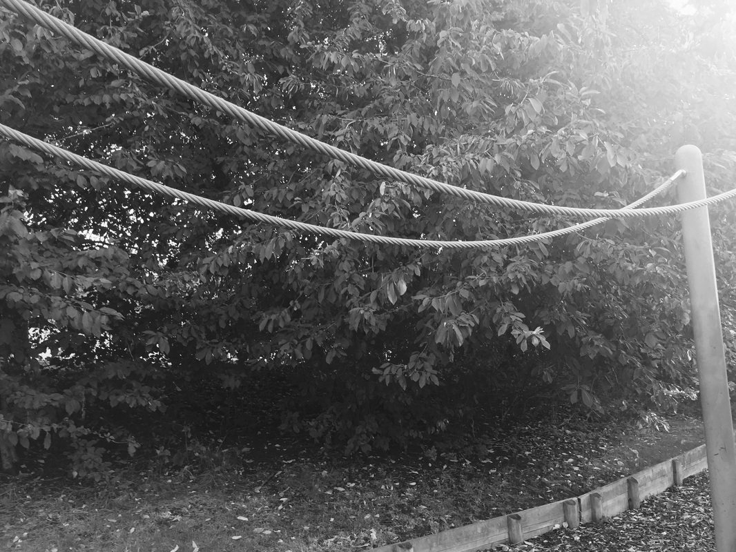
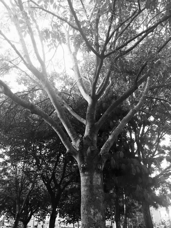
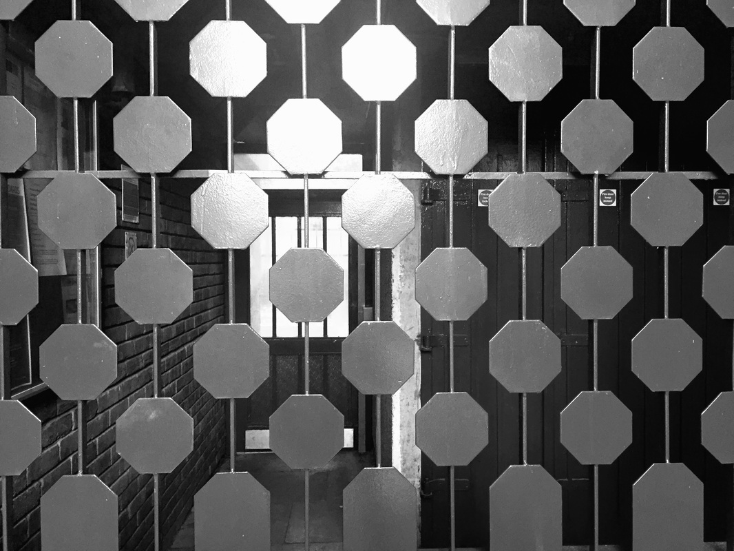
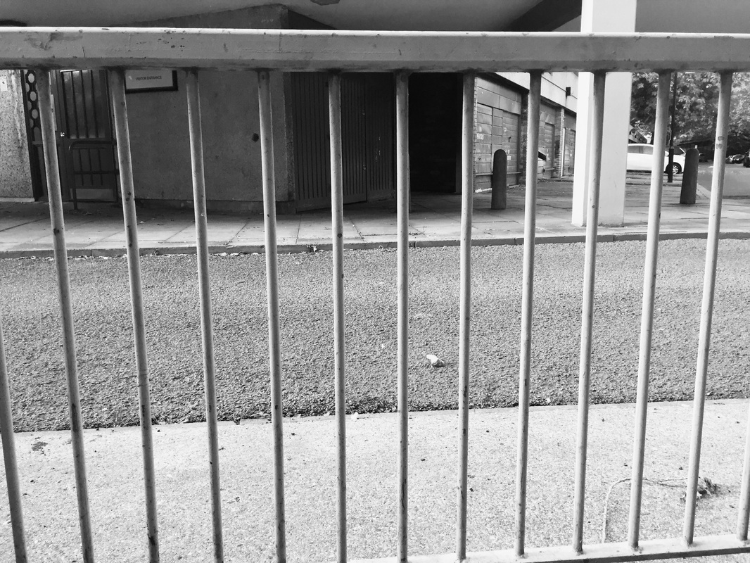
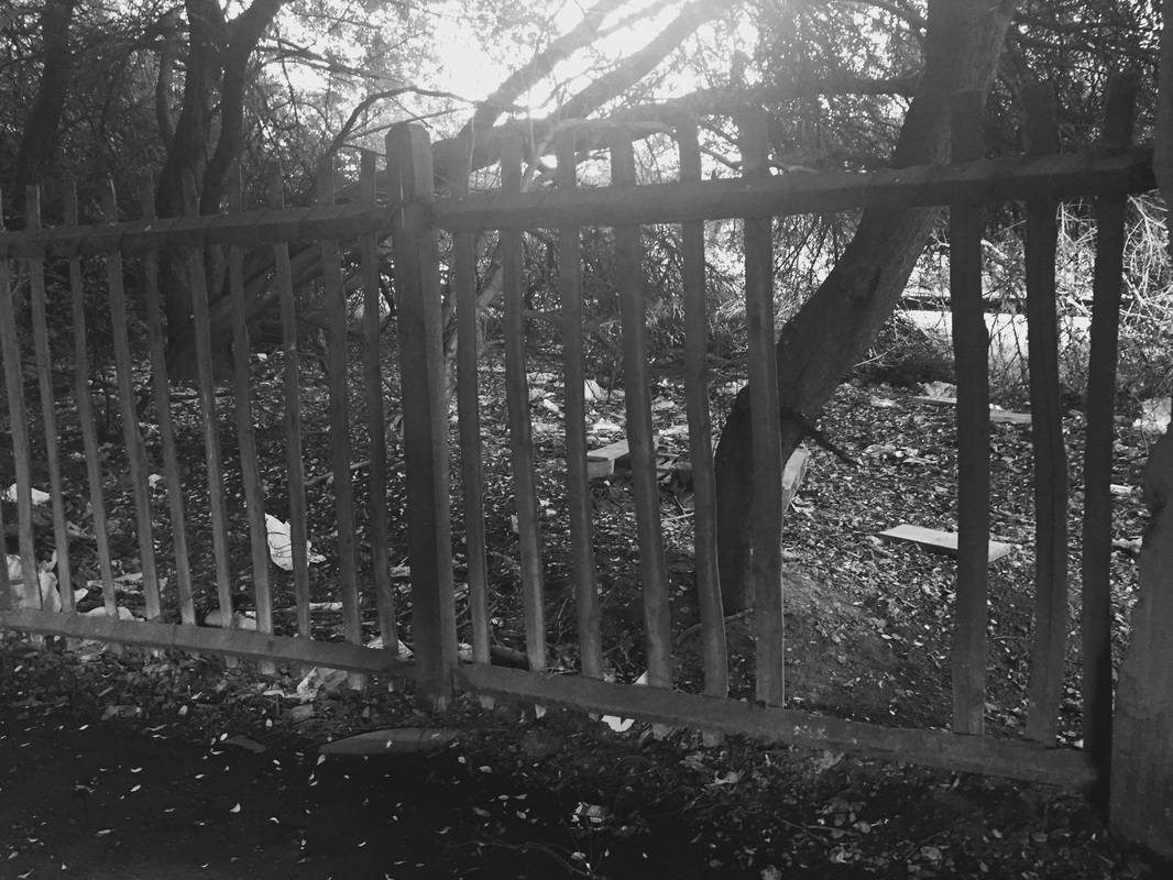
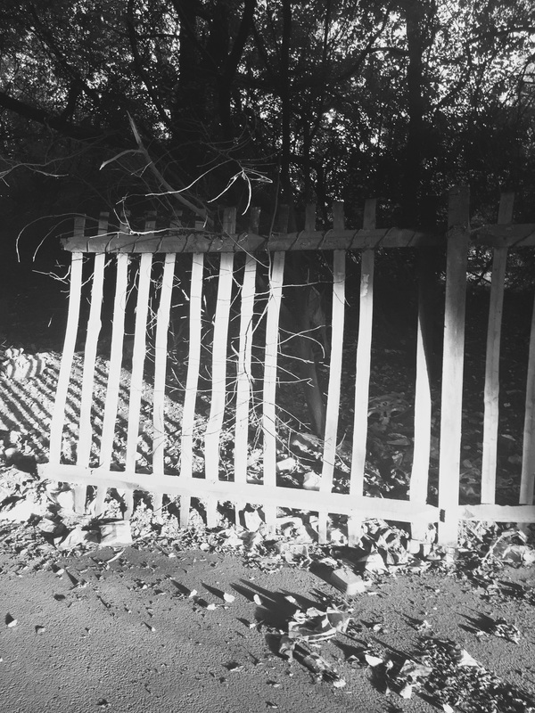
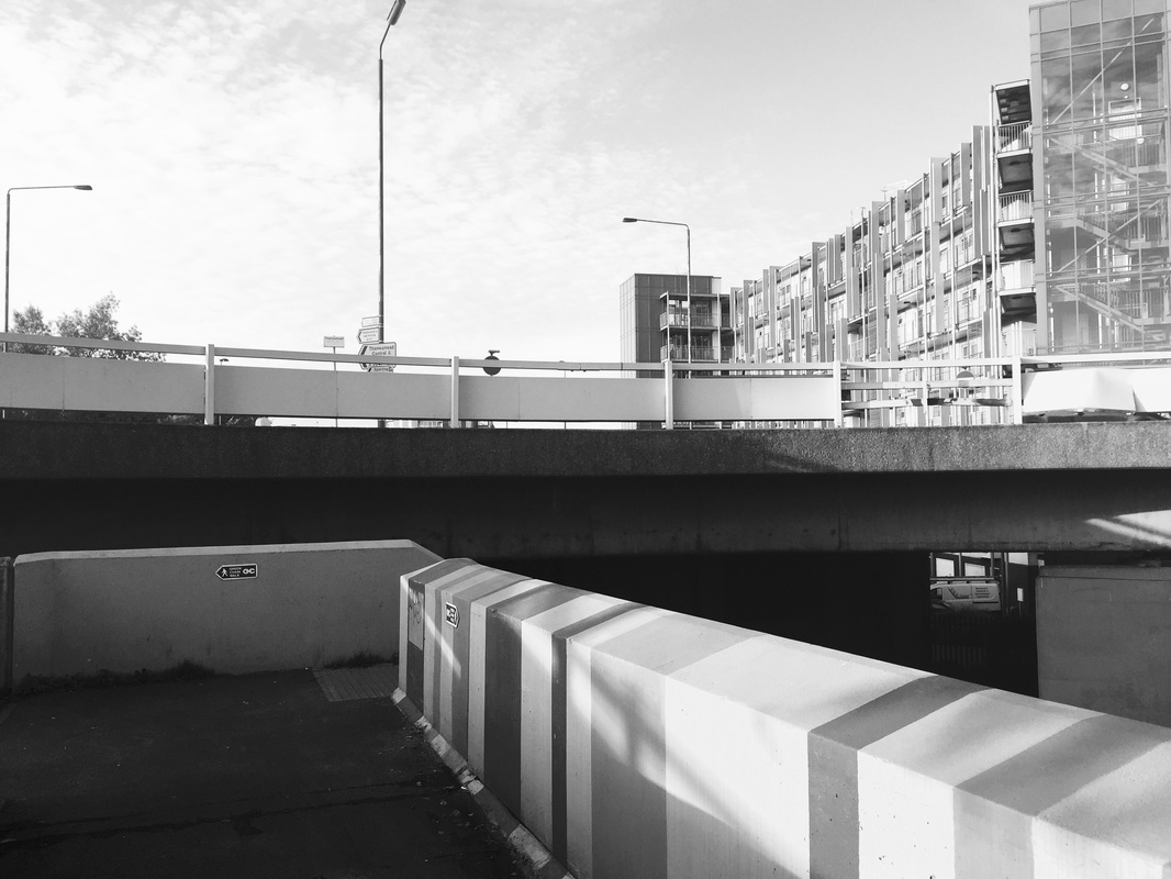
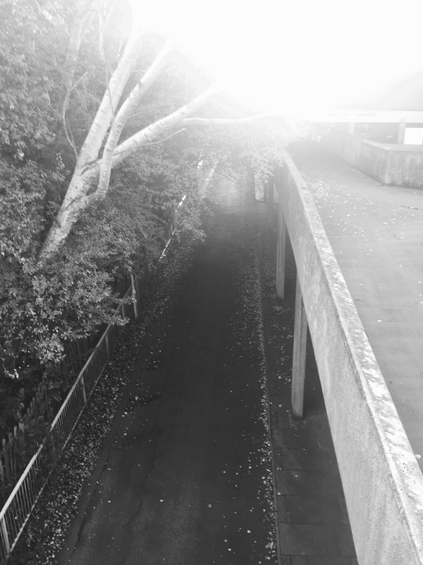
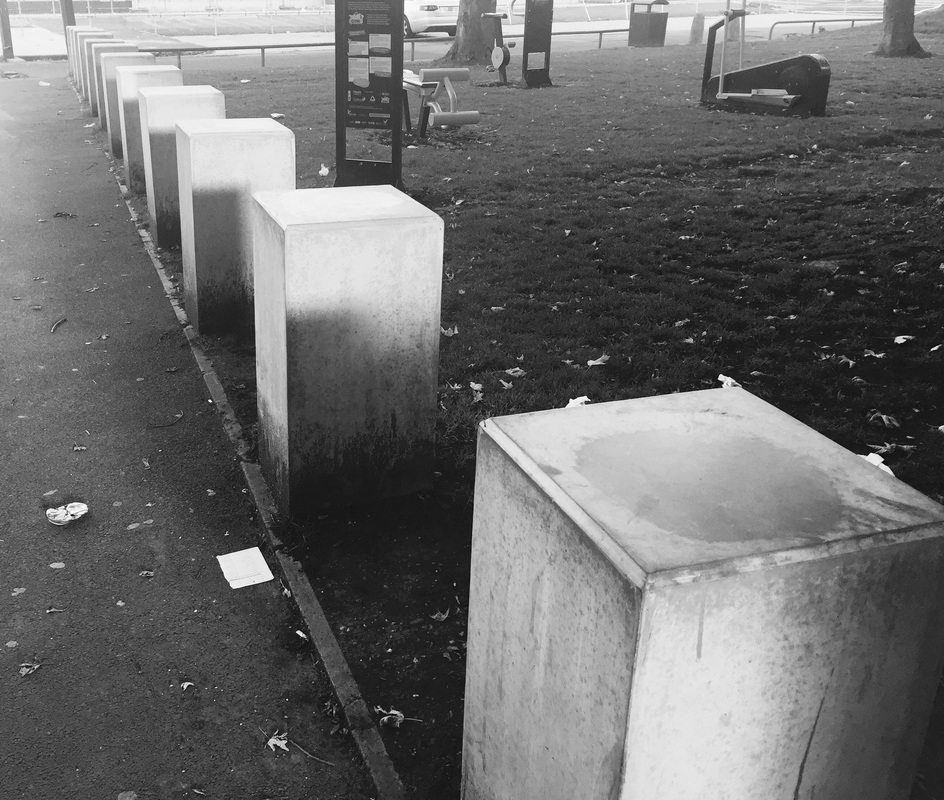
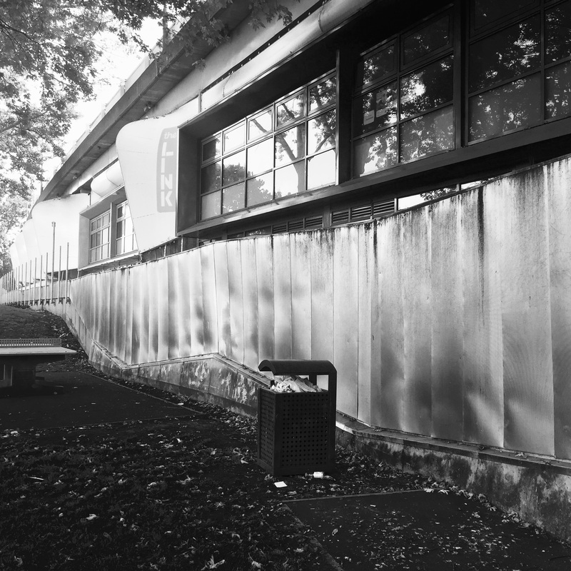
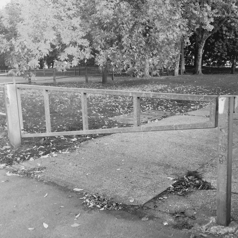
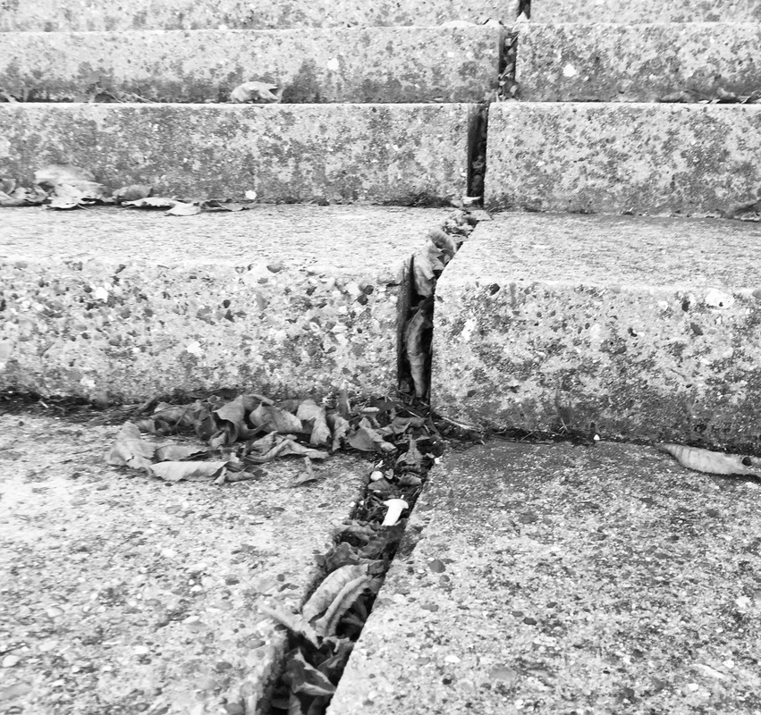
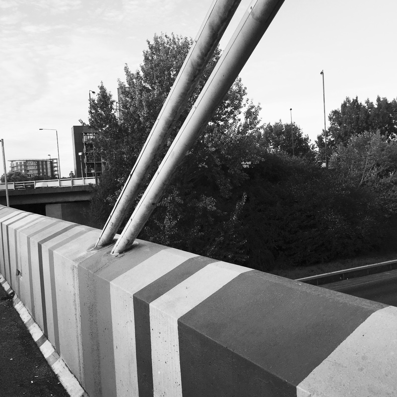
These two images taken by Renger, reflects the two formal elements of line and tone. There are many similarities and differences relating to these two images. The first image are man made objects, all stacked up right along each other, contrasting to this image, trees are natural things and even though they are stacked up right together, they are not in perfect order and they are all different types of sizes and they seem bent. In the first image, the darker tones are more obvious at the top of the objects, because the main light in this image can be said that it was coming from the top right hand corner. The type of light that was used is not very obvious but it can be seen to be soft diffusion to create soft shadows, as it is not exactly sharp.
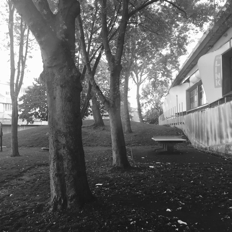
Similarly, in the other picture, there are many darker tones nearer towards the camera, this allows the viewer to see more definition, but less detail of the trees. Towards to far back, the tones on the trees are lighter due to the amount of fog in the atmosphere, because the tones are lighter, we are able to see more detail in the trees and allows different shades and tones to be seen in the trees, which also shows us more definition in the trees.
These two images taken by Renger, reflects the two formal elements of line and tone. There are many similarities and differences relating to these two images. The first image are man made objects, all stacked up right along each other, contrasting to this image, trees are natural things and even though they are stacked up right together, they are not in perfect order and they are all different types of sizes and they seem bent. In the first image, the darker tones are more obvious at the top of the objects, because the main light in this image can be said that it was coming from the top right hand corner. The type of light that was used is not very obvious but it can be seen to be soft diffusion to create soft shadows, as it is not exactly sharp.
Similarly, in the other picture, there are many darker tones nearer towards the camera, this allows the viewer to see more definition, but less detail of the trees. Towards to far back, the tones on the trees are lighter due to the amount of fog in the atmosphere, because the tones are lighter, we are able to see more detail in the trees and allows different shades and tones to be seen in the trees, which also shows us more definition in the trees.

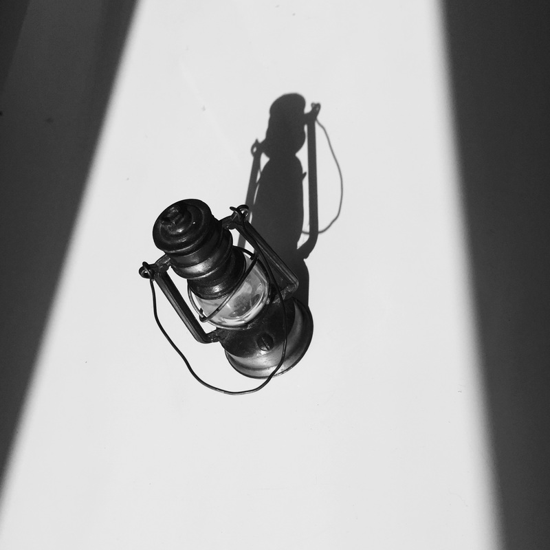
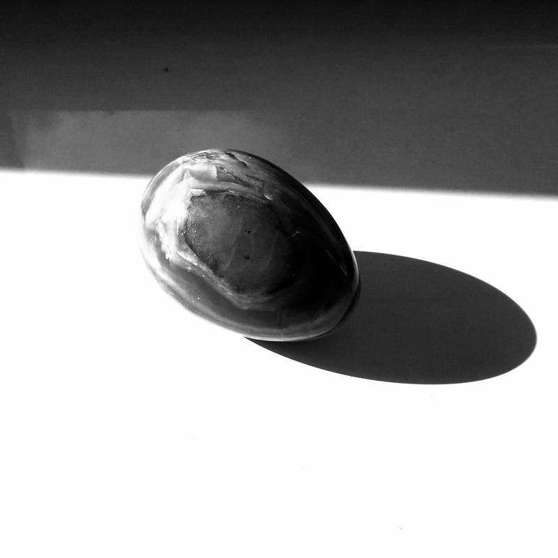
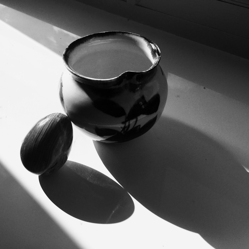

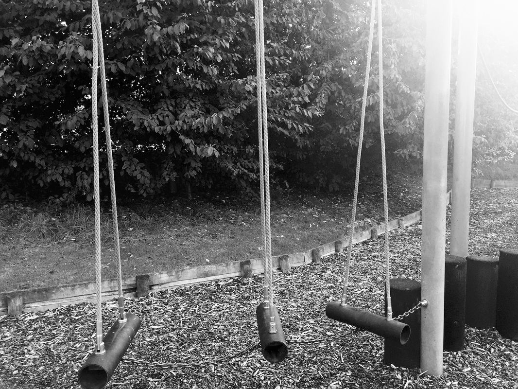
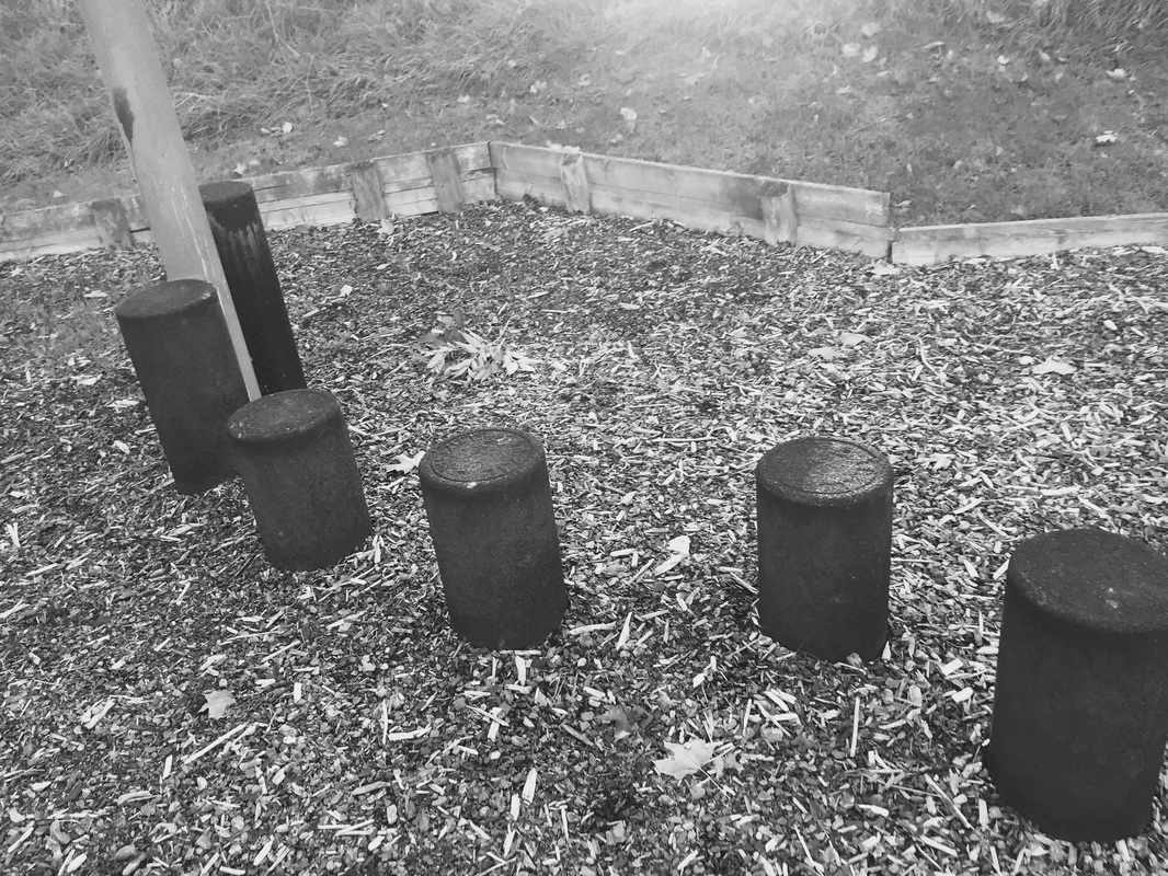
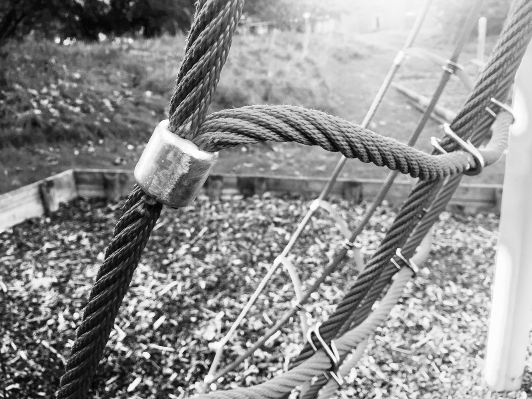
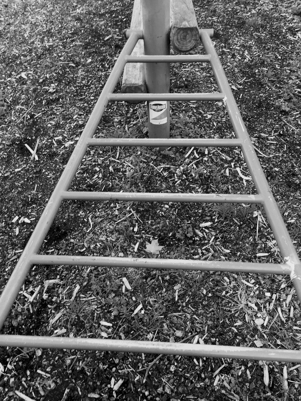
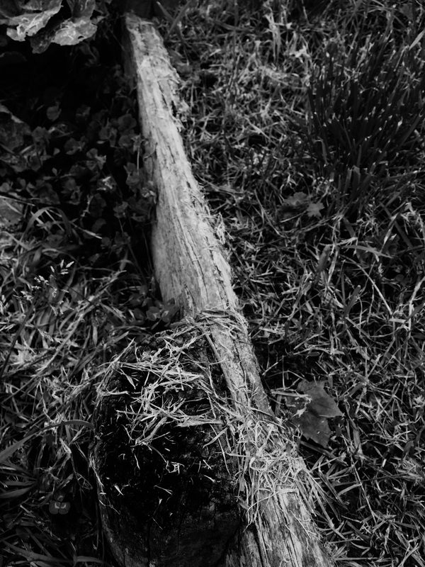
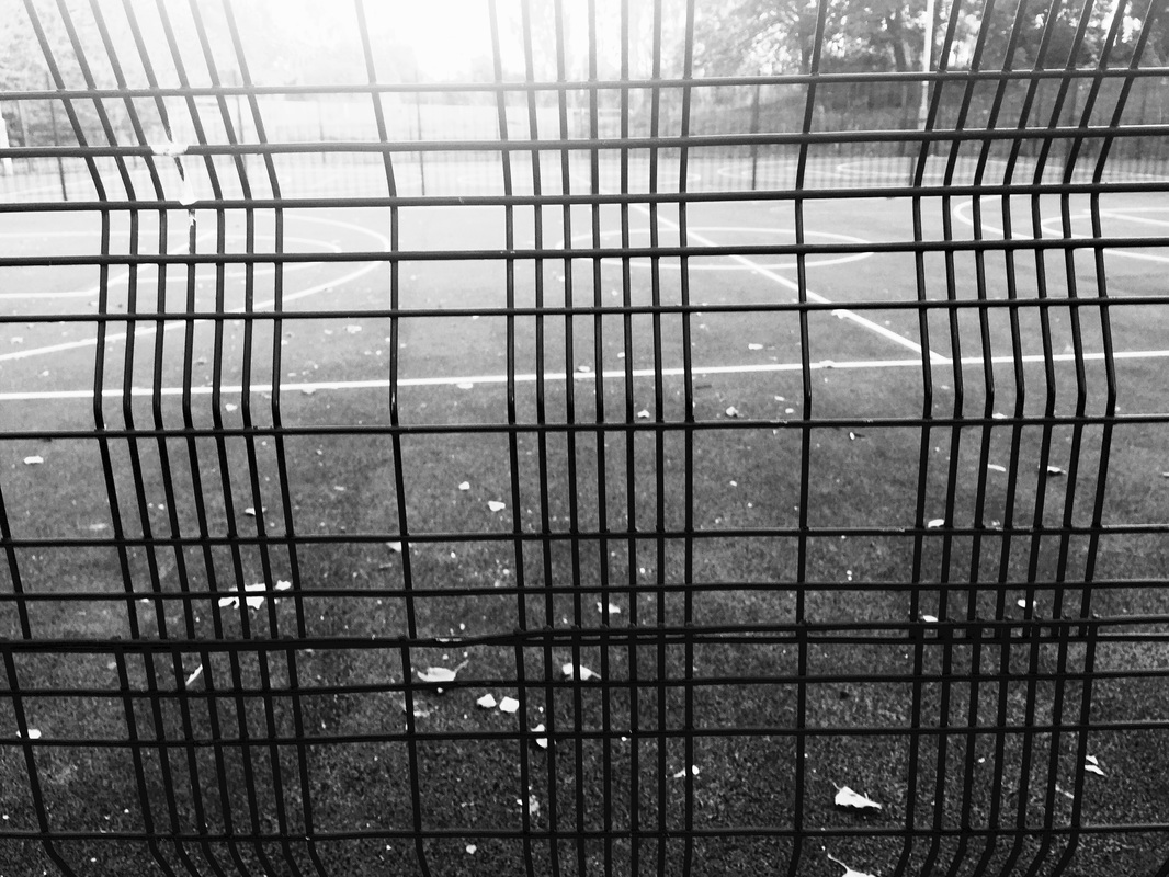
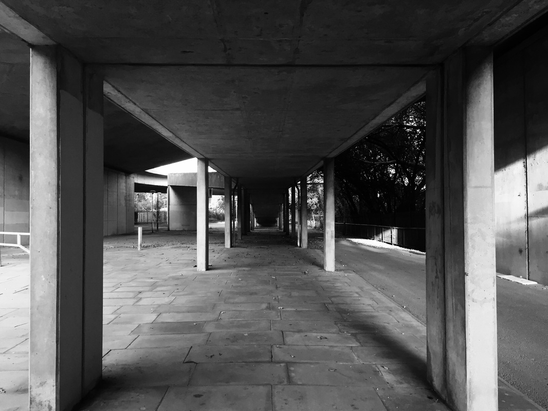
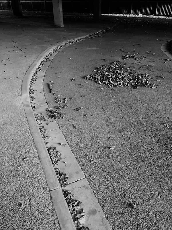
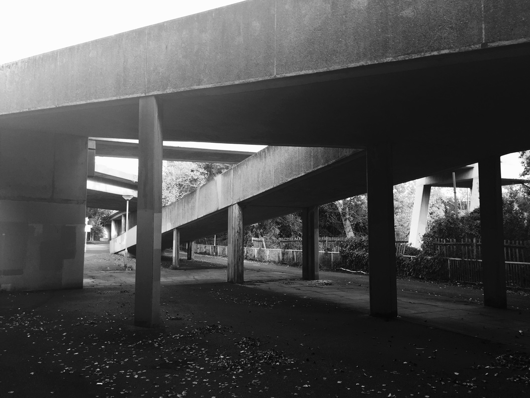
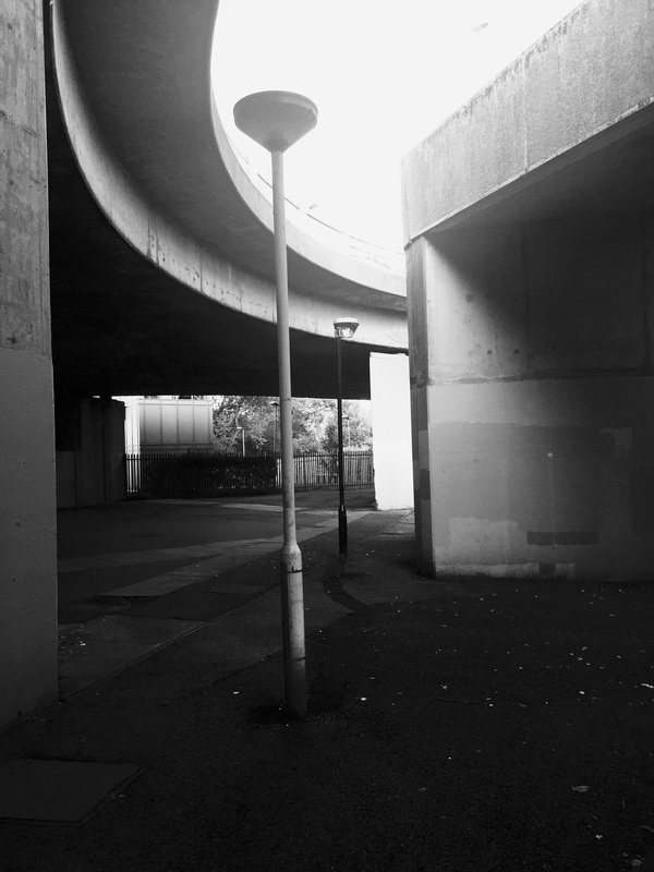
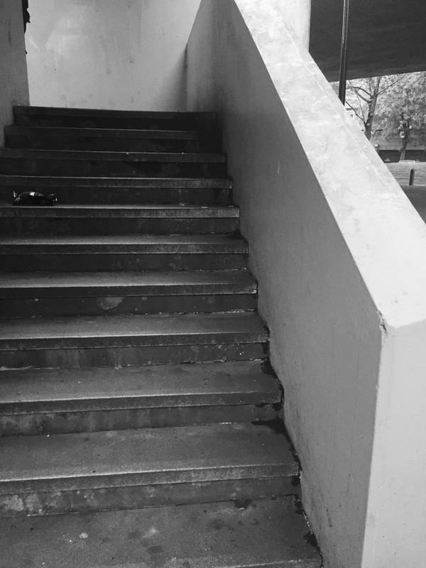
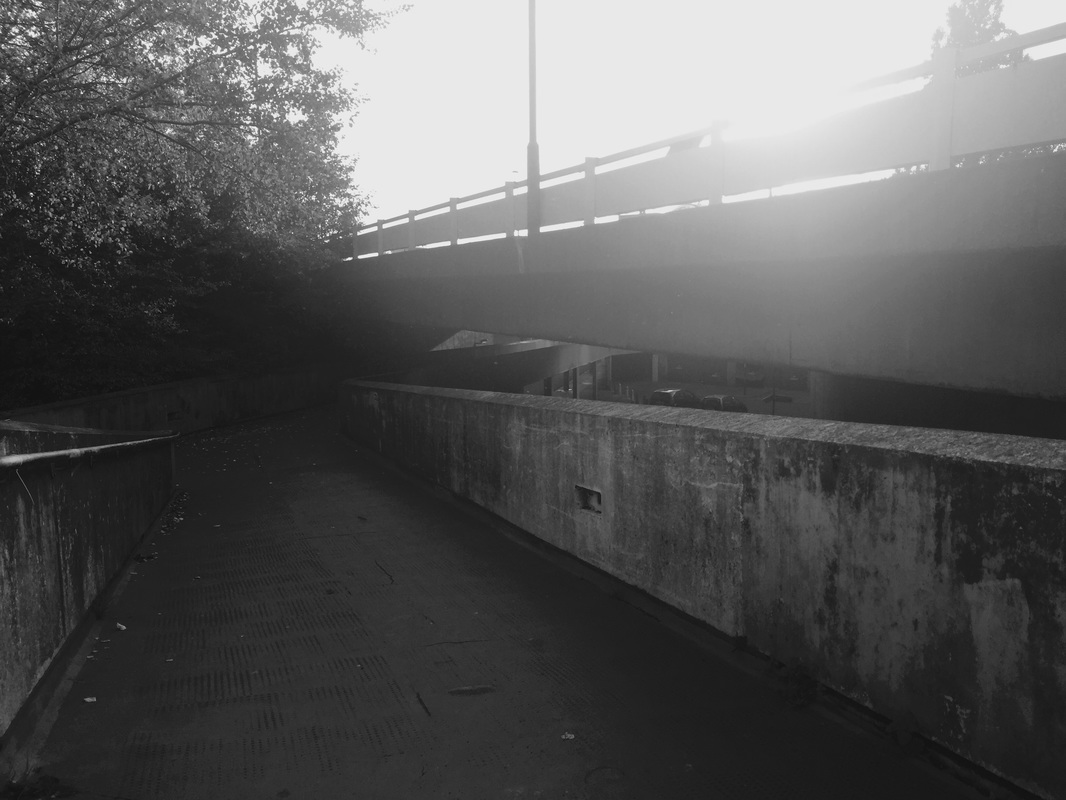
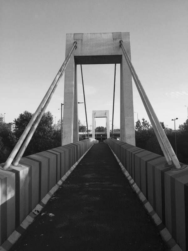
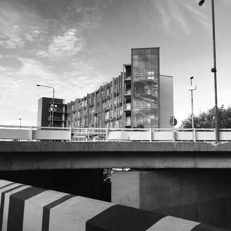
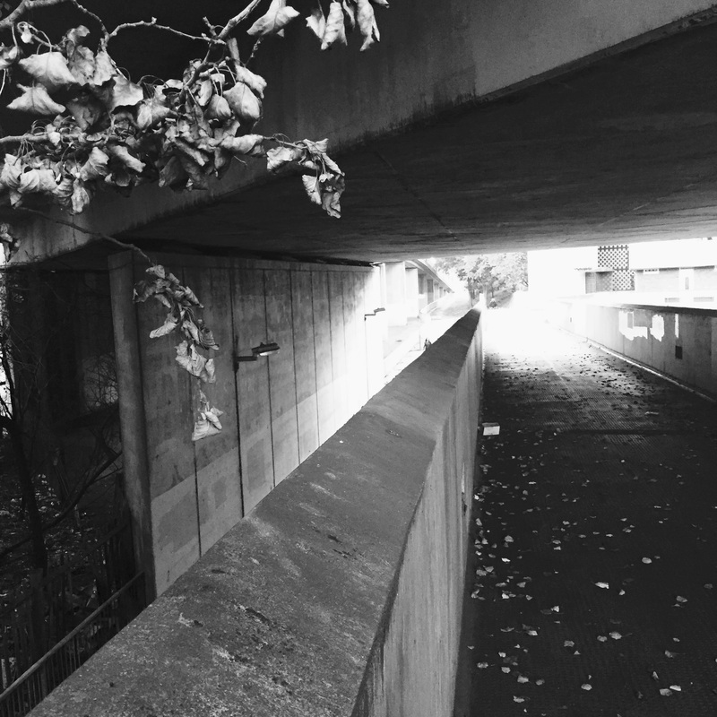
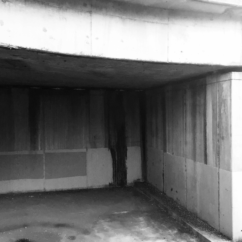

Taking 100 photographers focusing on Albert Renger Patszch was very hard, due to the fact that I only hard certain things to focus on rather than it being open and allow me to express myself. I studied his images, and tried to understand what his motive was during his photographs. Knowing this I went on to duplicate his photographs, but adapt them in a way to make them unique but still similar and focusing on the elements he bases his photographs on. I made sure that I had some images that reflected the man made part of Albert Renger Patzch work. Doing this assessment I wish I had more understanding on the type of themes renger focused on but by studying his work I realised it must have been organic vs man-made. Showing different types of geometric shapes in natural and organic objects and also finding geometric shapes and lines in man-made objects such as concrete buildings.
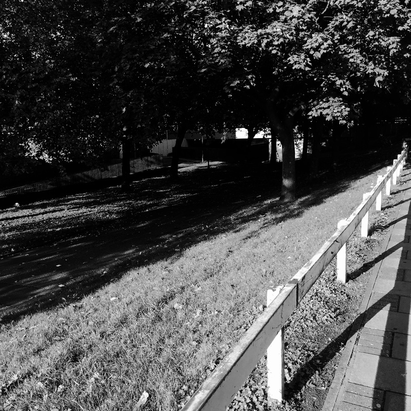
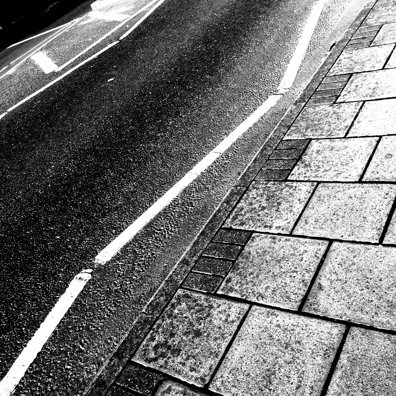
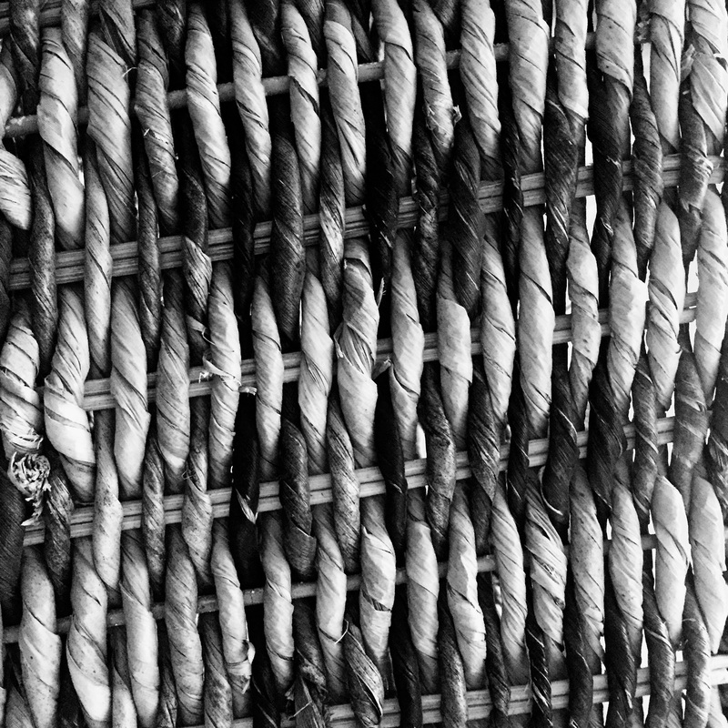
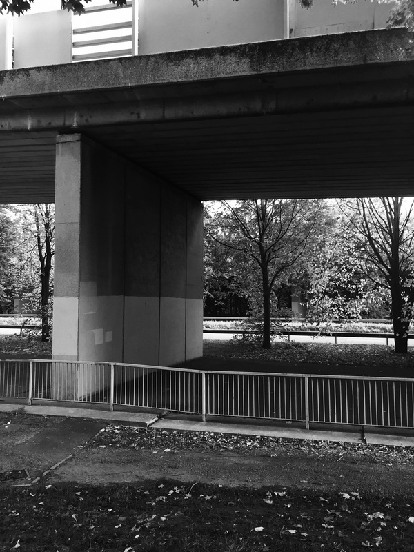
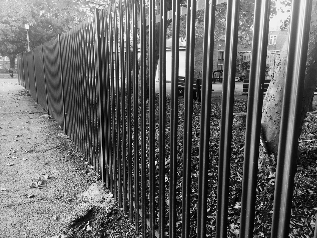
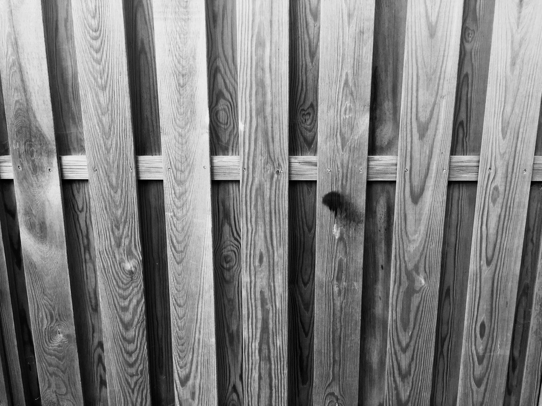
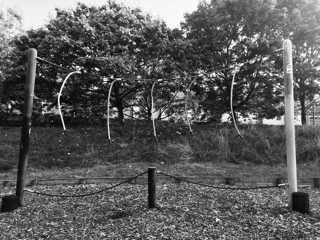
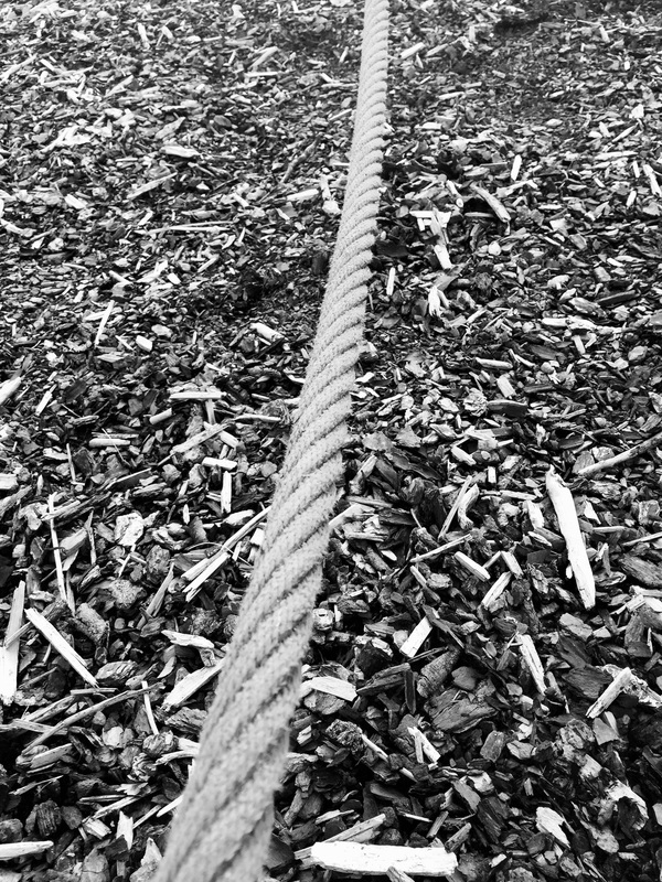
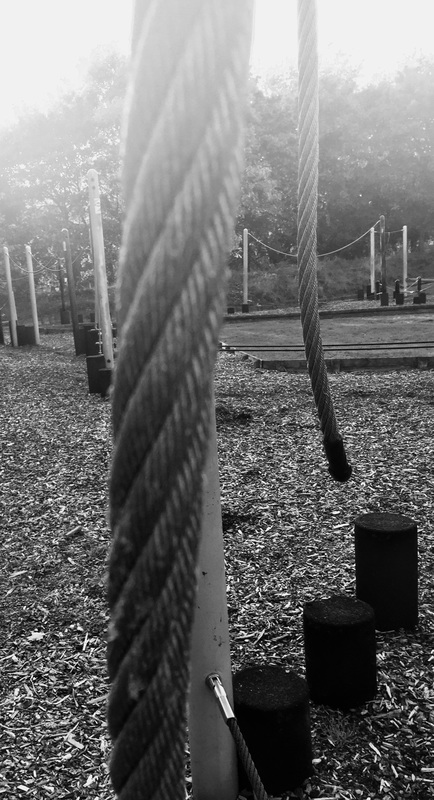
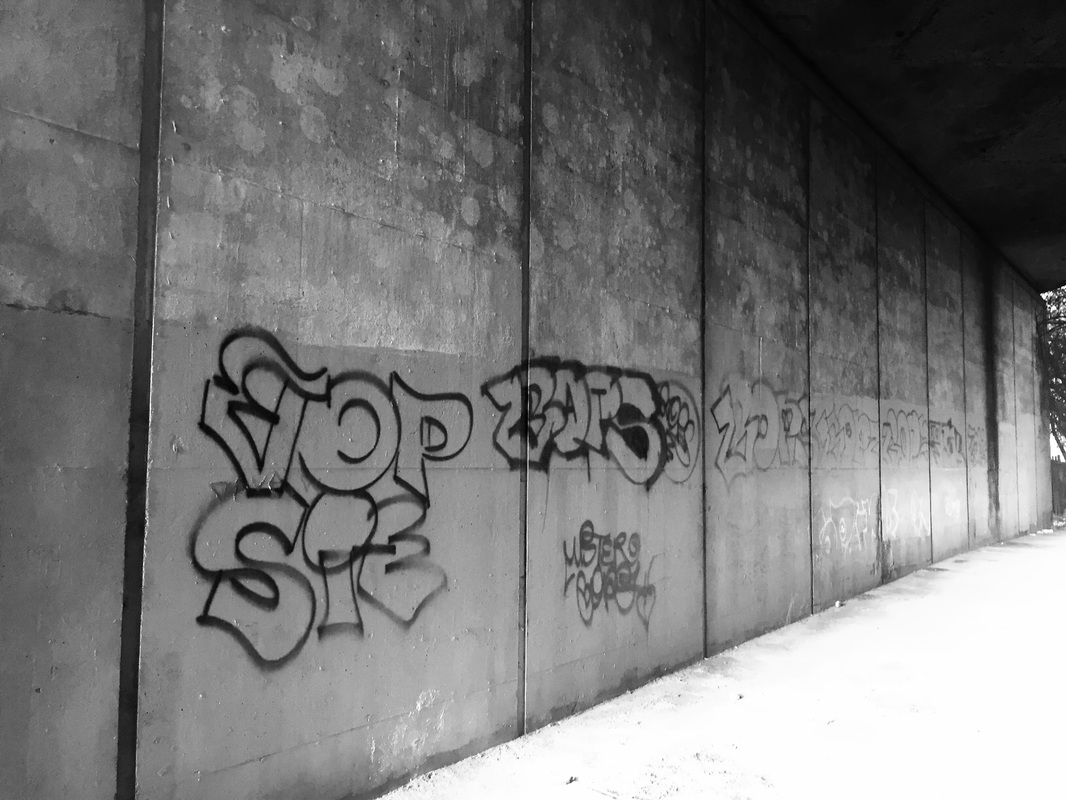
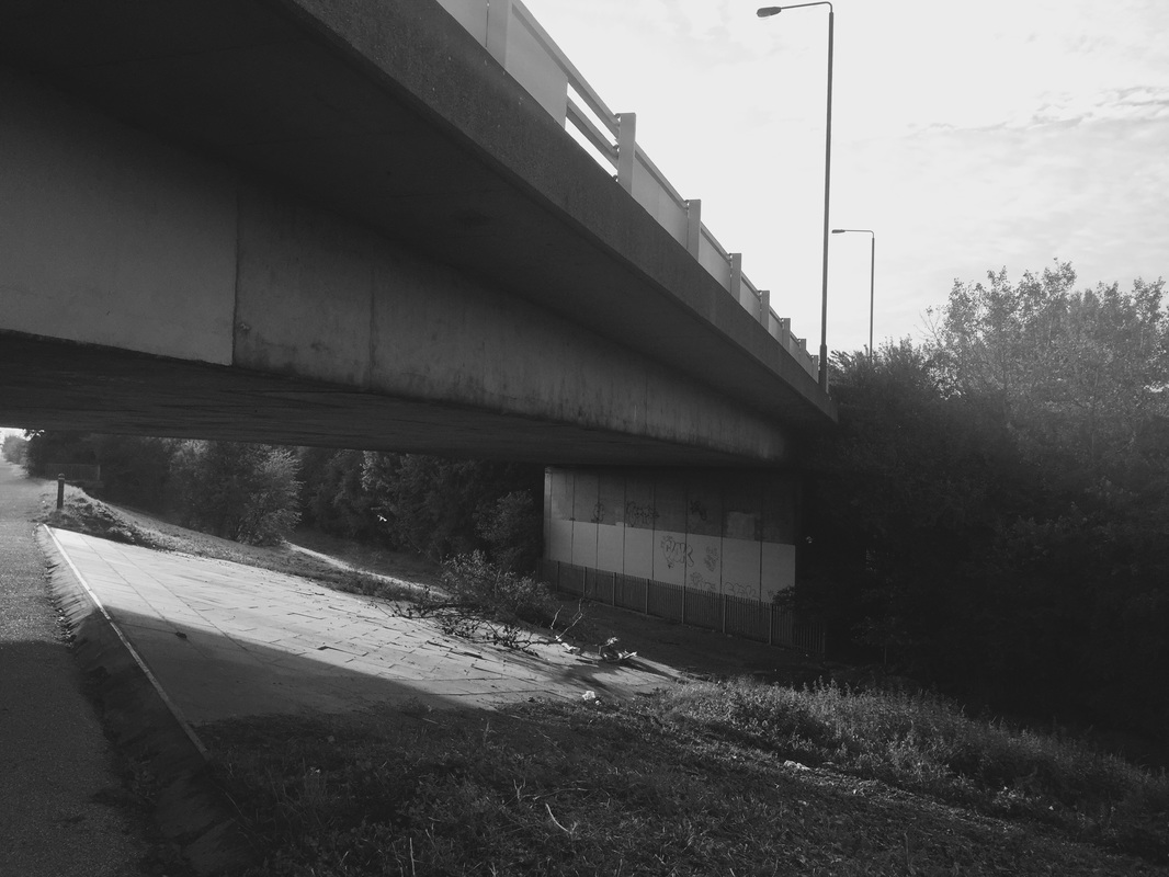
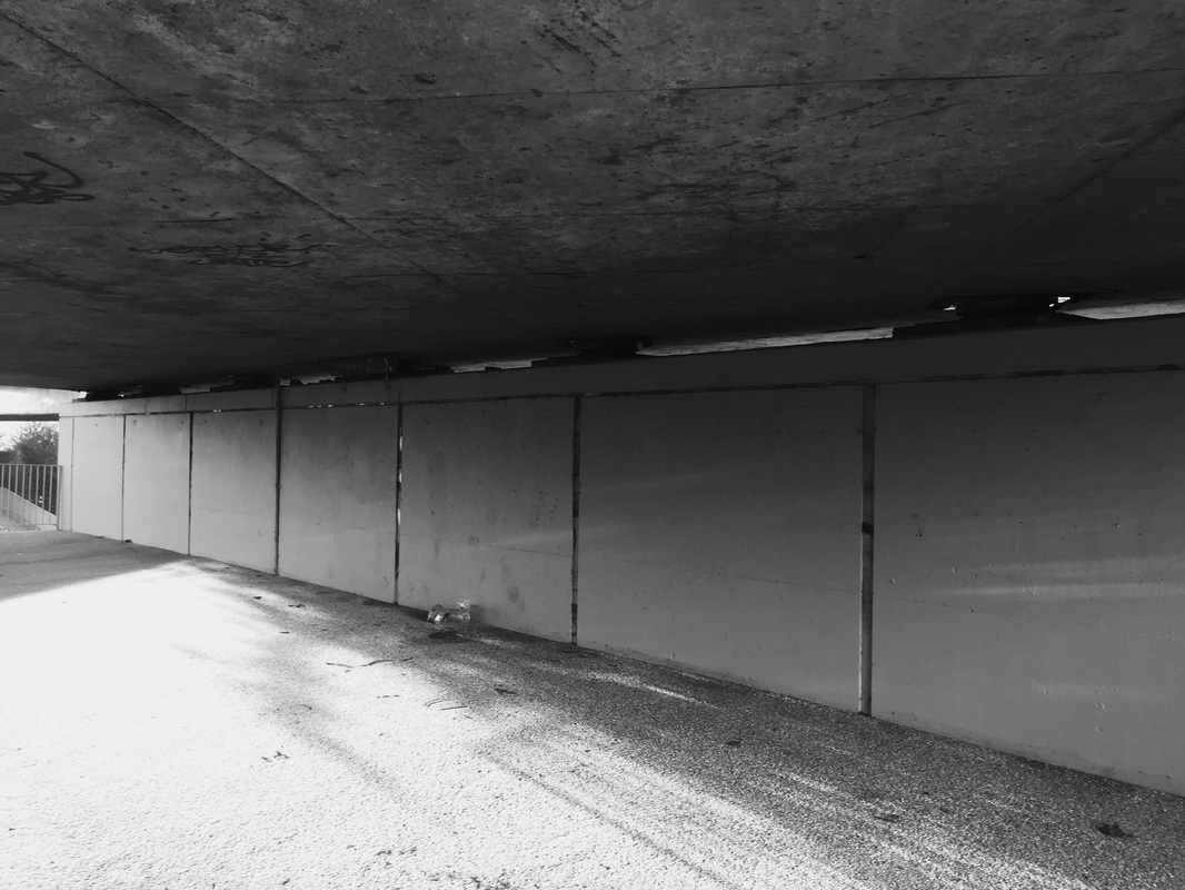
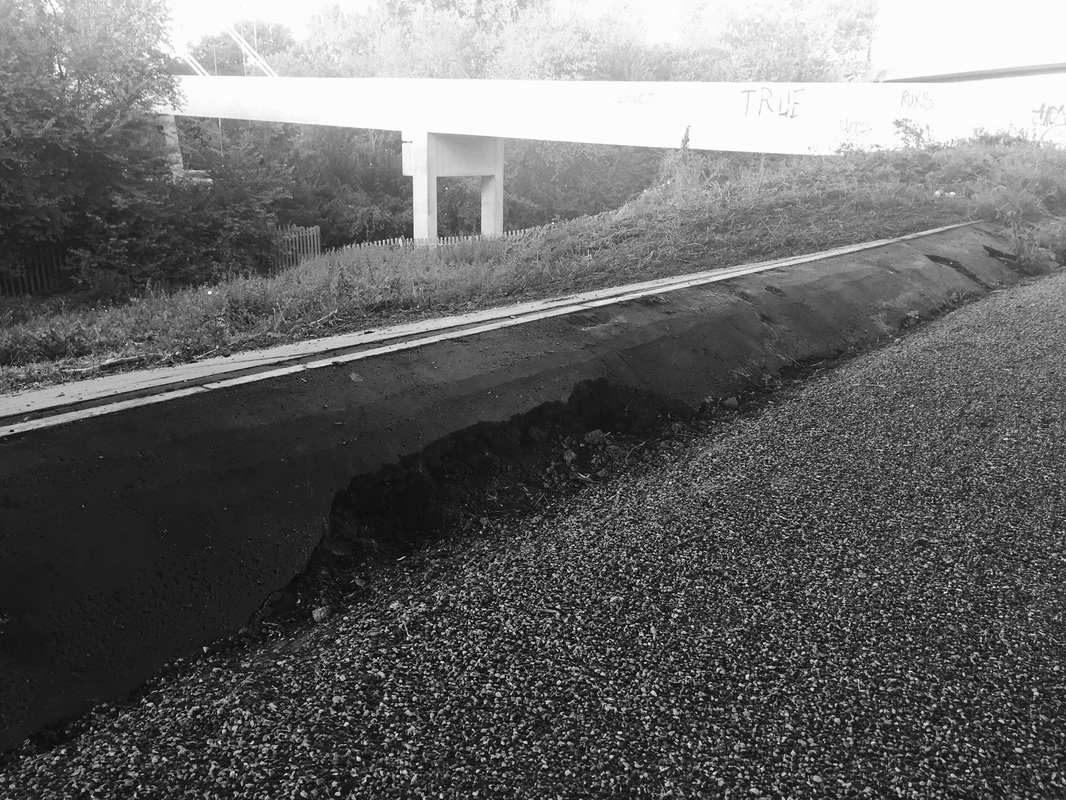
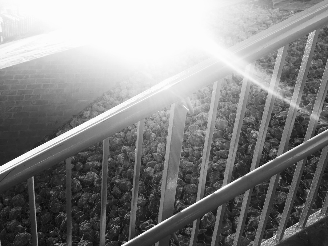
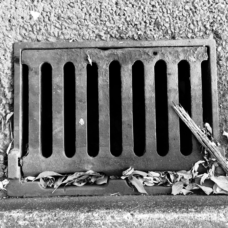
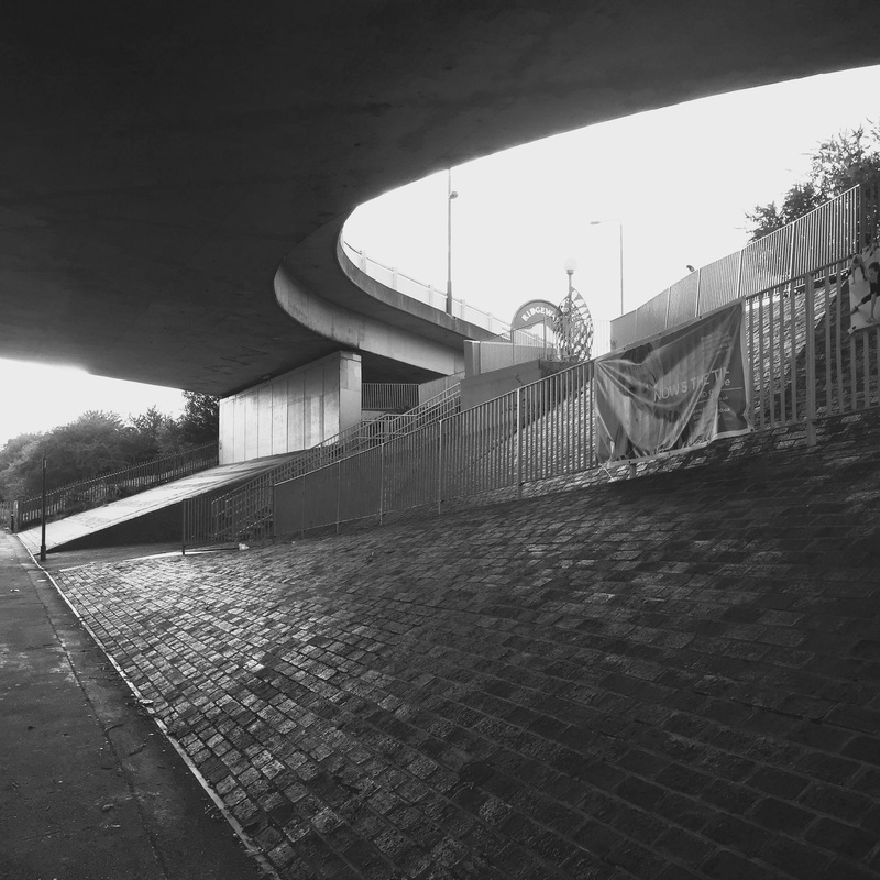
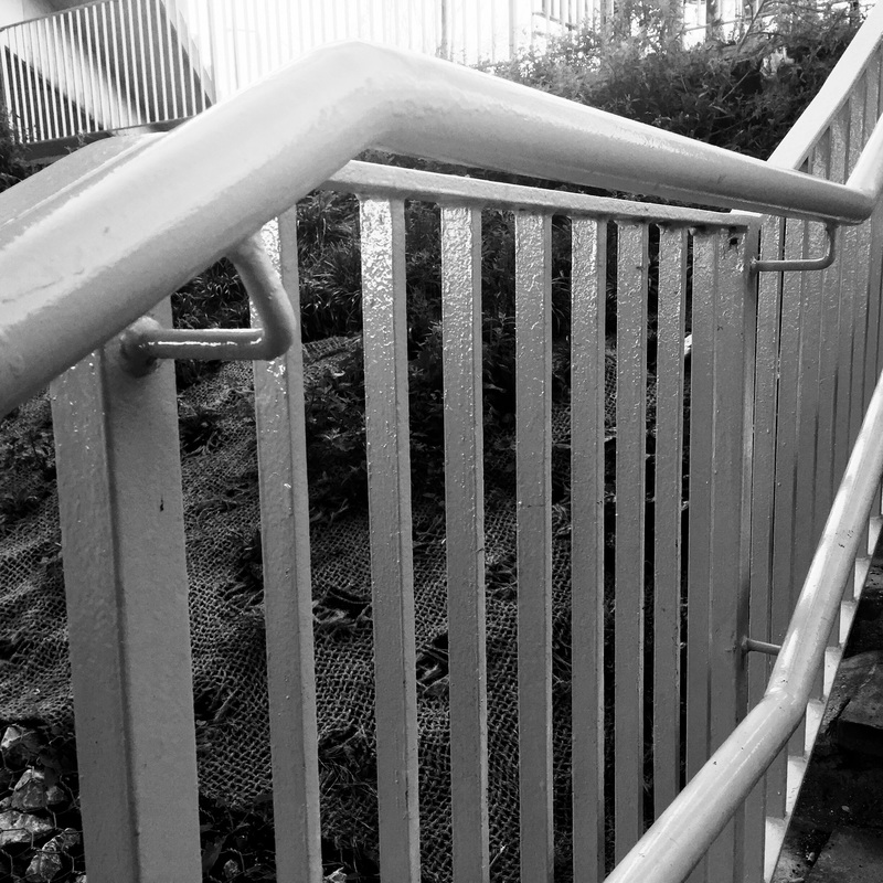
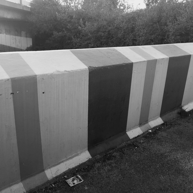
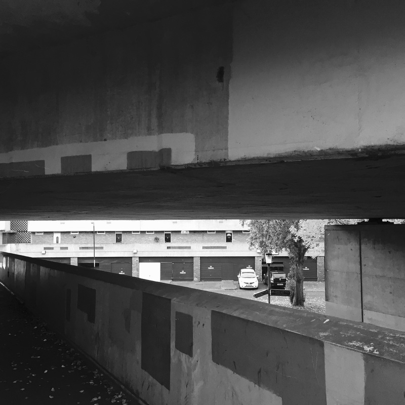
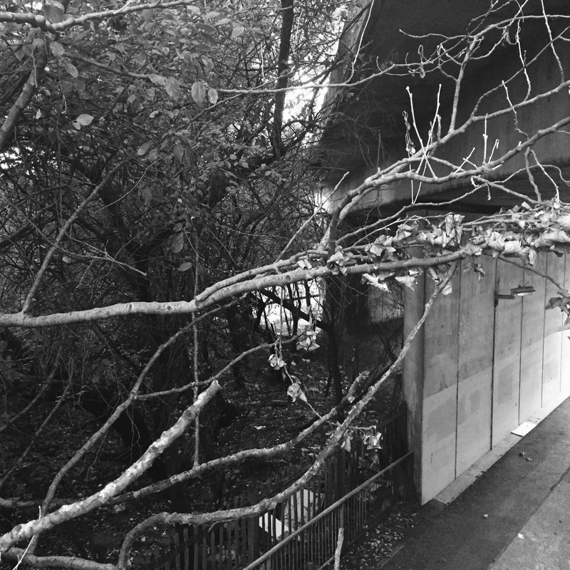
Outside there was buildings and I made sure I found buildings with curves and different shapes. Photographing them in different and unique angles, allowed the viewer to see different details and allows the viewer to see the building in a new view, different to what is "normal". Majority of the buildings that I focused on where brick/concrete buildings and I made sure to adapt roads into those photographs, because that would replicate Albert Renger Patzch work. Albert focused on line, which is one of the main elements I made sure to involve in majority of my photographs. Around the house there are a lot of things I could manipulate to produce line, and I made sure that there were lots of dark tones to make them stand out, as I wanted them to be the main element that the viewers would see in these photographs.
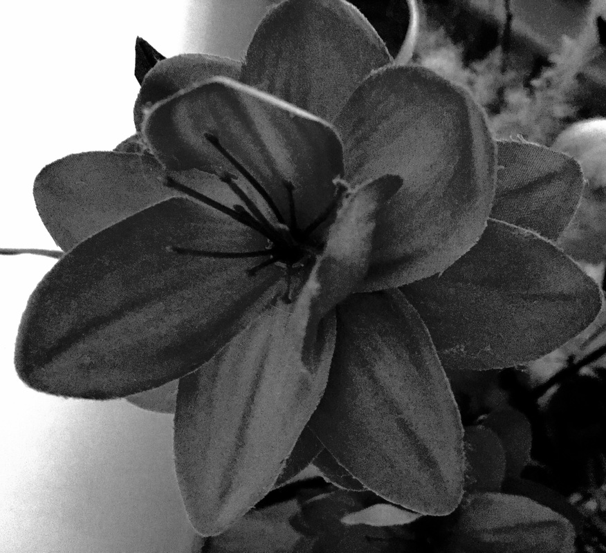
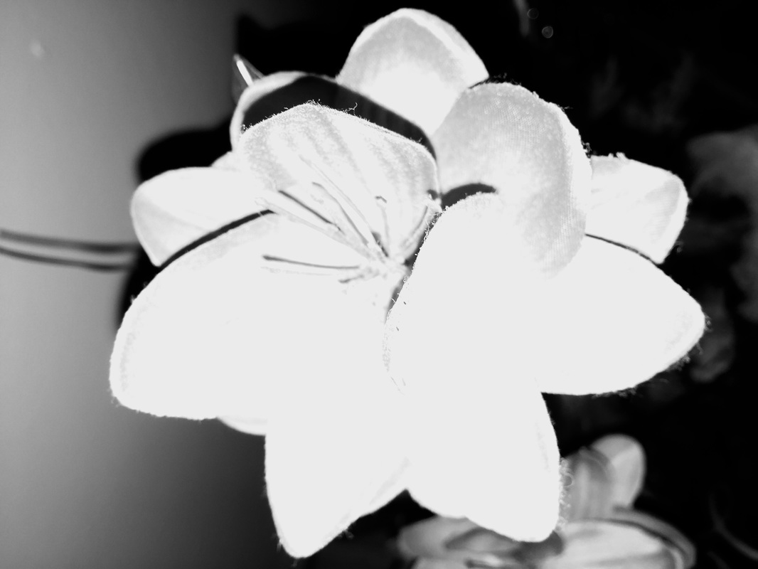
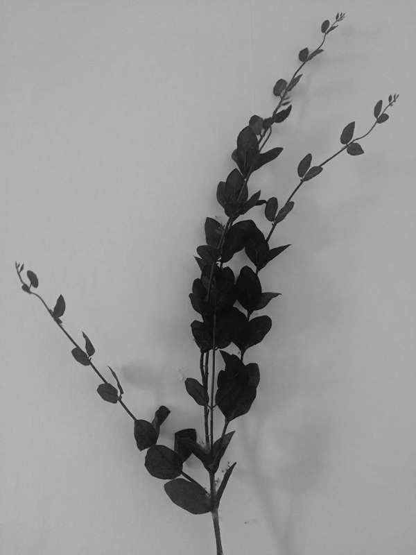
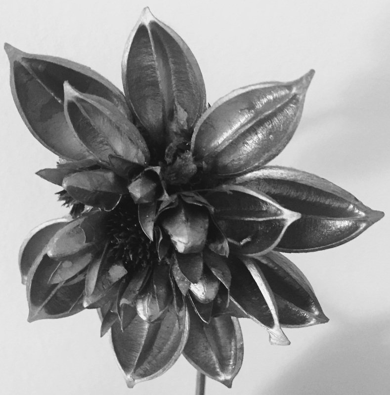
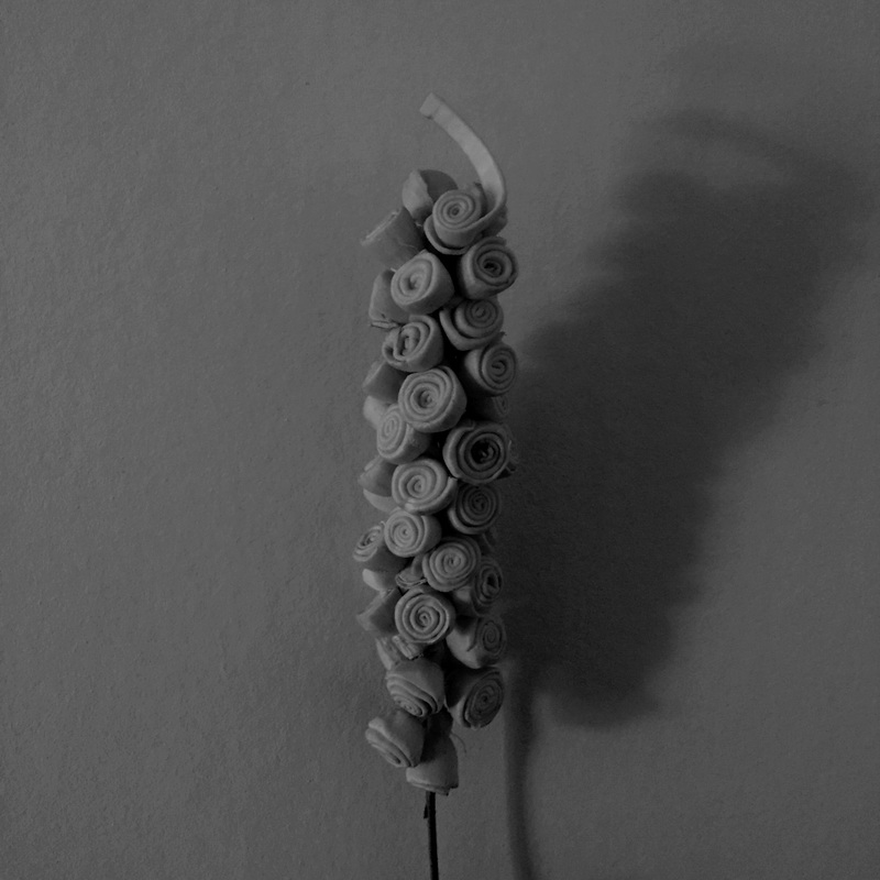
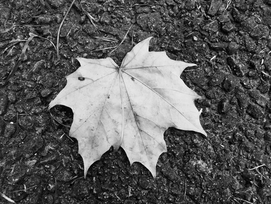
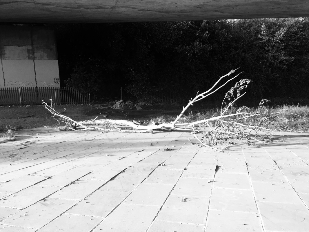
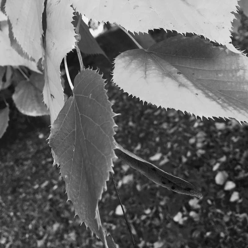
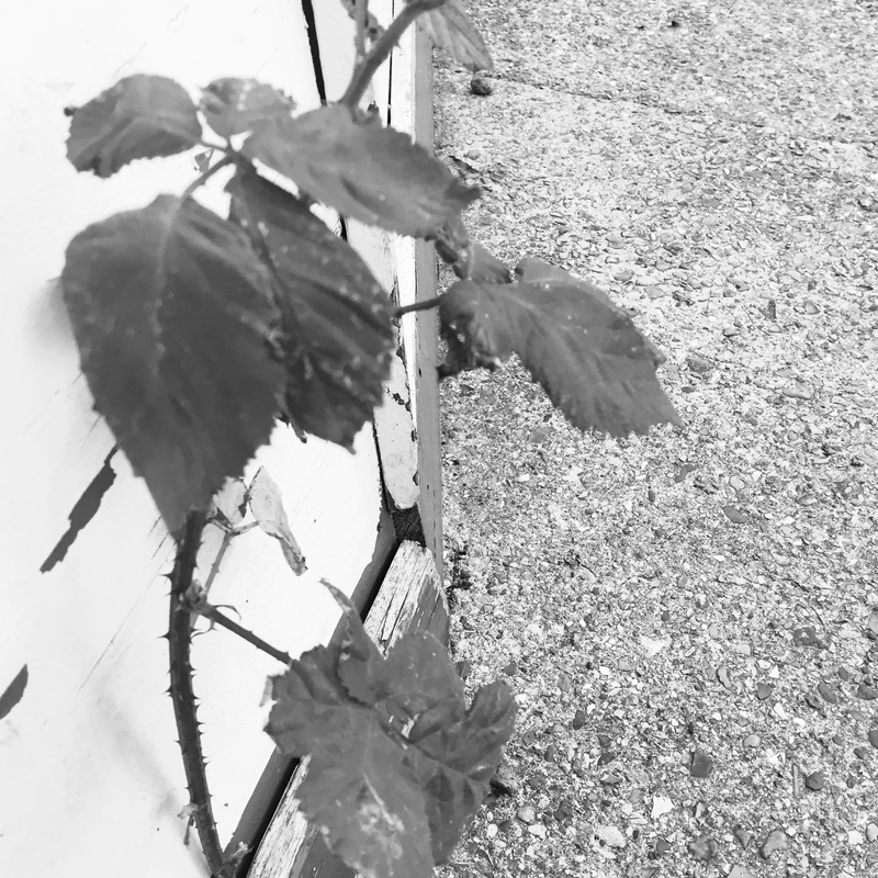
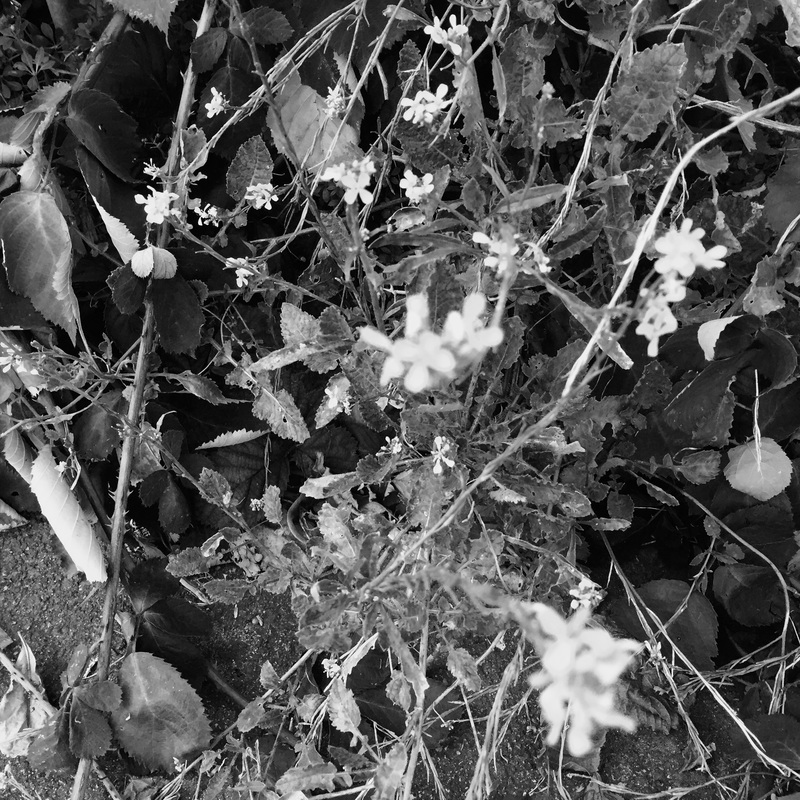
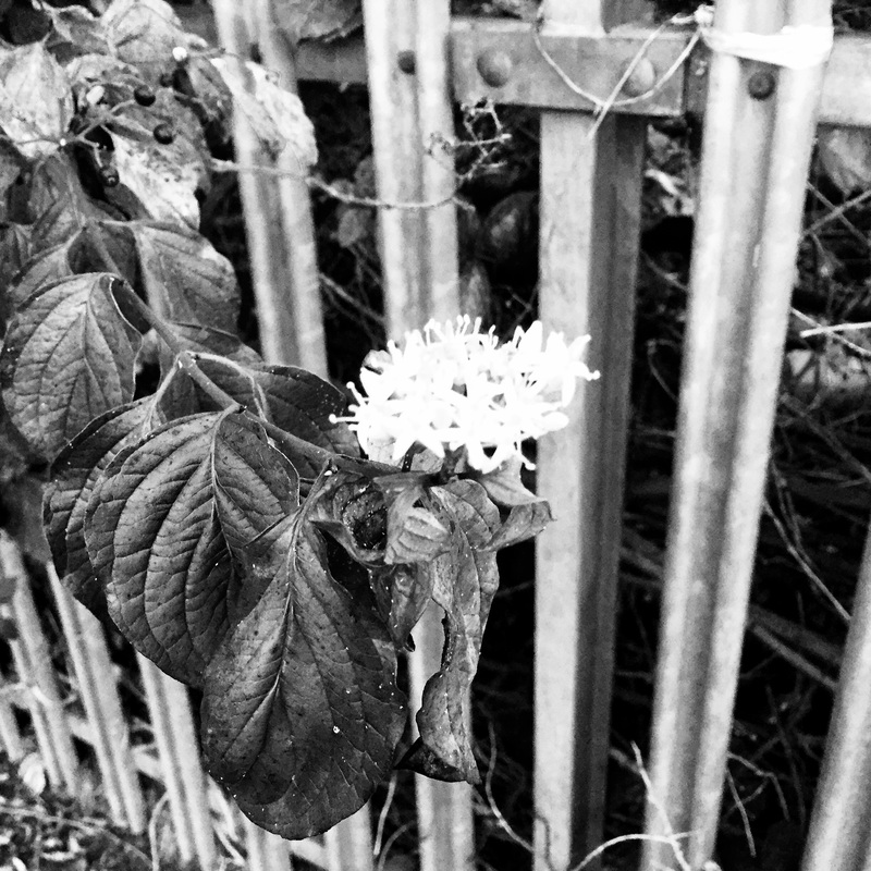
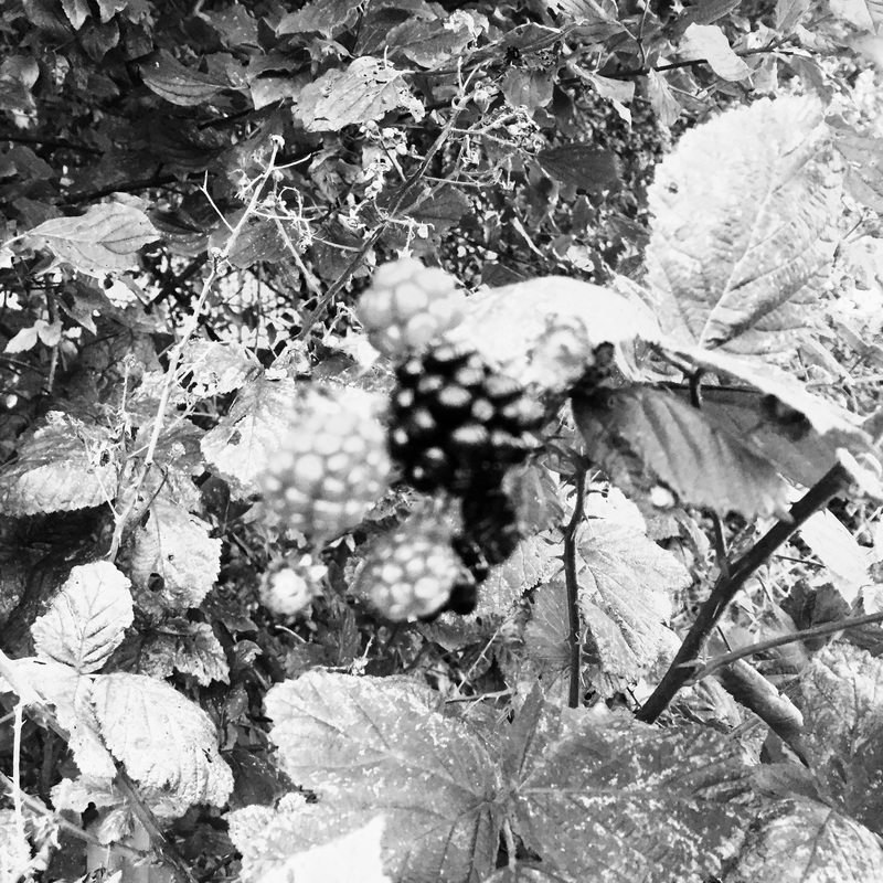
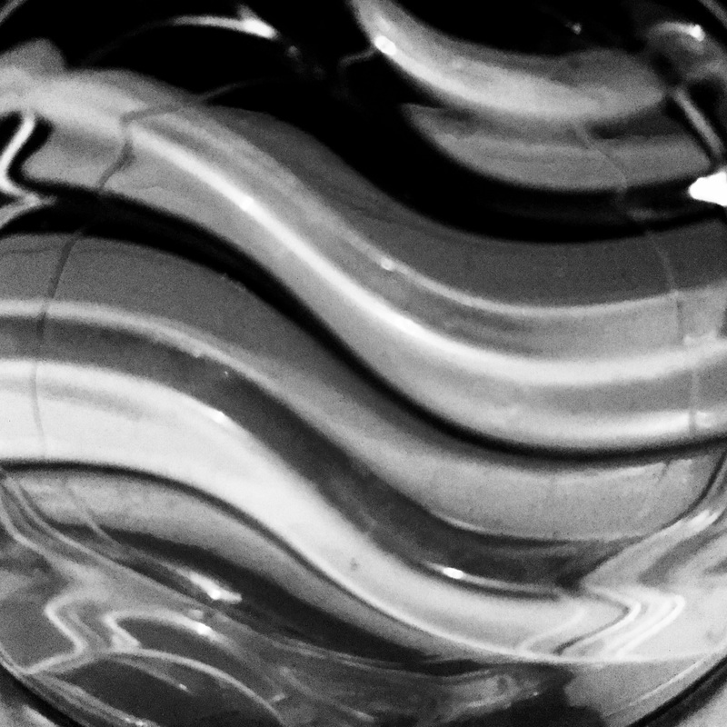
When focusing on the organic part of rengers work, I mostly used flowers and leaves to perform this element. I zoomed them in to exaggerate the size and show more detail of the organic object. Rather than focusing on line as the main element, I wanted to focus on light and the position of my phone, so that I capture the objects perfectly. I also focused on framing making sure that there weren't any distractions, allowing the viewer to focus on one thing in the photograph.
Editing these images, I made sure that they were black and white or even sepia effect because renger did not have colour in his images, so to be able to relate to his photos they had to have no colour. I made sure I added more contrast onto the photographs so that they will stand out more and detail will be seen clearer. I made sure that the exposure on certain images was down, so that the images did not look washed out and less like rengers photographs. I also made certain tones in the photographers darker, replicating rengers photgraphs and also darker tones will allow more abstract shapes to become more vivid and exaggerated.
Outside there was buildings and I made sure I found buildings with curves and different shapes. Photographing them in different and unique angles, allowed the viewer to see different details and allows the viewer to see the building in a new view, different to what is "normal". Majority of the buildings that I focused on where brick/concrete buildings and I made sure to adapt roads into those photographs, because that would replicate Albert Renger Patzch work. Albert focused on line, which is one of the main elements I made sure to involve in majority of my photographs. Around the house there are a lot of things I could manipulate to produce line, and I made sure that there were lots of dark tones to make them stand out, as I wanted them to be the main element that the viewers would see in these photographs.
When focusing on the organic part of rengers work, I mostly used flowers and leaves to perform this element. I zoomed them in to exaggerate the size and show more detail of the organic object. Rather than focusing on line as the main element, I wanted to focus on light and the position of my phone, so that I capture the objects perfectly. I also focused on framing making sure that there weren't any distractions, allowing the viewer to focus on one thing in the photograph.
Editing these images, I made sure that they were black and white or even sepia effect because renger did not have colour in his images, so to be able to relate to his photos they had to have no colour. I made sure I added more contrast onto the photographs so that they will stand out more and detail will be seen clearer. I made sure that the exposure on certain images was down, so that the images did not look washed out and less like rengers photographs. I also made certain tones in the photographers darker, replicating rengers photgraphs and also darker tones will allow more abstract shapes to become more vivid and exaggerated.
