Photography and film are used in advertising campaigns to raise awareness of an issue, to promote a product or to convey information. Photographic images have played a significant part in campaigns such as the UK government's 'Visit Britain' campaign, the Oxfam 'Grow' campaign, or the Blue Cross 'I Will Survive' campaign. Investigate appropriate examples and create images for a cause that is personal interests to you.
Threshold Concept #9
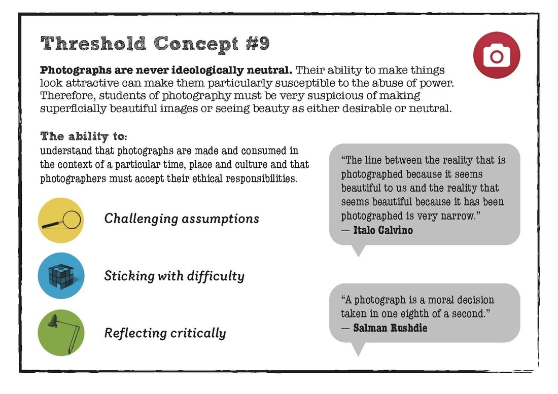
THRESHOLD CONCEPT 9 RELATES TO CAMPAIGNING PHOTOGRAPHY AS THE THEORY OF PHOTOGRAPHY IN MY OPINION, RELATES TO HOW DECEPTIVE PHOTOGRAPHS. PHOTOGRAPHS ARE ILLUSIVE AND WHAT MAKES IT THAT WAY IS DUE TO IT BEING FLAT AND 2D BUT NOT ACTUALLY LOOKING FLAT. THE PHYSICAL PHOTOGRAPH IS FLAT BUT THE IMAGE IS PRESENTED 3 DIMENSIONAL.
IN COMPARISON PAINTINGS, REGARDLESS OF THE QUALITY, IS STILL EASILY PERCEIVED AS A WORK OF ART AND NOT REALITY. PHOTOGRAPHS CAN BE EASILY MISTAKEN TO BE REALITY AS THE VIEWER MISTAKES THE TWO. PHOTOGRAPHY IS AN ILLUSION OF REALITY, AND MORE SO A SYMBOL OF THE REAL WORLD AND VIEWERS COMMONLY FORGET THEY ARE LOOKING AT A CONSTRUCTED IMAGE MADE OUT OF CHEMICALS, PAPER AND LIGHT. WE ARE SEE THE THINGS WE ARE SHOWN IN A PHOTOGRAPH AND BELIEVE THAT IT IS REAL LIFE RATHER THAN A SYMBOL OF REAL LIFE.
PHOTOGRAPHS HAVE CONSTANTLY BEEN USED THROUGHOUT HISTORY TO BE PROOF THAT SOMETHING HAS HAPPENED. EXAMPLES OF THIS IS ARTISTS IN COURT DRAWING PICTURES OF PEOPLE IN COURT AS CAMERAS ARE NOT ALLOWED. CLEARLY WE CAN SEE AND TELL THAT IS A DRAWING OF A PERSON RATHER THAN THE ACTUAL PERSON. IF PHOTOGRAPH WAS USED IN COURT TO REPLACE THE ARTISTS DRAWINGS, IT WOULD BE HARDER TO DISTINGUISH BETWEEN THE PICTURE OF THE PERSON AND THE PERSON. PHOTOGRAPHY HAS THE AMAZING ABILITY TO CONVINCE SOMEONE THAT THE PHOTOGRAPH IS REAL WITHOUT QUESTIONING IT.
THIS IS WHY PHOTOGRAPHY IS COMMONLY USED WITH POLITICIANS AND ADVERTISERS IN A WAY OF SELLING PRODUCTS AND IDEAS TO THE PUBLIC, AS PHOTOGRAPHY IS THE BEST WAY TO TRICK PEOPLE INTO BELIEVING THAT SOMETHING IS REAL WHEN IT IS NOT. PHOTOGRAPHY IS SO SUSCEPTIBLE TO THE ABUSE OF POWER BECAUSE PHOTOGRAPHY IS SO CLOSE TO REALITY AND ALLOWS PEOPLE TO LIE AND EASILY MANIPULATE THE AUDIENCE.
Roland Barthes: Camera Lucida ‘1980’
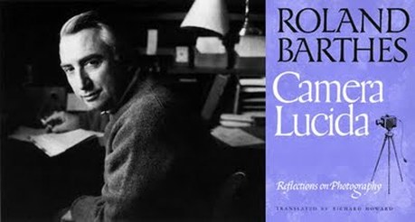
roland barters cameria lucida -
photograph is a sign/referent because we see the referent and forget to see the sign.Showing a powerful sign and referent creates much power over there imagination, selling them and idea (propaganda). photographs are universal.
-Ontological desire
-Contemporary expansion
-Classification = photography evades us
-Empirical (professionals/amateurs)
-Rhetorical (landscapes/objects/portrait/nudes)
-Aesthetic (realism/pictorialism)
-Photography reproduces infinity.
-Photography mechanically repeats what could never be repeated existentially.
-In a photography the event is never transcend for the sake of something else.
-A photograph cannot be transformed philosophically.
-Certain photograph are never distinguished from its referent (from what it represents).
-It is not impossible to perceive the photographic signifier, but requires a secondary action of knowledge or of reflection.
-A photograph as something tautological about it.
-Photograph always carries its referent with itself, both affected by the same amorous or funereal immobility.
-A photograph is a special sign and is separated from its referent
-Distance between sign and referent is impossible to distinguish, due to them being so similar its almost an illusion that the referent is just there and that its only a sign.
-Photographs are not culturally unspecific
-Not made by people but by machines
-As machines do not have an opinion, the photograph is not manipulate by people and is not opinion.
-Propaganda does not want to be propaganda.
-‘the claim to truth’
-Photography (due to manmade form) creates a trace of reality-indexical link (direct link to reality) - as light from the world created the image. DNA of photography, so that photograph is some what believable, truth and reality.
- useful for to persuade someone that the evidence they are showing are real.
- photographs crop reality.
- photographs are abstract as they have an edge, whereas reality doesn’t
- photographs take things out of context which makes them not believable
LEAVE BREXIT CAMPAIGN:
|
|
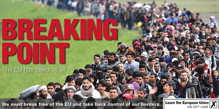
The "breaking point" campaign poster is in relation to anti-migrants.
The original photo comes from a Getty image showing 47,000 refugees that have entered Slovenia after the Croatia borders shut down. There is no relation with Britain and the EU regarding the refugees in the poster but it has been edited to make it seem like this way. At the bottom of the poster, the caption says "we must break free of the EU and take back control of our borders.
This insinuates that after 2004 were the borders were opened for EU citizens to freely migrate inside Europe, that there is a huge line of refugees and other immigrants trying to enter the UK. Even though this isn't the case, the poster scares the people into voting leave, in fear that the UK will be densely populated and will cause more problems especially with many population issues such as the housing crisis.
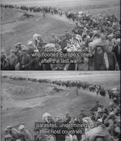
There is theme of coercion in this campaign poster as it is quite similar to Nazi propaganda. The captions underneath the posters are quite similar as the Nazi propaganda says "who flooded European cities after the last war - parasites, undermining the host countries". The brexit poster isn't as blatant as the nazi propaganda but it still has subtle discriminative remarks to using the line of refugees in wrong way to make it out that there is an abundance of refugees entering the UK. This is modern day propaganda as it is misleading and creates fear to people that there will be a lack of jobs and housing for UK citizens. This also shows how photography is unreliable as it has created an imitation
This anti-migrant photograph was the most coersive way of tricking the public into believing that these people were lining up at the doors of Britain waiting to enter. Regardless of the fact that the image was not even taken in Britain, it still created an illusion to convince the public they were immigrants entering Britain to take jobs and ruin the national health service.
The original photo comes from a Getty image showing 47,000 refugees that have entered Slovenia after the Croatia borders shut down. There is no relation with Britain and the EU regarding the refugees in the poster but it has been edited to make it seem like this way. At the bottom of the poster, the caption says "we must break free of the EU and take back control of our borders.
This insinuates that after 2004 were the borders were opened for EU citizens to freely migrate inside Europe, that there is a huge line of refugees and other immigrants trying to enter the UK. Even though this isn't the case, the poster scares the people into voting leave, in fear that the UK will be densely populated and will cause more problems especially with many population issues such as the housing crisis.
There is theme of coercion in this campaign poster as it is quite similar to Nazi propaganda. The captions underneath the posters are quite similar as the Nazi propaganda says "who flooded European cities after the last war - parasites, undermining the host countries". The brexit poster isn't as blatant as the nazi propaganda but it still has subtle discriminative remarks to using the line of refugees in wrong way to make it out that there is an abundance of refugees entering the UK. This is modern day propaganda as it is misleading and creates fear to people that there will be a lack of jobs and housing for UK citizens. This also shows how photography is unreliable as it has created an imitation
This anti-migrant photograph was the most coersive way of tricking the public into believing that these people were lining up at the doors of Britain waiting to enter. Regardless of the fact that the image was not even taken in Britain, it still created an illusion to convince the public they were immigrants entering Britain to take jobs and ruin the national health service.
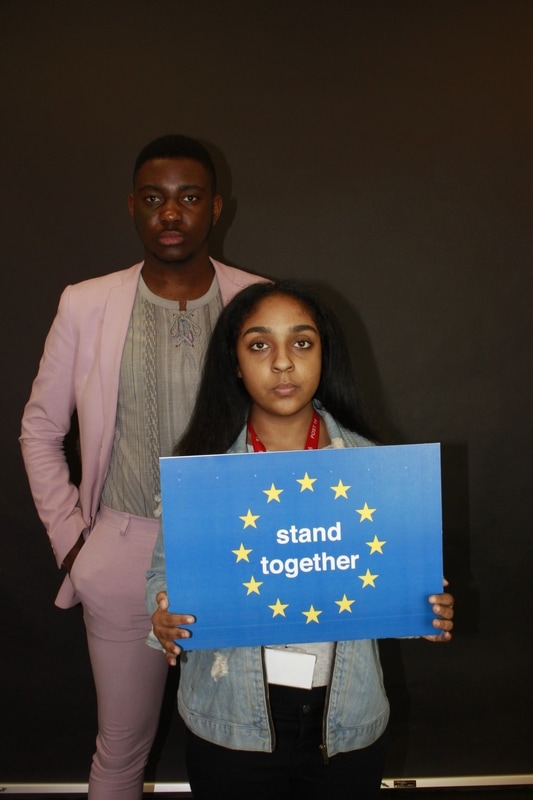
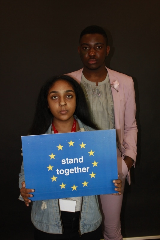
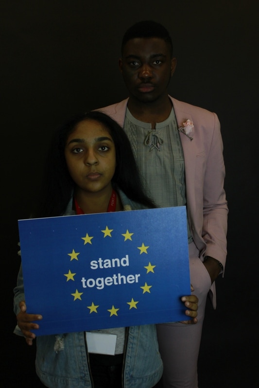
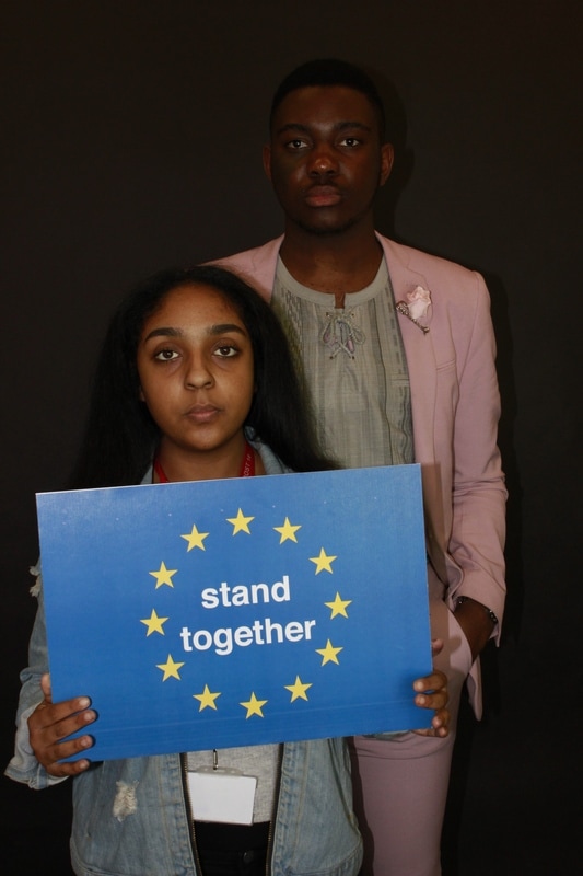
STAY BREXIT CAMPAIGN:
Wolfgang Tillmans:
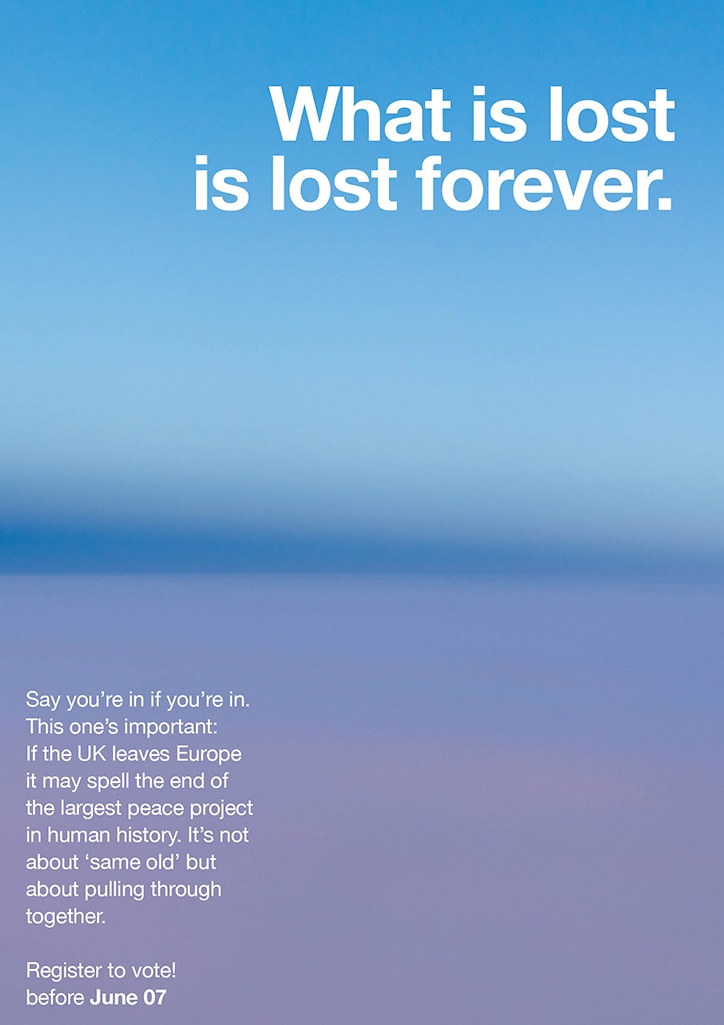
ANTI-BREXIT CAMPAIGN:
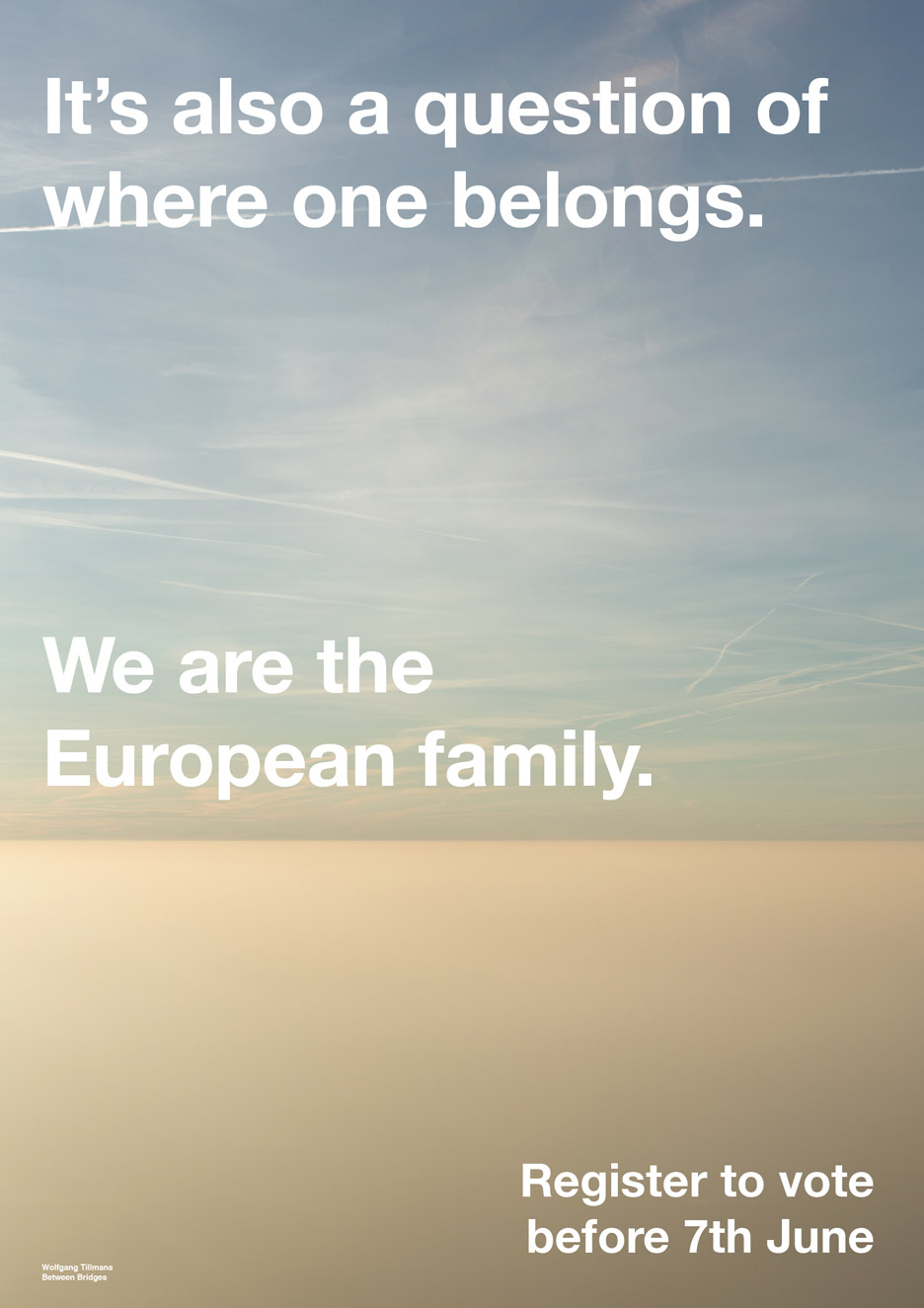
The aim behind Tillmans work is that he wants to encourage more young people to vote and have a say in the referendum, saying "I want to work towards maximizing turnout among younger voters by focusing on the first, crucial step: voter registration – the deadline for which is June 7," This is because young people are the ones who are highly effected by the choice the UK have made to leave the EU. He also targets the younger generation through adding quotations on university students abroad in Europe and how Brexit will change.
The aim behind Tillmans work is that he wants to encourage more young people to vote and have a say in the referendum, saying "I want to work towards maximizing turnout among younger voters by focusing on the first, crucial step: voter registration – the deadline for which is June 7," This is because young people are the ones who are highly effected by the choice the UK have made to leave the EU. He also targets the younger generation through adding quotations on university students abroad in Europe and how Brexit will change.
TILLMAN EXHIBITION
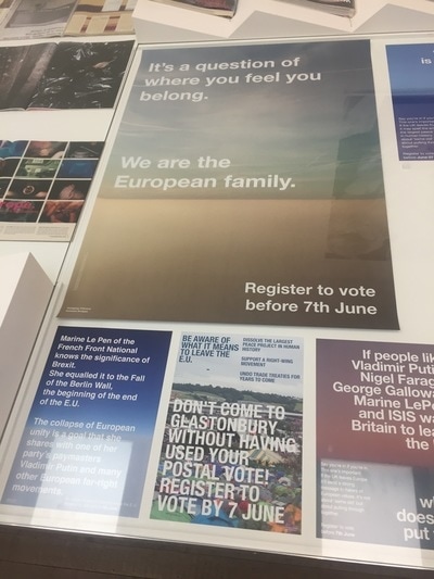
What I gained from the this exhibition is that Tillman is able to explore and capture different things which relates to broad range of people and topics. Regarding the placement of each photograph in the exhibition, it was all thoughtfully placed together to create a connection.
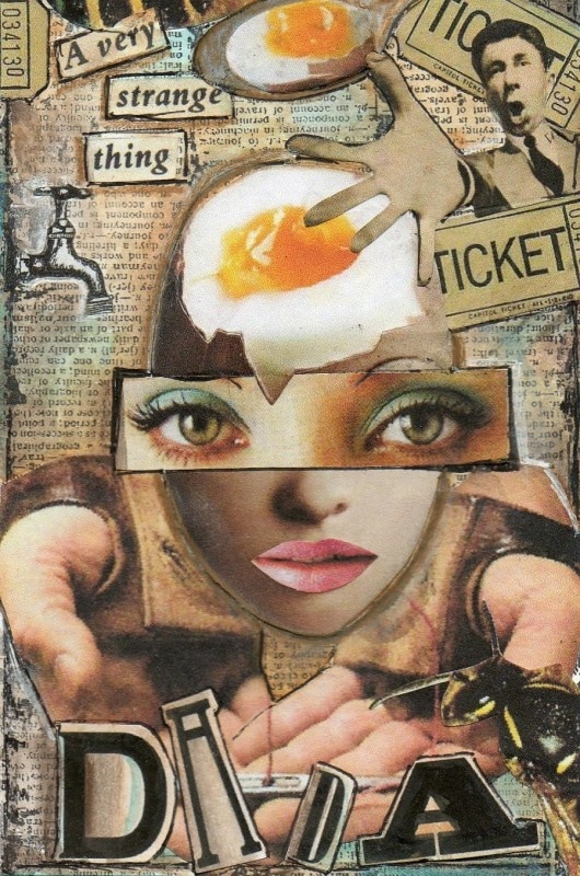
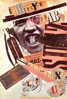
DADA ART MOVEMENT (1916-1924):
This political art movement was created in reaction the world war 1, as many people began to question society and in response to this they began to ruin and destroy traditional values in art. They created new art to replace old art and one of the new pieces of art they began to create was photomontages. This political art movement were anti-war, anti-bourgeois and also had relations with the radical left. This movement is highly inspirational as they create a mockery of vain cultural figures that stood for something deathless.
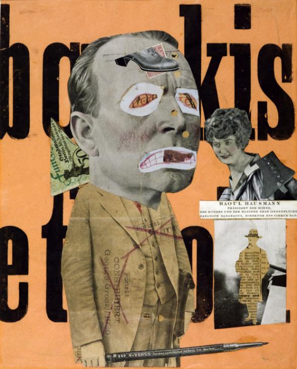
PETER KENNARD
|
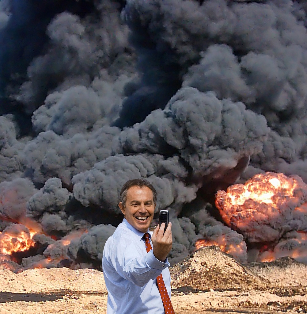
Photo Op
This photomontage created by Kennard and Phillips is a combination of two images. One which is of Tony Blair taking a "selfie" with a group of naval cadets during the 2005 general election, and behind they replaced the naval cadets with a gas explosion to create comical juxtaposition on the Iraq war. This is one the art demonstrations against the start of the Iraq invasion, and in 2013 the two photographers decided to create this piece to artistically produce on outcome on many of the pubic opinion on how Tony Blair is responsible for mayhem that has occurred. The deep intentional political meaning outweighs the comical aspect of the photomontage and relates to a modern day dada art movement. The act of Tony Blair taking a "selfie" behind the explosion simply shows that Tony Blair is proud of what he has accomplished and is nonchalant of the destruction he has caused for the Iraqis. This one image pulls the heart strings of the viewers of war and capitalism. |
|
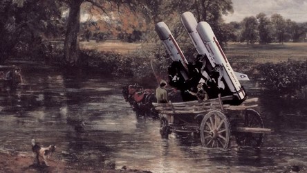
Unofficial War Artist "Haywain with cruise missiles" montage
This photomontage was formed from the famous painting "haywain" by John Constable. Kennards aim was to completely change the peaceful and calm greenfield into a war zone by adding missiles. This photomontage was created in response to the cold war. His montages were anti-war and against the use of missiles. |
|
Defended Death
THE EDUCATION SYSTEM
set 1
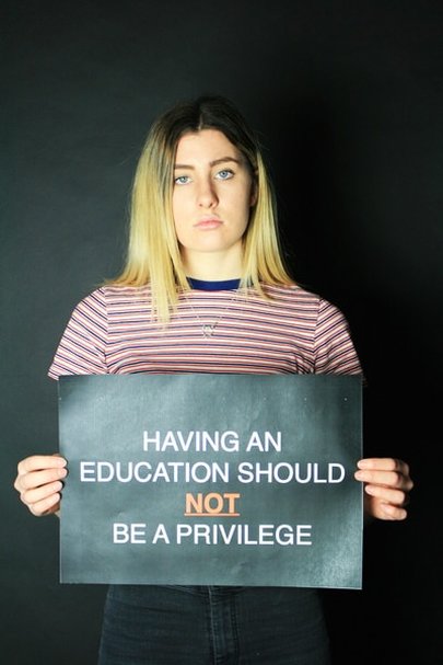
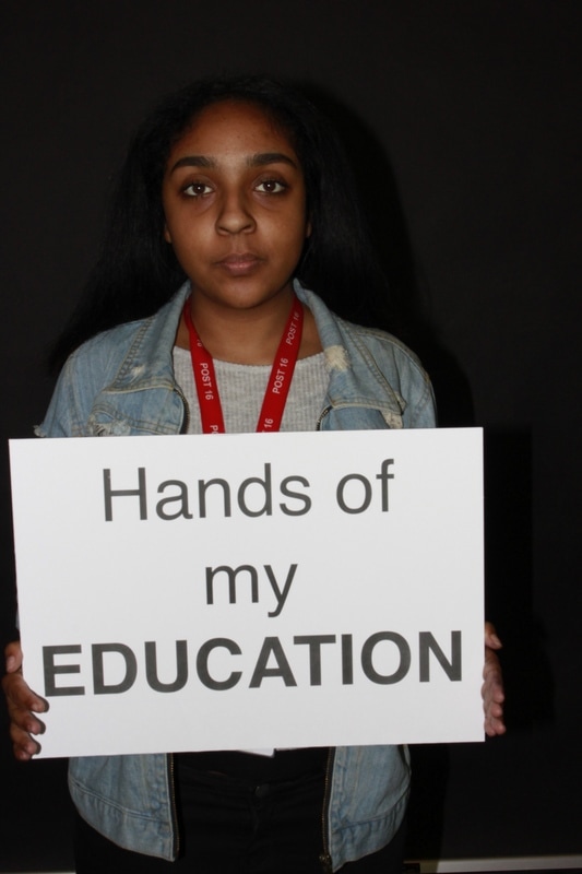
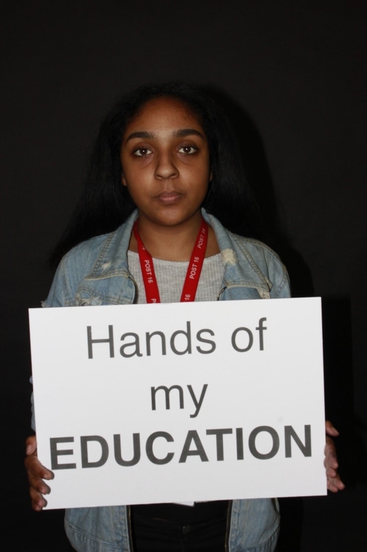
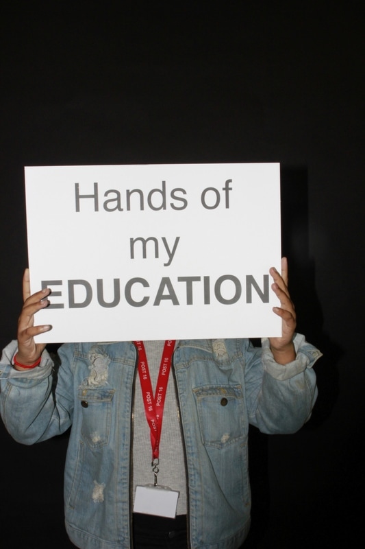
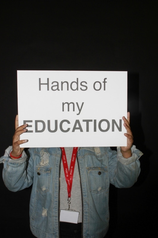
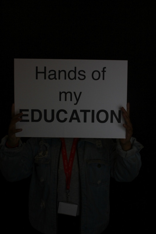
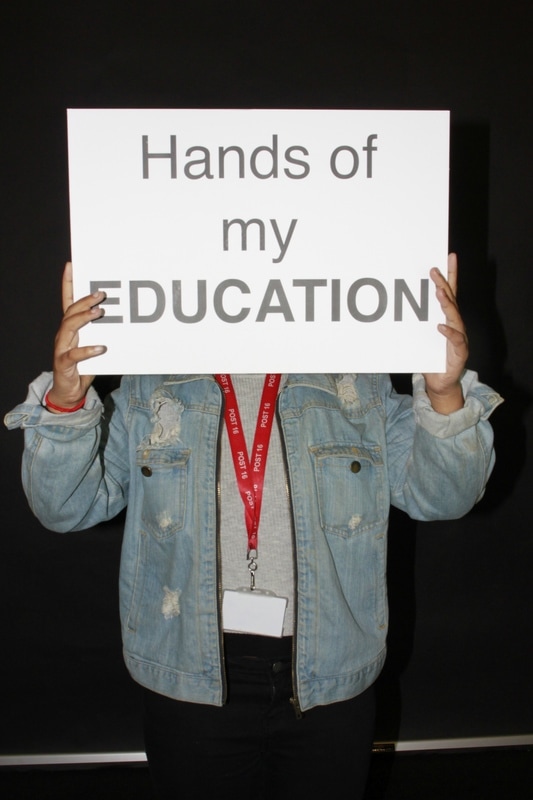
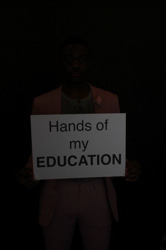
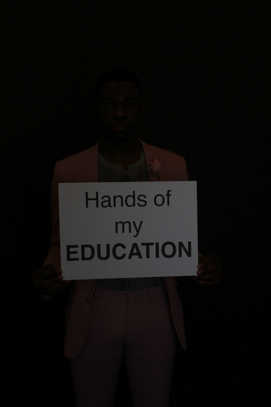
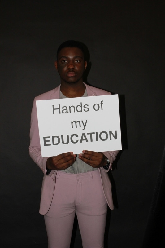
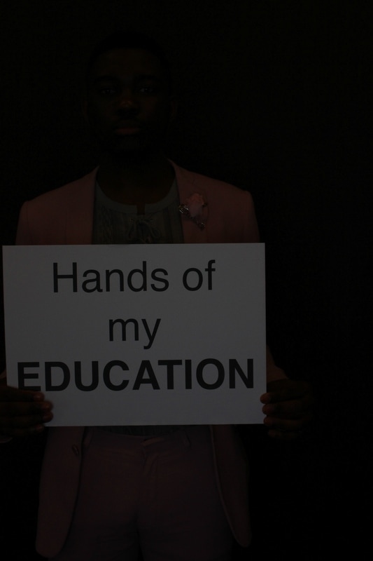
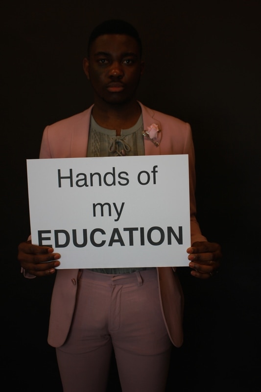
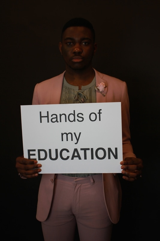
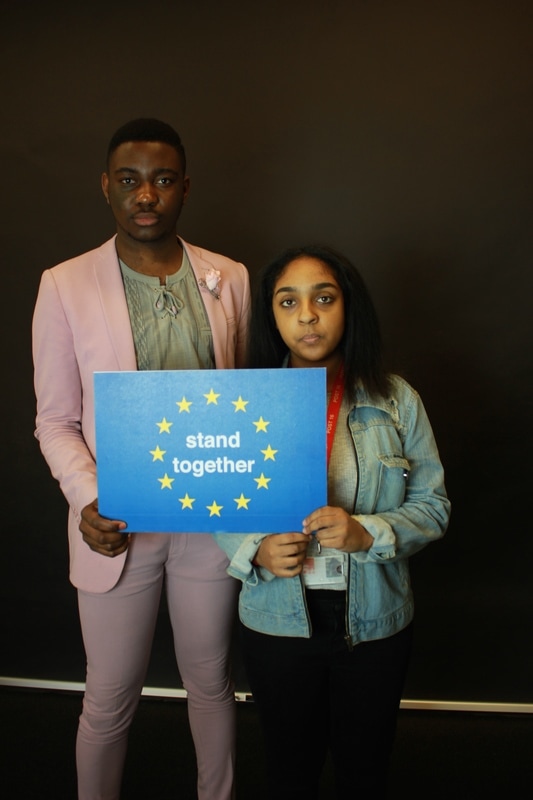
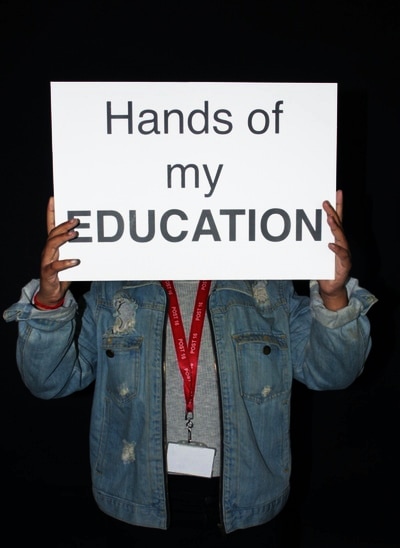
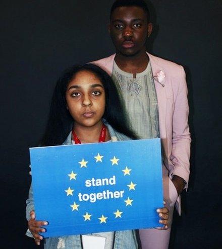
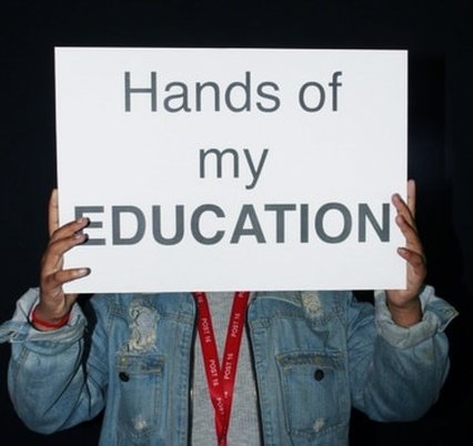
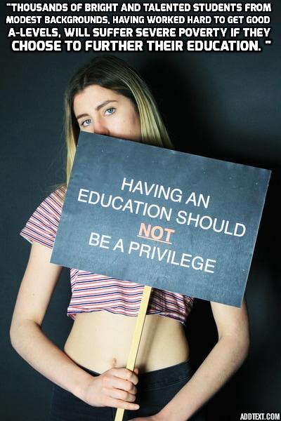
The university tuition fee crisis is a problem that I am first hand struggling with. During the coalition government in 2010, they raised tuition fees from £3,000 to £9,000 which has caused many demonstrations and backbench rebellions in parliament. Recently for people entering university in 2017/2018 they have have increased the fee by £250, and have scrapped tuition and maintenance grants. This is a serious issue that I believe that many people have recently discarded as it reduces the amount of smart children from poorer backgrounds having a chance to enter university or it has also made university unpleasant for people to attend as many people believe it is a capitalist scam for the youth. It is made crucial and necessity for people to go to earn a degree and get a "good job" but 50% of graduates have jobs which their degree is not needed for.
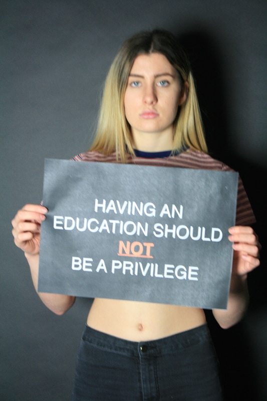
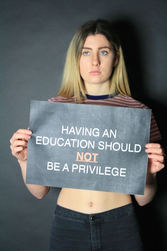
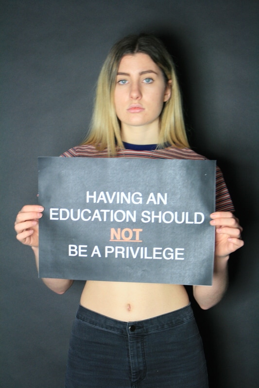
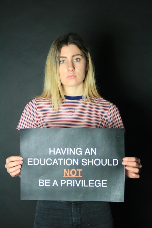
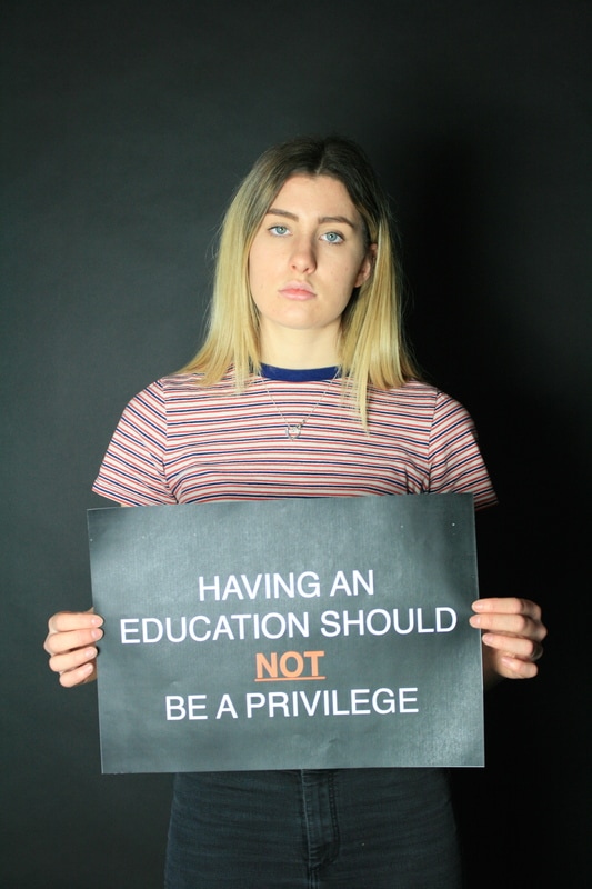
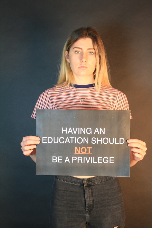
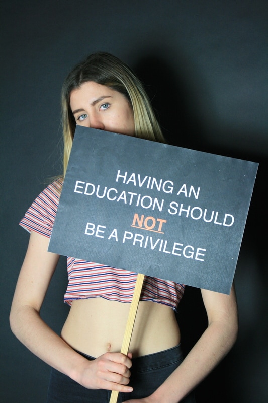
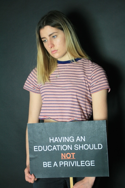
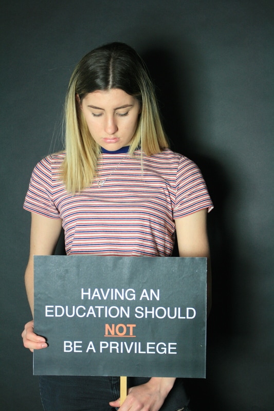
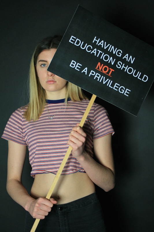
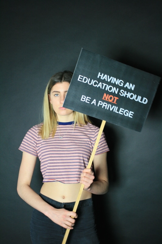
I created a placard stating "having an education should not be a privilege". The key word in this statement is "privilege", relating to only a certain amount of people are able to apply for university due to the increase of fee, meaning it creates an advantage for some students and creates a gap in education and also the chance to have a good corporate job in the future. The use of colour creates a melancholy effect. The emotions behind the colour black is normally negative, such as evil, death and "power". Power, in a way that it is being used in a negative and inappropriate way to control lives and make it harder for others.The emotions behind the colour red relates with anger, war, danger and also power. Red is a really intense colour and has high visibility as it is used in many signs such as stop signs and fire equipment. The use of the colour in the placard makes the "not" stand out the most to emphasise how wrong the education system is
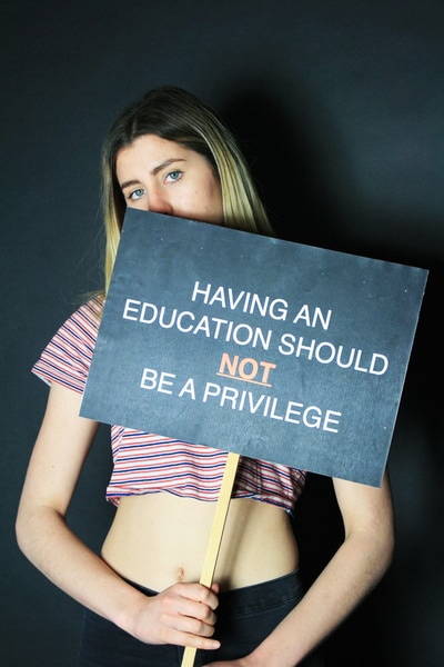
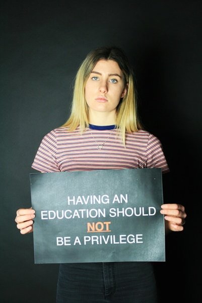
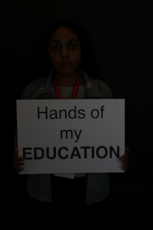
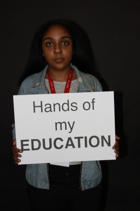
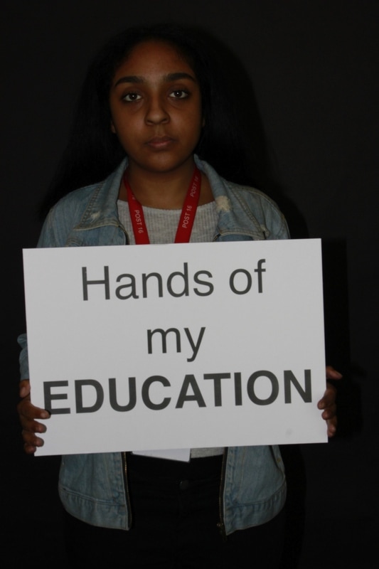
refined images
|
|
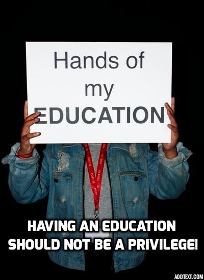
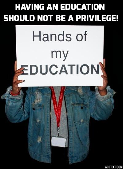
I edited these images using photoshop, brighten the photographs and added more contrast to make the model and sign come out more so that it stands out against the black background.
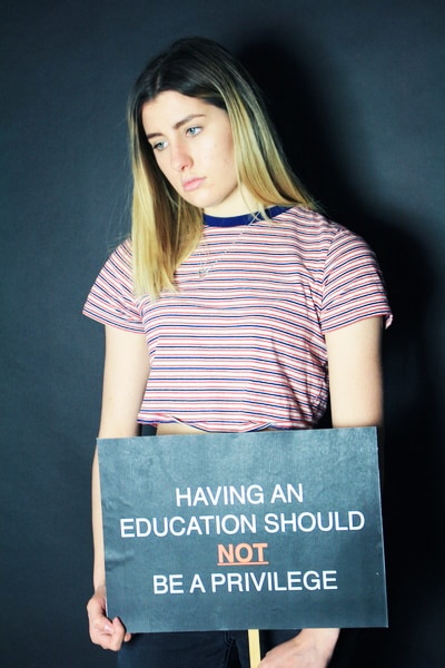
set 2

refined images

|
|
Experimenting with text
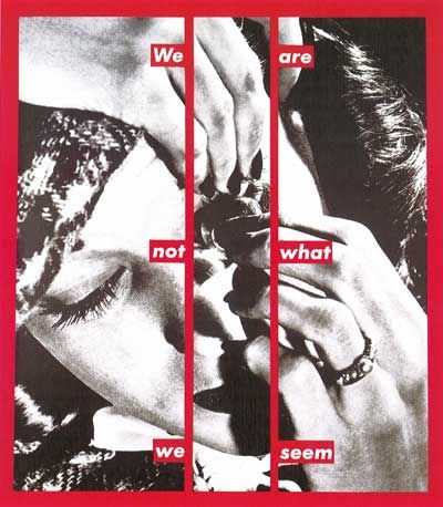
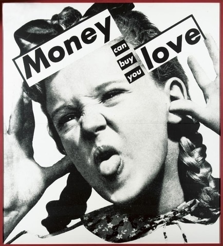
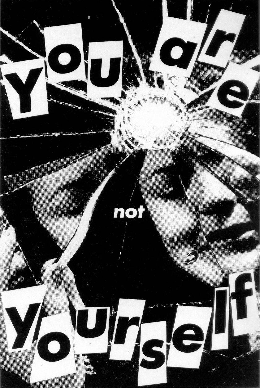
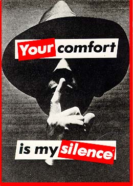
Babara Kruger
|
Kruger is a conceptual artist who is most famously known for her screen prints by adding specific captions on a topic on a found image. Krugers captions were related with culture, society and politics. The captions Kruger uses are short and direct, capturing the publics eye and getting to the point straightaway to make a clear statement. Martha Kruger is also most iconic due to her use of colour. Kruger only prints the pictures in black and white with red bordering the picture or text. Kruger uses the colour red due to emotions behind the colour red which are boldness, aggressiveness and power. The colour red is used in most signs such as traffic lights and fire equipment. Red is a extremely bold colour out of the whole colour spectrum which in addition with the short captions, easily captures to publics eyes.
|
|
Experiments:
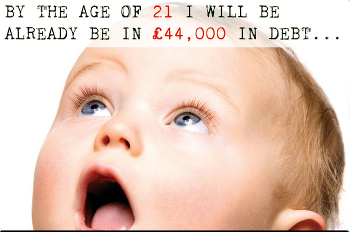
When I decided to experiment with text, I found an image of the internet of a baby and added the text. I wanted to use a young innocent baby to show the harsh reality they will have to receive when they grow up. I also continued to add red to important parts of the text relating to the issue. I highlighted in red the age and price, to make sure the viewer understands the point.
Final Outcomes:
Final Outcomes:
|

|
To refine my work further, I added text to the image quoting how young people from poorer backgrounds are less likely to go to university due to the increase of fees. This is to highlight the lack of opportunity and privilege people are not experiencing due to the government increasing the funds. This causes a clear division in classes and having a decent education. Lack of decent education means that they are less likely to leave the cycle of poverty.
Inside/Out - Ethics Photography
|
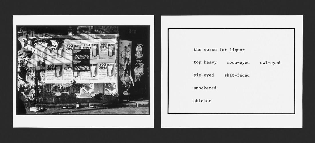
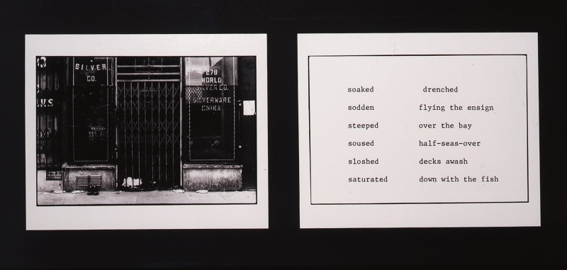
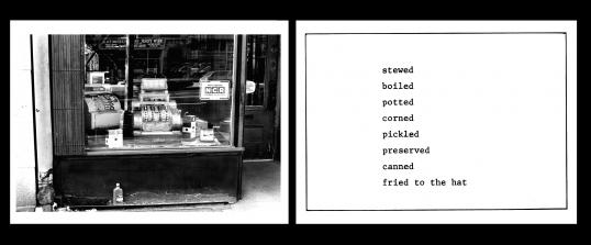
Martha Rosler
The Bowery in two inadequate descriptive systems 1974-5 Roslers project was based on the different concerns of political documentary and not exploiting people. Her work involved 21 black and white images reflecting east side New York City. On the blank canvases next to her images, she added synonym text of "drunk". This photo-text project was a way of Rosler finding a loophole and alternative of capturing drunkard people in New York without taking photos of them and exploiting them. This technique is iconic as it opened a pathway for photographers to capture political images and make awareness of a situation without taking pictures of people suffering. |
|
HOMELESSNESS - final piece theme
Homelessness is clear issue in the UK. There is an abundance of people who are homeless and there are many reasons why this is occurring including the housing crisis and an increase in unemployment.
Homelessness is clear issue in the UK. There is an abundance of people who are homeless and there are many reasons why this is occurring including the housing crisis and an increase in unemployment.
CRISIS CAMPAIGN:
|
The photographers for the crisis campaign have a very hands on approach when taking photos. They take photographers of the harsh environments that homeless people in UK live in and adds text with questions which are aimed at the audience. Rhetorical questions regarding being homeless, tackling peoples morals and feelings. I have learnt from this campaign how there are many alternatives of capturing the harsh reality of homeless people without taking pictures of a homeless person. This reduces exploitation.
|
|
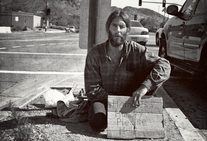
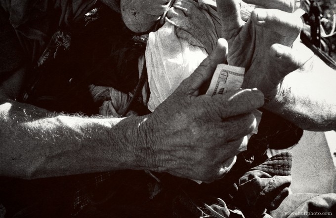
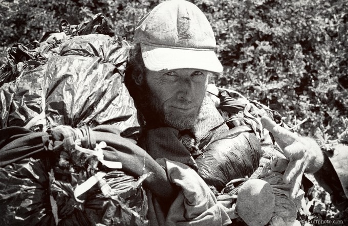
My Homeless Project - STEVE HUFF
|
|
This homeless project was created from Huff taking photos of homeless women and men he would encounter on his way home. To avoid the usual exploitation of taking pictures of homeless people, he went by it in a respectful way by giving them food, water and company. Without the actual intentions of taking photos of them, they began to open up to him and become more comfortable with his presence and they later on allowed him to take their photos. Huff used a film camera to take their photos, which created a complex, textured grainy effect to his photographs. The film camera added character to photograph and helped emphasise the subjects skin and clothes. Their clothes are clearly old and of poor quality material and the grain from the film camera complimented the different textures involved.
|
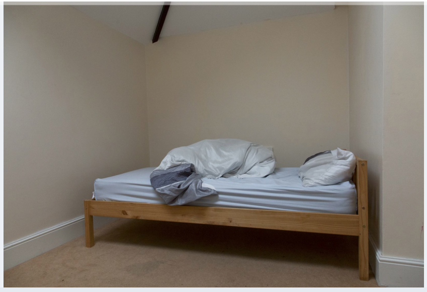
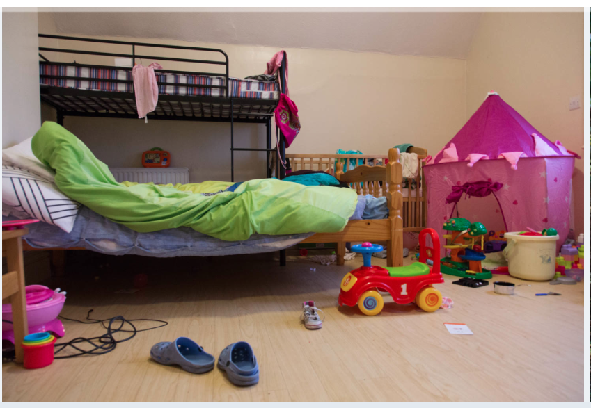
Multistory.org.uk - room of their own - Susan Meiselas
|
|
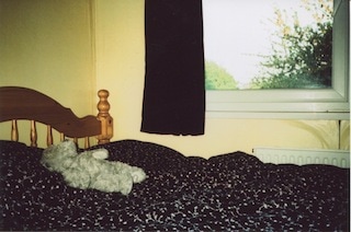
These images are of women refugees bedroom in their shelter. Meislas agreed with them to not photograph their faces to keep their identifications private to avoid people from their original country finding them and putting them in danger. The women shared their stories which involved much abuse and different unfortunate experiences. Meislas technique of of creating awareness of what these women went or or going through without exposing or exploiting them is quite significant. Taking pictures of their personal environment which could easily represent their mood, emotions and personality. Some bedrooms only include 1 bed with minimal items showing women who escaped their country alone with none of their belongings. Other bedrooms showed multiple beds and toys showing single mothers leaving with their children.
|
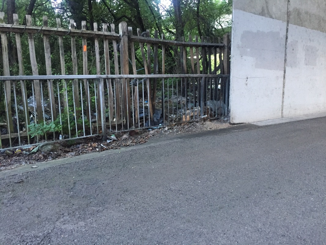
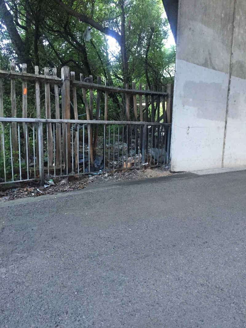
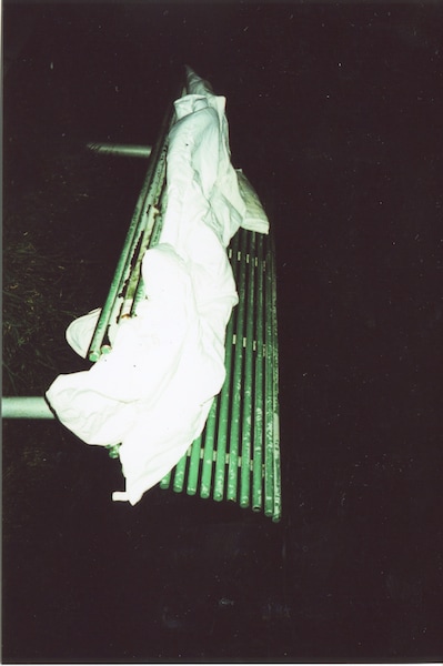
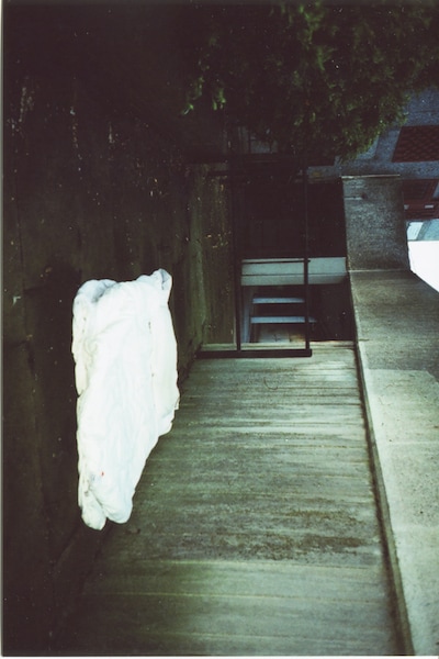
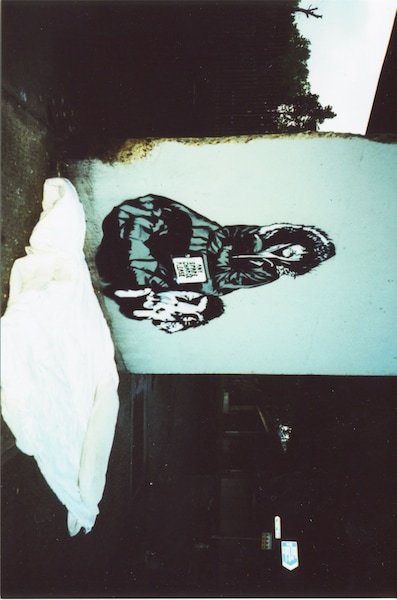
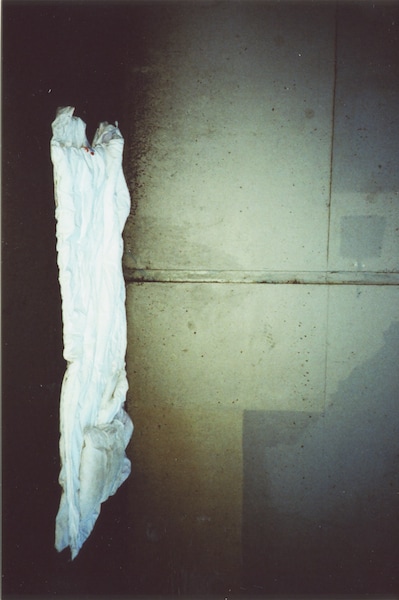
set 1:
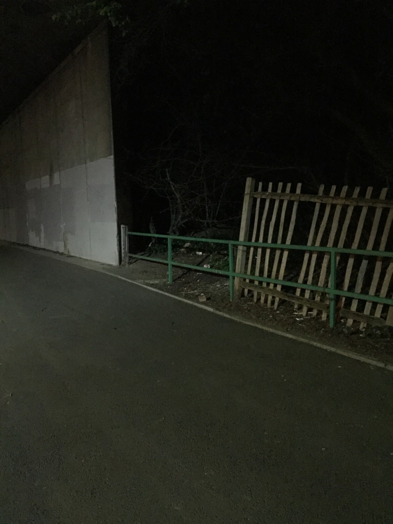
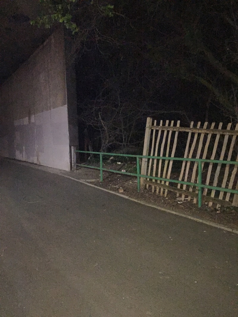
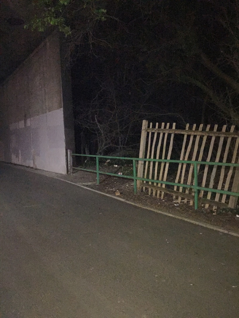
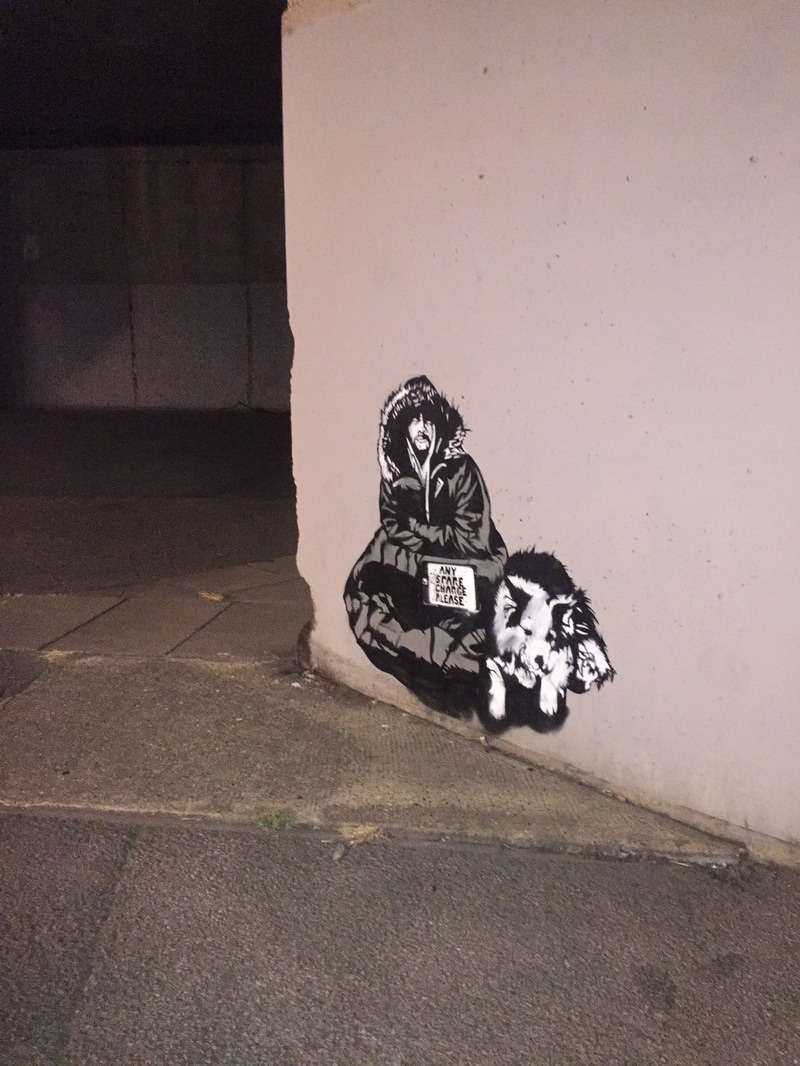
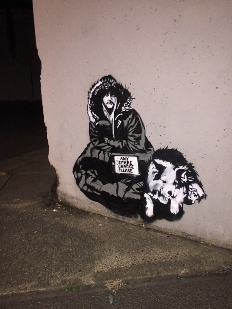
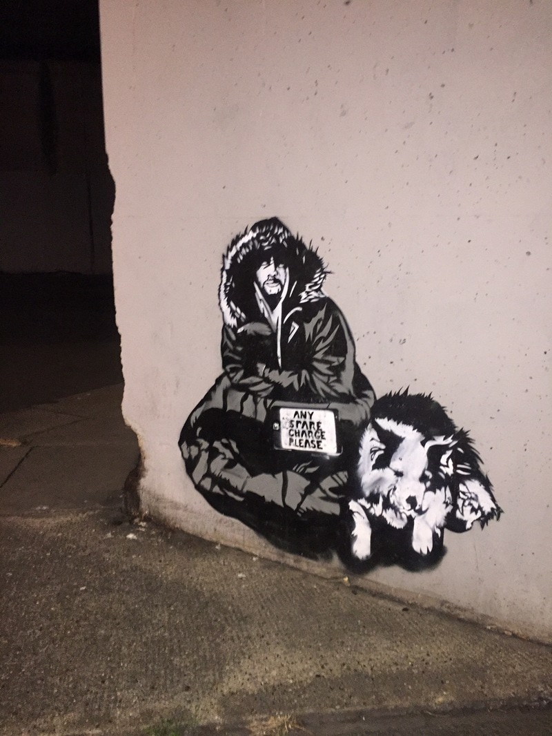
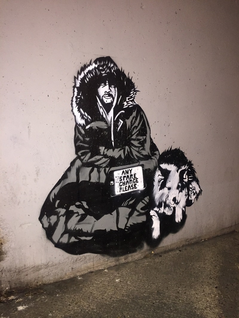
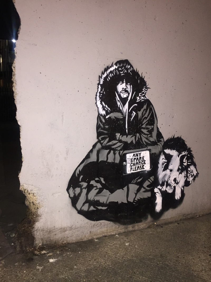
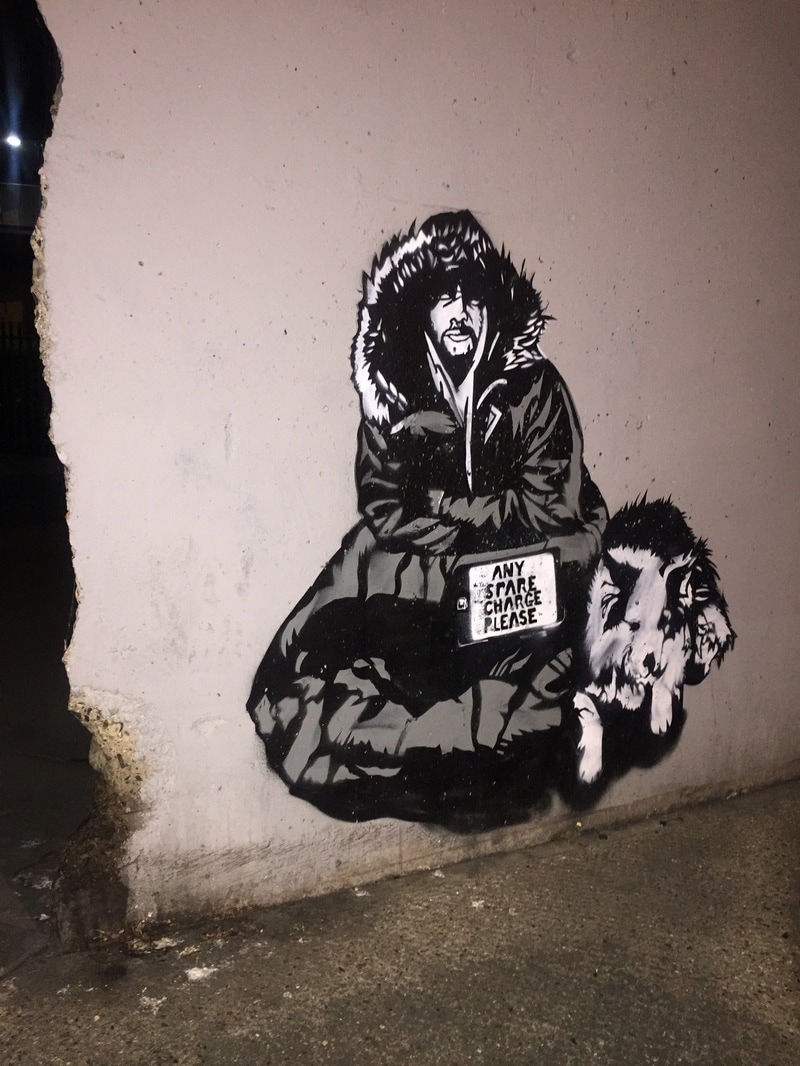
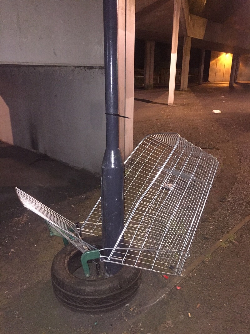
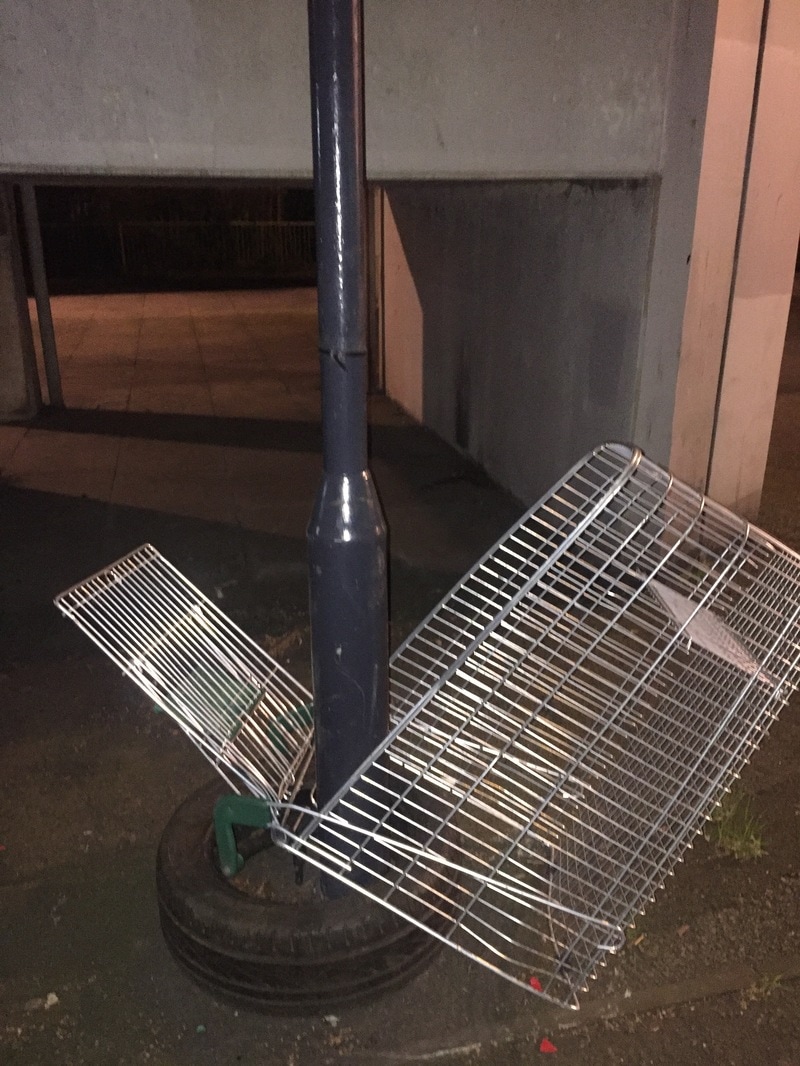
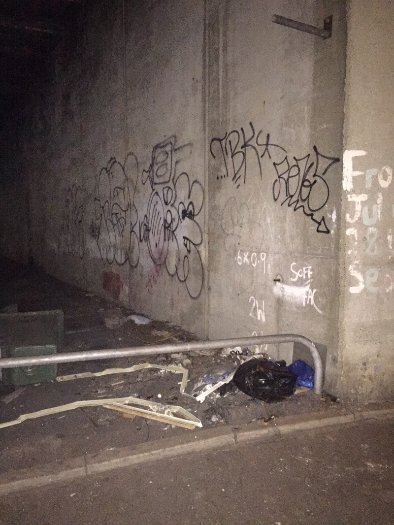
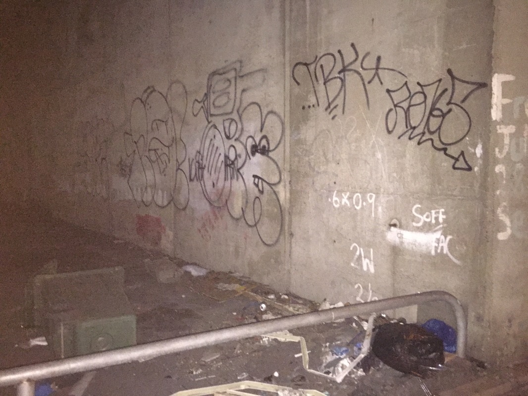
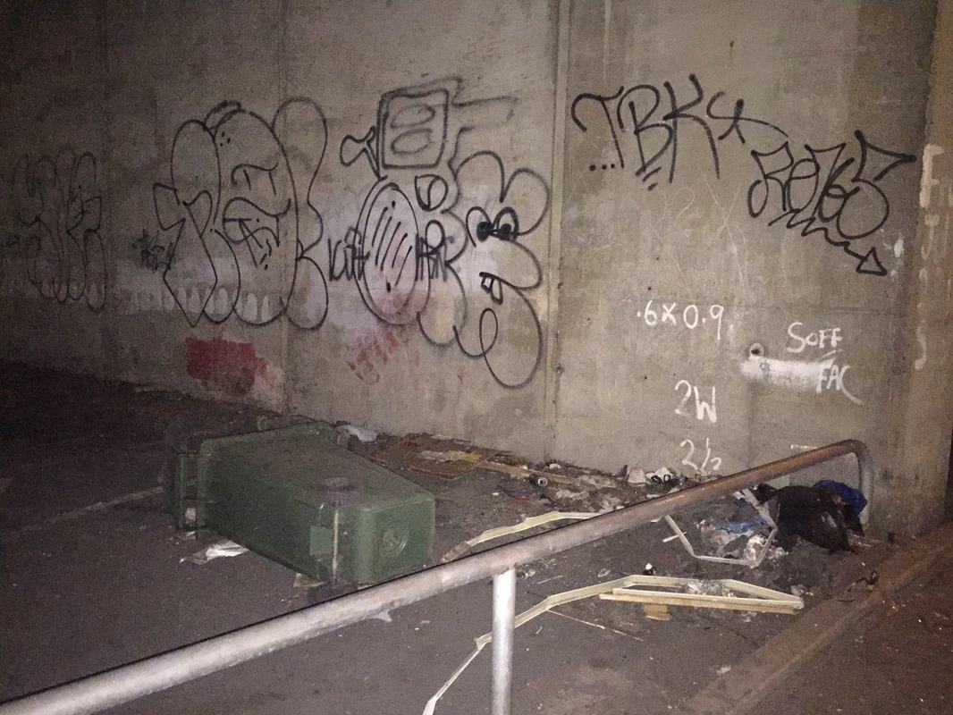
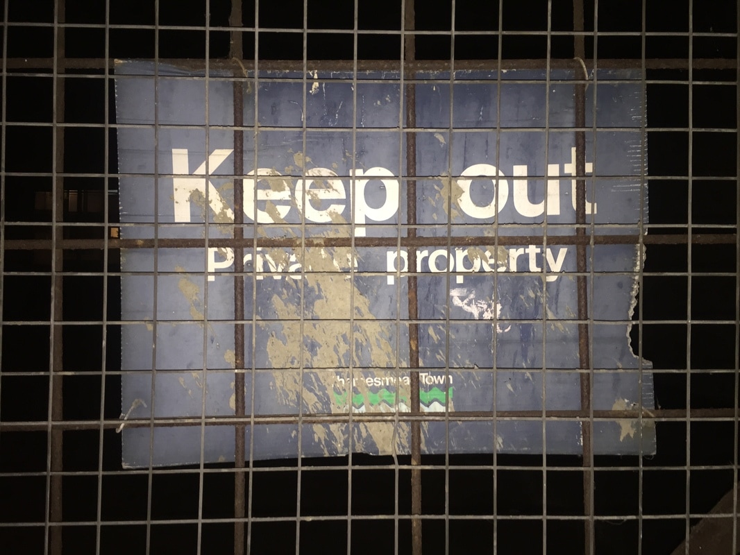
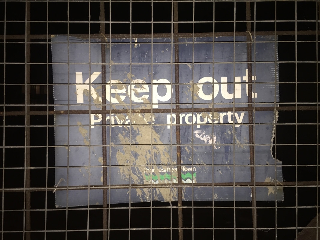
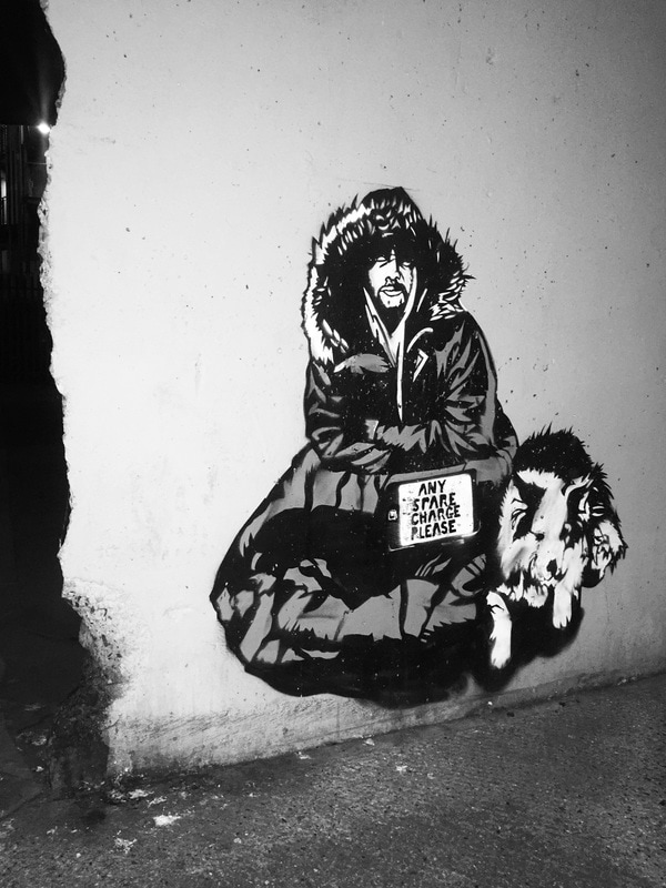
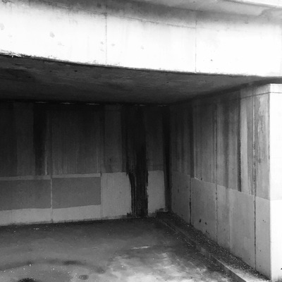
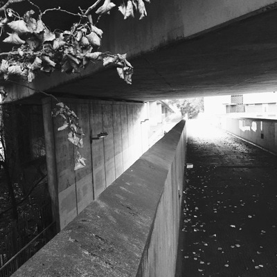
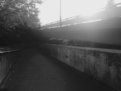
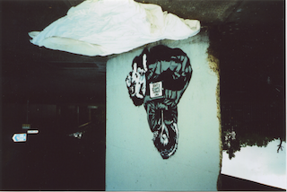
These set of images were taken near my area and I focused on taking images of homeless peoples environment and their living conditions. I captured really displeasing areas to show that this is where people are staying. I didn't want to take pictures of actual homeless people because i find it disrespectful exploiting someone else's suffering and vulnerability. Finding street art which had images of a homeless person was more pleasing to me, as I am not physically and literally capturing someones venerability but the message is still perceived through the image and street art. I took pictures of displeasing areas to show where homeless people live.
refined images:
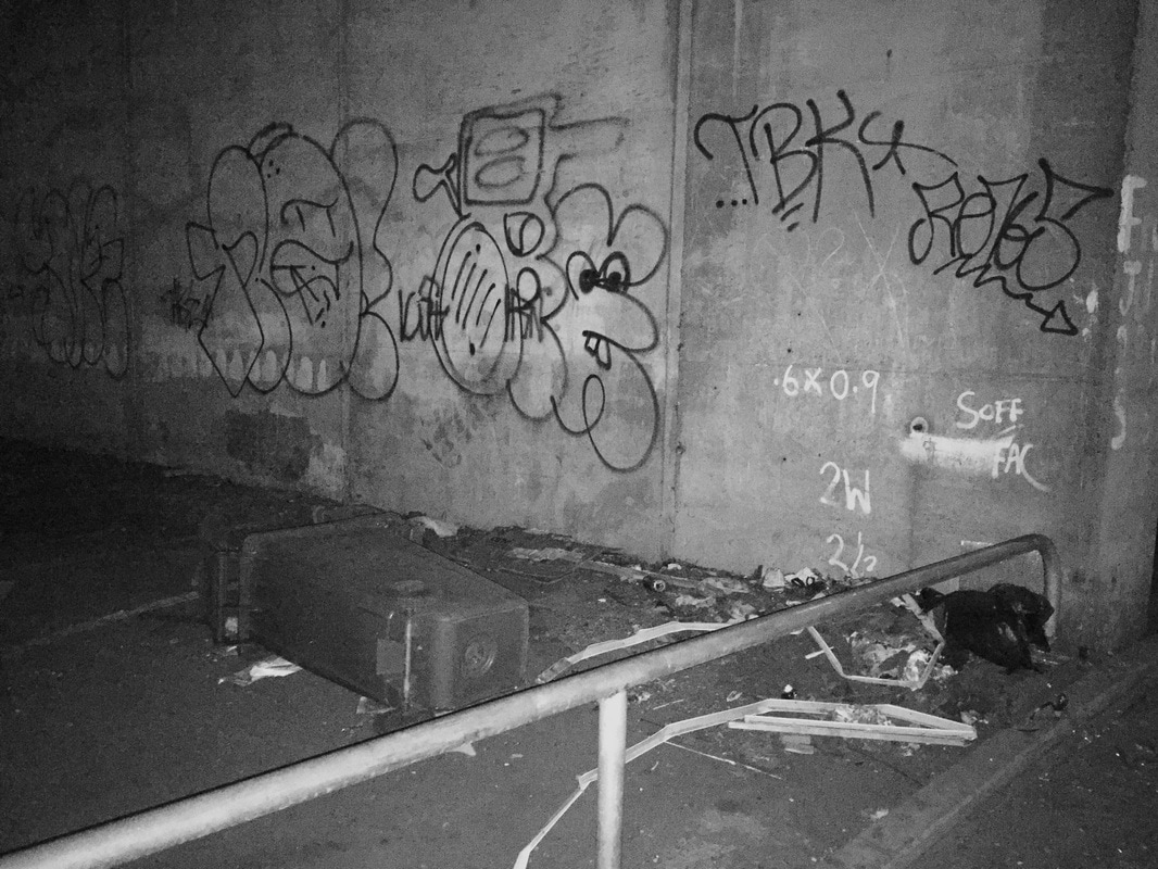
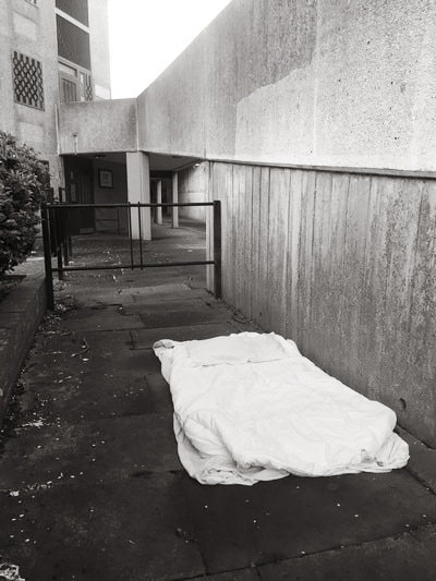
I turned all of these images into black and white to create a melancholy emotion. Also black and white represents the harsh black and white reality of living. It also removes and reduces any distractions which aren't related to theme of homelessness.
set 2

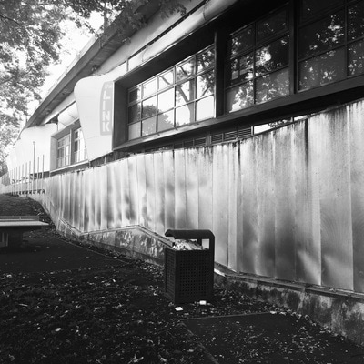
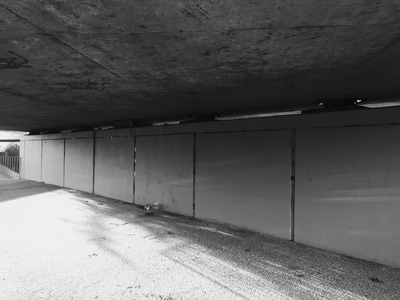
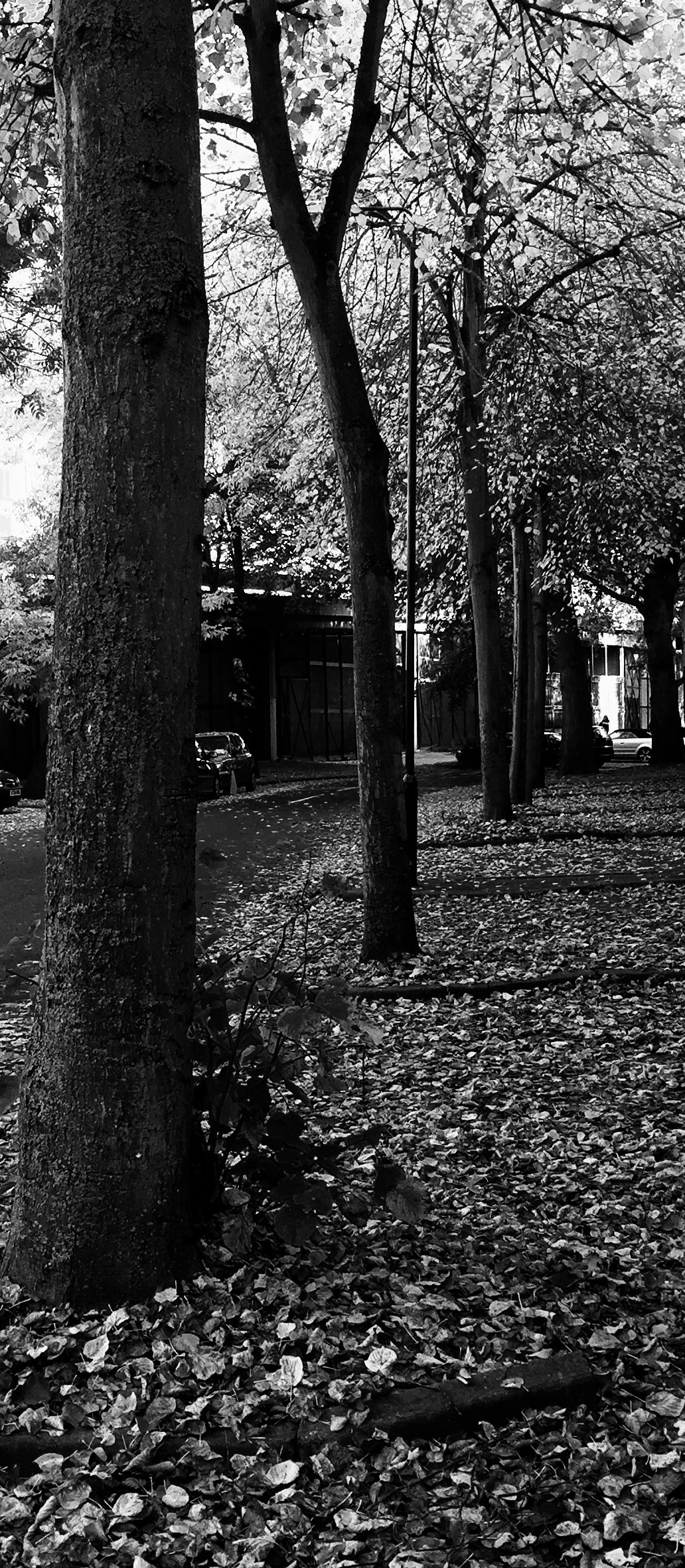
I found grimy areas near my house and photographed them. I further edited them in black and white to create a sad atmosphere.
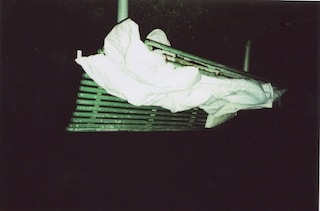
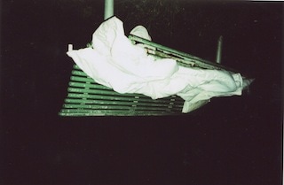
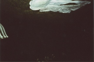
set 3:
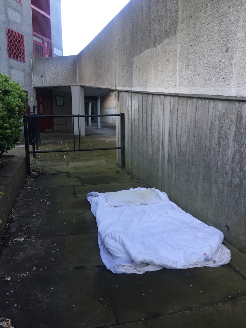
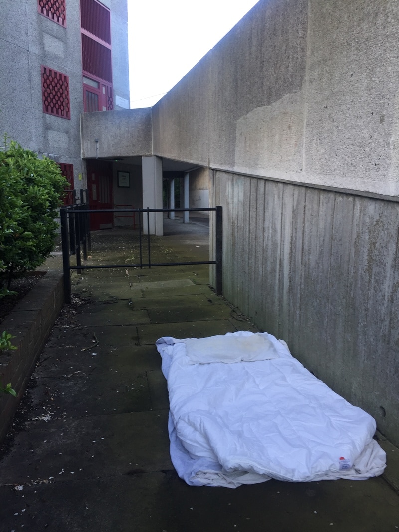
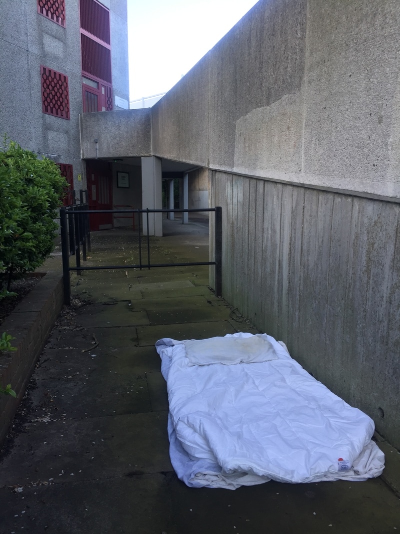
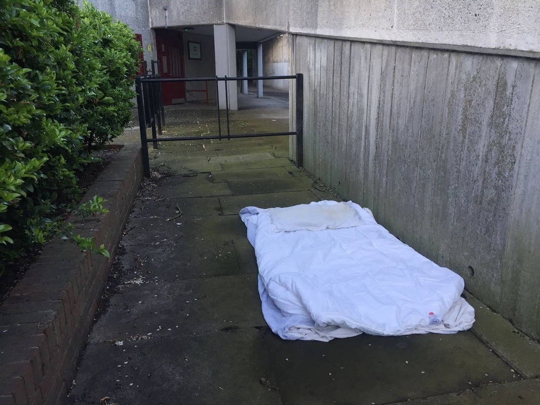
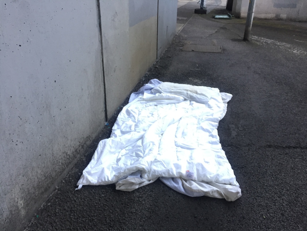
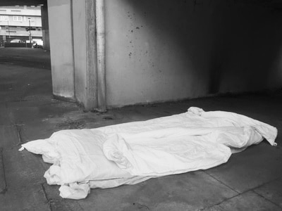
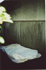
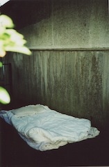
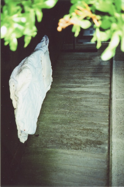
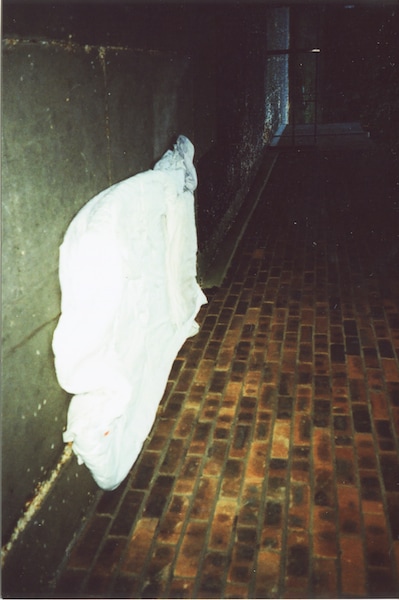
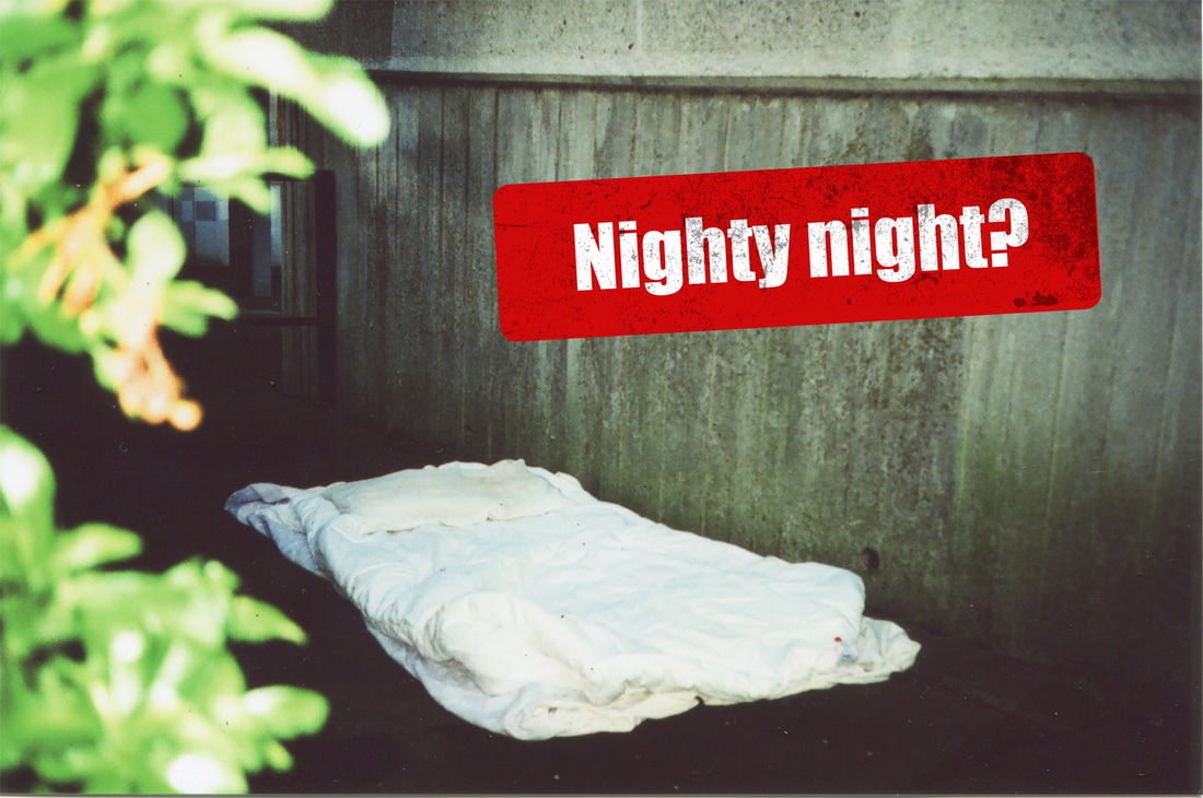
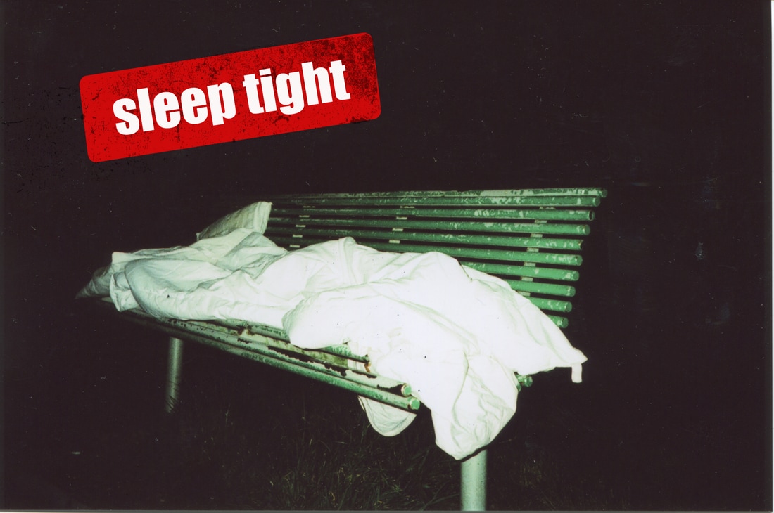
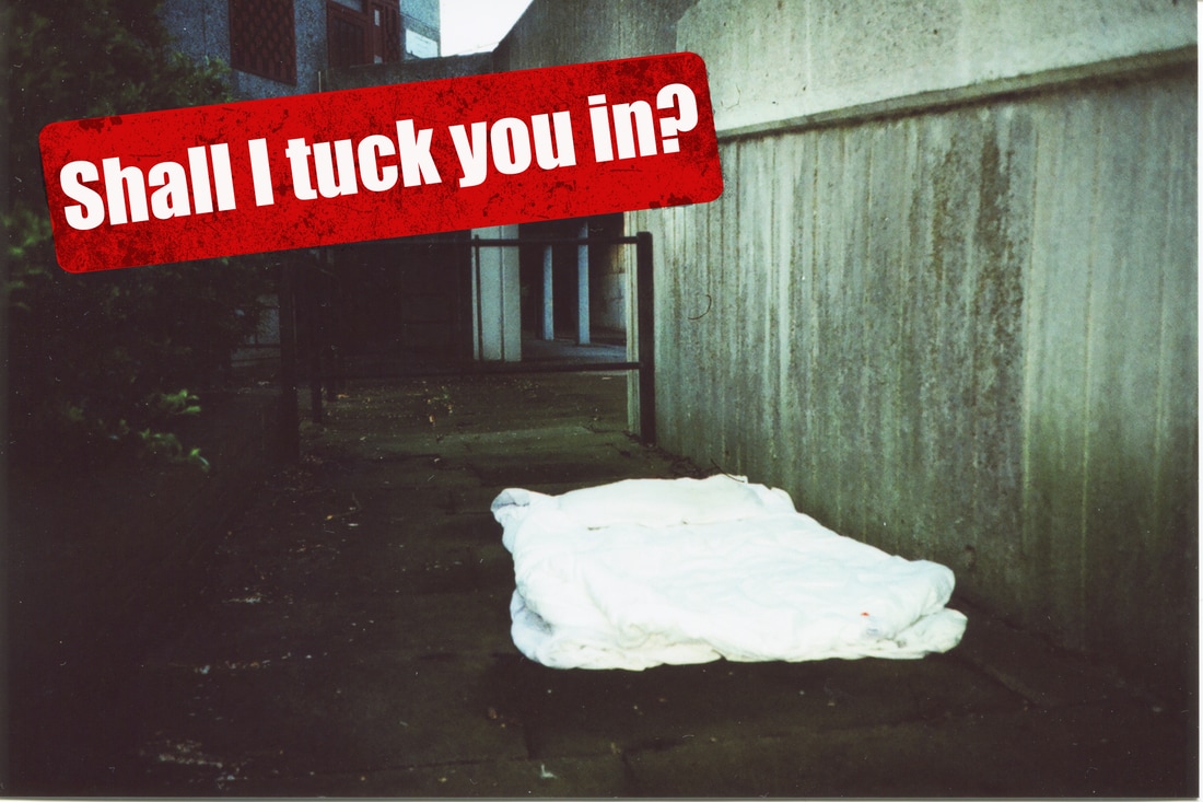
I went to similar areas that I had previously went to take the first set of photos but I adapted the scene by adding a duvet and pillow to symbolise a homeless person. This is similar technique to Martha Rolser by photographing the environment and using words to describe the subject, whereas I used bedding to become almost a physical synonym for a homeless person.
refined images:

set 4:
Previously taken images related to the topic of outside environment. I turned them all into black and white images with high contrast to create a melancholy aspect to the photographs. This represents the mood, emotions and characteristics of homeless people.
Adding text experiment:
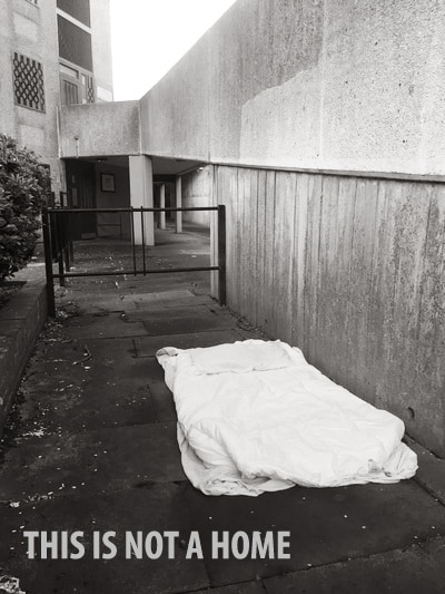
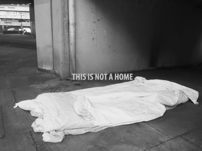
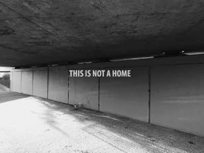
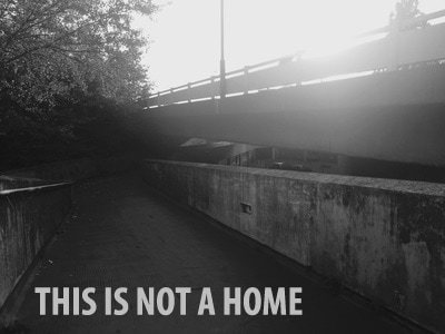
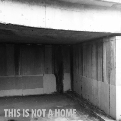
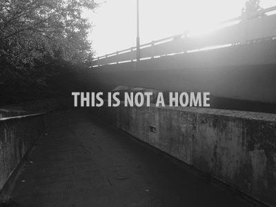
While carrying on with the theme of text, I added the quote "THIS IS NOT A HOME" to all edited six images to highlight the melancholy reality of homeless people and how this should not be what they have to go through. This quote is short and simple and significantly represents the issue of "homelessness".
set 5:
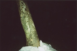
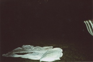
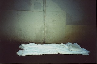
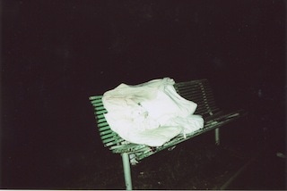
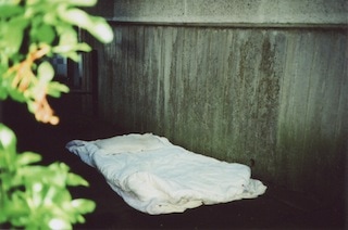
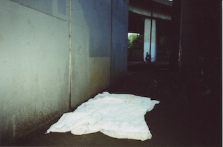
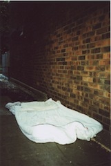
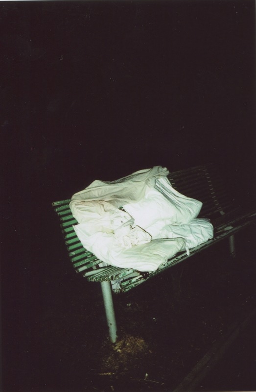
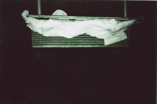
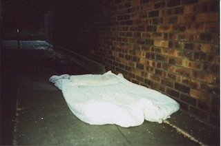
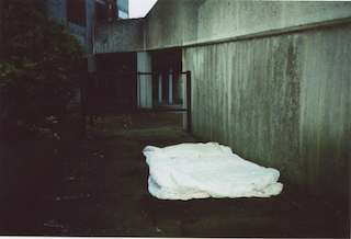
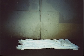
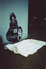

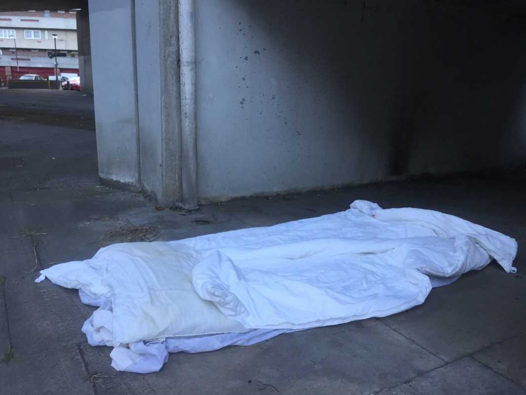
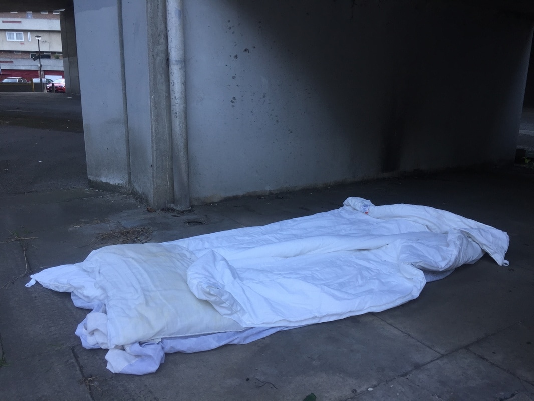
These images were all taken on a film camera and I took images of places outside with a duvet and pillows to be a personification of a homeless person. The film camera added grittiness to the images, without being further edited on Photoshop. These set of images are intended to stay in colour as it will show extensive texture of the floor, ground and environment.
Decision making:
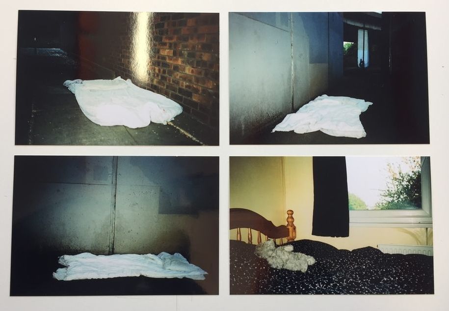
After long and careful deliberation, I decided to use these 6 images for my final piece. Out of all of the images I had taken, these images seem to highlight homelessness.
FINAL OUTCOME:
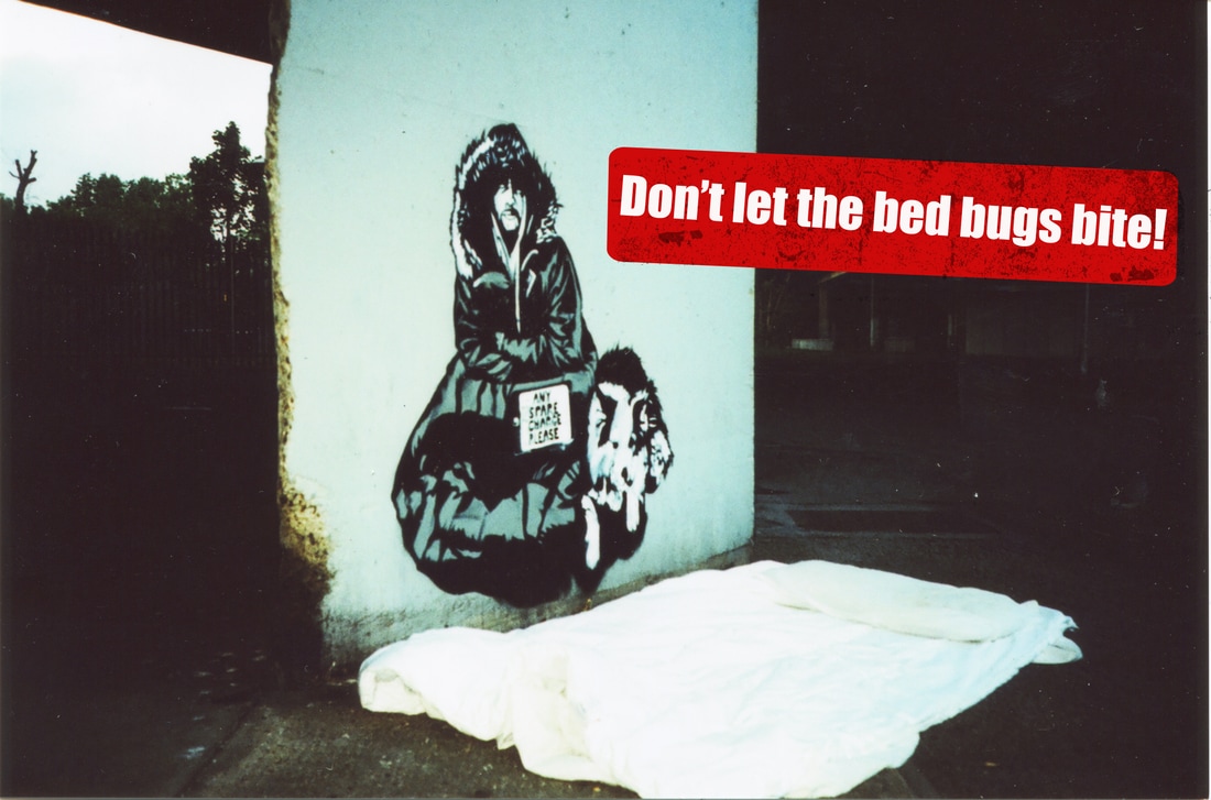
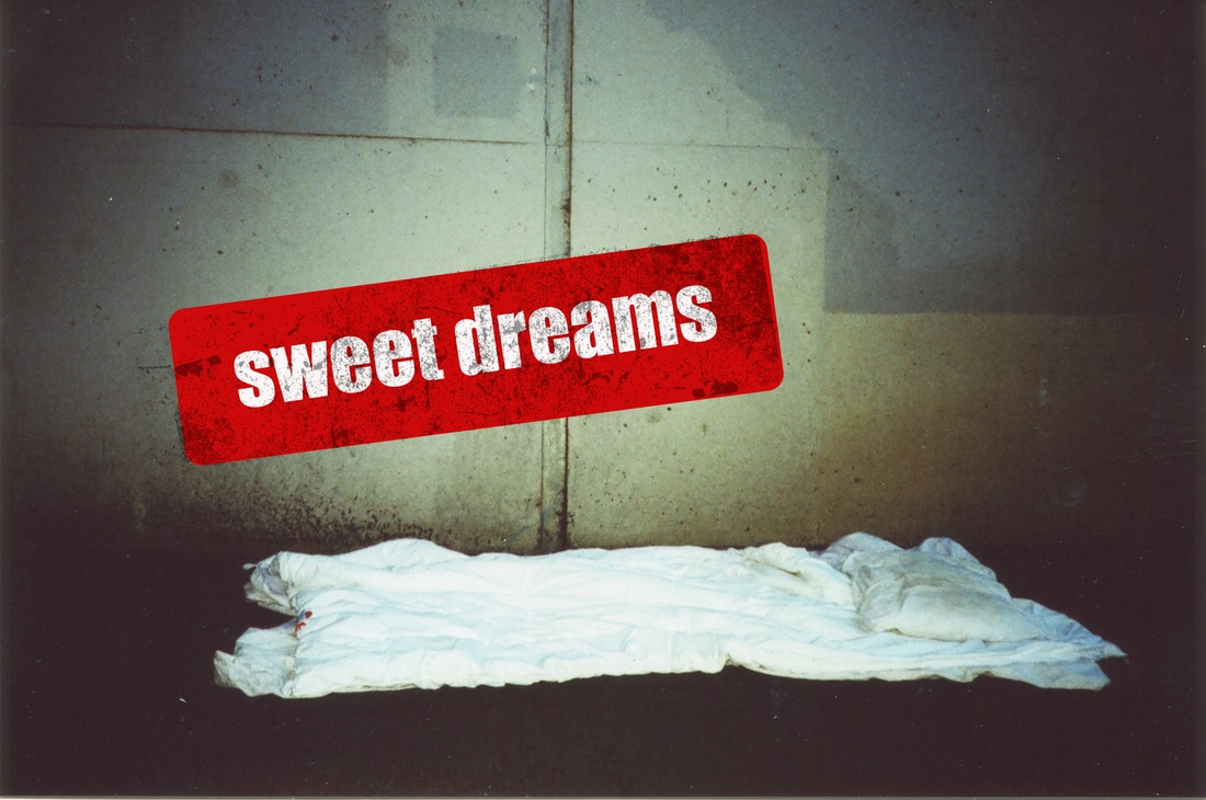
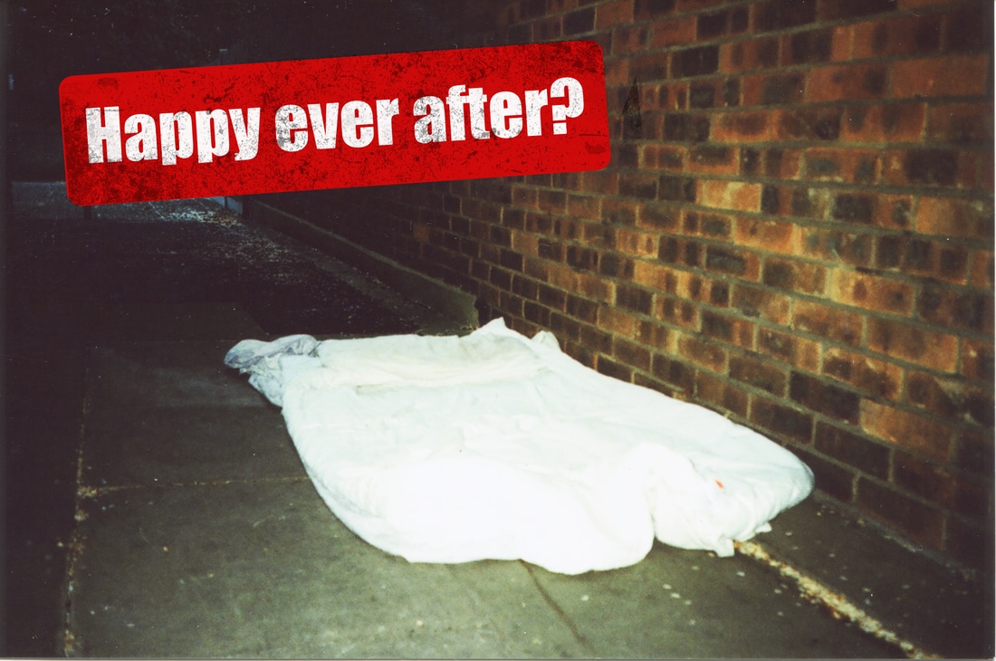
For this project I chose campaigning photography for my exam. I chose this for my exam because I am highly interested in the theory of photography and how it can easily manipulate the human mind into believing that something is there when it is not. This relates to how hard it is to differentiate from the sign and symbol. For this project I began to study and research different campaigns regarding Brexit. This was done because it is something that I have constantly seen in the media since the referendum and the campaigning that took place for the referendum was highly influential. I discovered the leave campaigns most prominent piece of work during the campaign which is believe to be the reason why they gained so many supporters. This piece of photography was created to believe that an extremely long line of immigrants are waiting at the borders to enter the EU. Creating a piece of dominant photography, fabricated many lies on the amount of immigrants entering the Britain. The main threshold concept that relates to my theme and exam question was threshold concept 9, as it reflects on how deceptive photography can be. This then grants the photography power and he/she can use the power to their own advantage. My initial theme for my final piece was going to be politically influenced, especially regarding American politics and their presidency. After much research with many artists, I then decided that I was going to have a final piece that is a concerning issue near where I live. The housing crisis is effecting millions of people every single day and living in a densely populated city, it is extremely difficult to avoid the site of homeless people every day. The living conditions are unacceptable for a someone to live in and I believe this issued is not receiving as much news coverage due to the media focusing on less important news for their own comfort.
I used to different media formats which were film and digital. I used both cameras and photographed the same area so experiment on the aesthetics of the photography. Firstly with digital, I changed the colour to black and white to create a downhearted atmosphere to the photography to represent the mood of a homeless person. I decided to experiment with film camera due to researching the photograph Steve Huff, who's homeless project was entirely taken on film camera. With the film photographs. I neglected changing the colour purposely as the mood was already reflected through the graininess and texture created onto the film photograph. To be able to express my ideas, I decided that film camera was the best option. Changing my media format was a way of refining my work, as I took images of the same place. I also further refined my work by taking the photographs in the same place at different times of the day. Taking images at night showed the harsh reality and cold wet weather homeless people face on a daily basis. Regarding adding text to my images, I had to different styles I experimented with. For one outcome, I used the same simple text "this is not a home". This was put on the photography to simply express onto the audience that these are not living conditions for a human. It was short and simple, and also got the point of the theme. The other style of text I went for, reflected more of a campaign poster. This text had a textured and distressed stamp on different parts of the photograph highlighting ironic captions said to little children before they go to sleep. This style for my captions on the photographs were used to express the satirical truth of people living in these areas. I used red to be the colour of the stamp and the emotions behind the colour red relates with anger, war, danger and also power. Red is a really intense colour and has high visibility as it is used in many signs such as stop signs and fire equipment. Using this colour made the captions stand out and also relates to making the topic of homelessness stand out in the news and media, as a topic that needs to be talked about more often. By using captions such as "don't let the bed bugs bite" and "nighty night?" creates a sense sorrow and helplessness from a homeless person. Choosing my final 6 images was the most difficult task for my final outcome. This was because, finding a the suitable images to highlight homelessness without an actual subject being there to avoid exploitation of them is complex.
After deliberating I chose my final 6 images, these captured homelessness in the eyes of someone almost invading a homeless persons space and discovering a new and unfortunate reality. I was hoping to create a range of images that when looked at immediately display my theme. With the short sarcastic indirect captions added these images, I was able to accomplish my aim. I believe I successfully explored my theme as when looking at those 6 images, despondent emotions are released. As my project is based on a campaigning photography, I decided I want to create A3 posters of all 6 images and they are all lined up against each other. I went for a simple approach to how I wanted these to be mounted and displayed because the theme and messaged from these photographs are already displayed in the image. Further altering of the simplicity distracts the viewer from the political message I am trying to capture.
