C A M E R A - L E S S PHOTOGRAPHY
Photograms
|
What is a photogram?
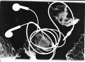
A photogram is a picture produced with photographic materials, such as light sensitive paper, but without a camera. When an object, such as during our lesson we used watches, lanyards and earphones, touches the paper, it will block it from the light. Which then leaves a light or pale grey impression. As the light will be unable to get underneath the object, unless it is opaque, the surface will change into a different tone. If there is not protection whatsoever the paper will turn black. When working with photograms I realised that my background was black on all of the photograms, simply because there was no objecting protecting the paper. During the lesson we were able to go into a dark room and create some photograms. We were each given a single sheet of the light-sensitive paper. Then we were given a vast amount of objects to use to arrange how we wanted it to placed on the paper so we can create a photogram. I placed the objects how I wanted them to be arranged making sure the smooth and shiny side of the light sensitive paper was up, after this was done I exposed it to light for a 5 seconds. Once this was done I waited in line to the wet area. to put my paper in the chemicals. The first chemical was called the "developer" this hence the name, develops the image and allows the actual objects to be seen in this photogram. After 2 minutes of leaving the paper in the developer, I put the paper in the stop bath, to stop the developing process, after 1 minute I then put my photogram in the "fixer" chemical/stage. This allows the image stay put and not move. This will allow the photogram to actually stay and be an actual photographs. Once this was done, I rinsed my photogram in water for a while to remove the sticky residue that was left behind due to the chemicals used to process this photogram. |
Examples:
|
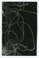
Man Ray
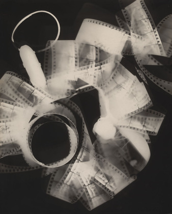
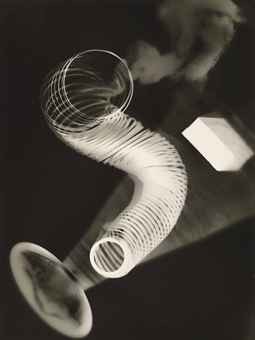
While making his photograms, man ray used many different types of objects. These objects are related to spirals and abstract objects that bend. Looking at man rays images, you can tell that he focused more on transparency and being able to see specific details of the objects. He used objects which are man made and also seem too be made out of mostly metals, such as the spring and jewellery. Man ray used common everyday objects but captured them in an abstract way to make the more unique and delightful.
Moholy Nagy
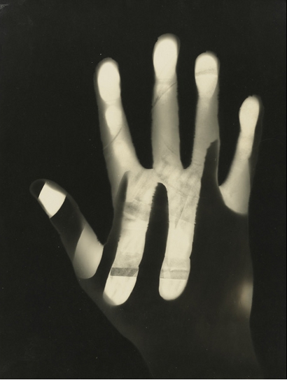
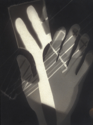
Moholy nagy seems to use more natural things in this photograms, body parts area common trend in what he uses to create such abstract shapes in this photograms. Where he uses hands, his aperture may have been lowered as it almost seems to be see through, allowing other objects and shapes to be seen. His backgrounds are seen more in his photograms, as the image is not busy and congested allowing the viewer to focus on one things while looking at his photograms.
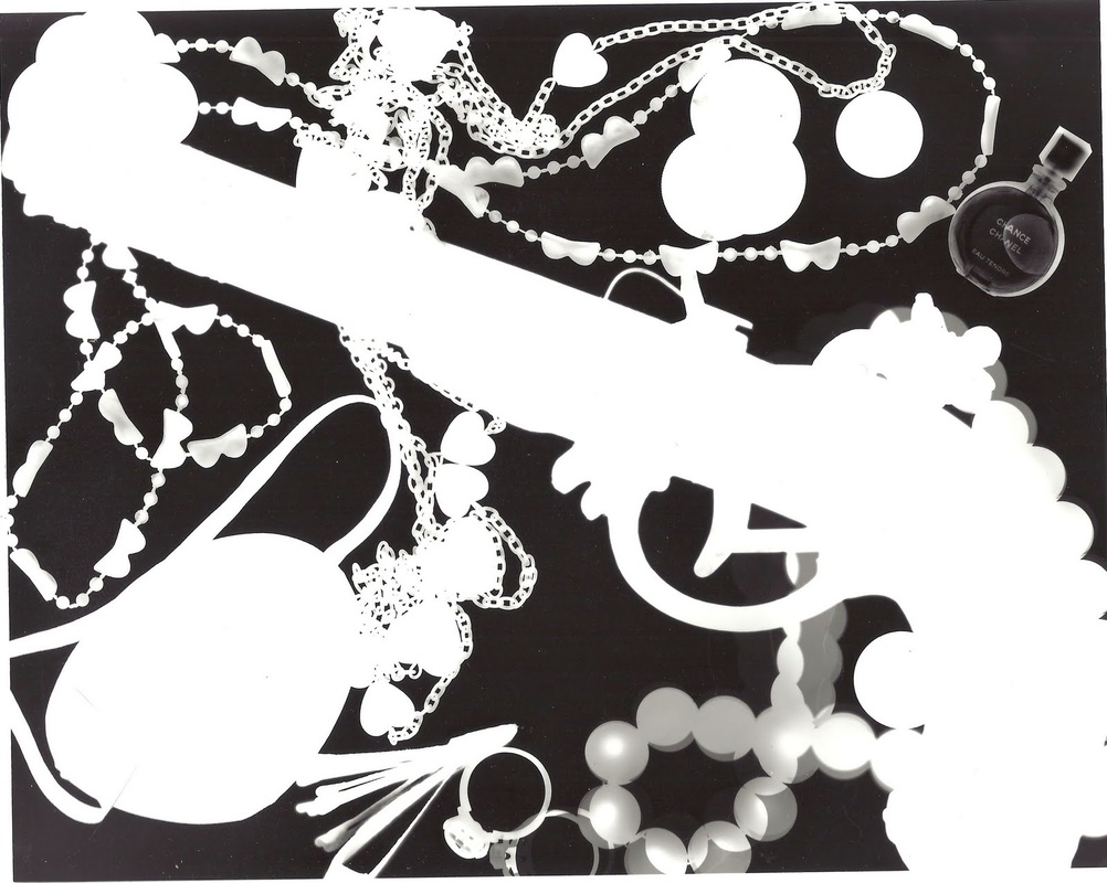
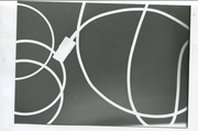
Abelarto Morell
This artist has used objects which are found normally around the house, especially kitchen. In the photogram you can see fruits and spoons which is were that idea came from. Morell seemed to place everything in a specific order, meaning every piece of object placed down and arranged has a purpose and meaning in this photogram, and they aren't exactly just throw there, even though it maybe not have been arranged neatly and perfectly it still seems to have some order. They have captured light in this photogram, very well because, certain objects light has been out through and able to seen. The amount of light in this photogram, allows the viewer to see specific detail and certain images and able to darker tones of objects to create more contrast again the background.
Experimenting:
|
Experimenting with objects:
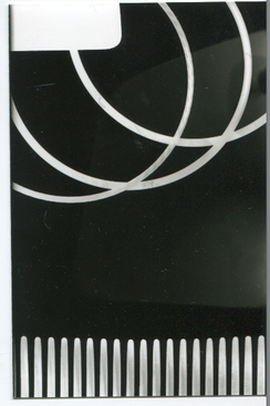
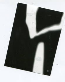
i wanted my photograms to focus on curved lines, this will help me understand how the light captures different parts of images even though they are not in the same straight line. This was the first time making my own photograms and i firstly wanted to focus on making the images stand out and the colour become bold. After this i wanted to experiment with how long i allowed the light sensitive paper to be exposed to light. Knowing this, i am able to decide if i want my photogram to be bold and bright or more dim. Leaving the paper to be exposed to more light made it more dim. |
|
|
Evaluation:
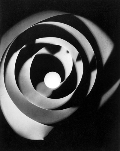
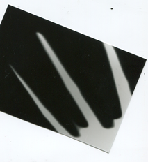
At first creating these photograms i was unable to understand how to manage the aperture and know how much light i will need to produce a good piece of work. I started by allowing the largest amount of light that could be added, and left my photogram sheet to be exposed for around 5 seconds. This made the objects stand out more and made the a lot brighter. I then used an almost clear piece of plastic and turned down the aperture, and left it on for around 5 seconds like before, unfortunately i moved the piece of plastic while leaving the light on. Even though this was a mistake, my photogram turned out very nice as it gave off a spiral effect, and my teacher was impressed of the outcome of my "mistake". |
|
|
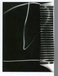
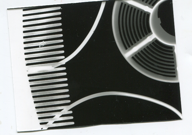
Evaluation (Curled Paper)
This photogram, was an experiment on how changing the amount of type the light sensitive paper is exposed to light and how much light will be produced through the enlarger. Changing these situations will determine how dark, light, clear etc the photogram will be. This photogram was exposed to light for around 4 seconds and the enlarger was at 16. I like the way the photogram turned out because the paper isn't washed out into the background as it is such lighter tone, this allows us to see it clearly. Even though I used the same type of paper in this photogram the both came out differently concerning their tones. The straight piece of paper on the left seems to be darker in tone with lighter tone streaks around the perimeter of the piece of paper. |
|
Chemigrams
|
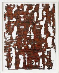
"Inventor" of chemigrams - Pierre Cordier
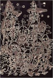
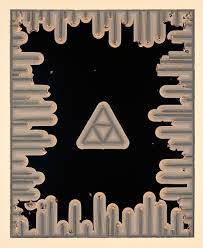
Pierre Cordier is a belgian artist who was born during in 1933 in Brussels. He is also known as the “father of chemigrams, relating to its artistic expression. Pierre discovered chemigrams in 1956, where he used nail polish on the photographic paper and then it was given to young German girl (Erika), writing a letter to her with nail polish on light sensitive paper and Cordier later went to call it a “chemigram”. The chemigram technique consists of combining painting equipment such as (varnish, wax and oil), and the chemistry part of photography (developer, fixer). What influenced him to call this technique “chemigram” simply for the fact that he wasn’t using a camera. (2nd image) In this image, i can see different lengths and thicknesses of pale line all close together and also a triangle right in the middle with 4 smaller triangles purposely placed and positioned specifically so they fit together to make that larger triangle. I would describe this a image as very geometric as there are many shapes positioned in a specific way. This image is very hard to describe, as it is very abstract but simple as there is only one main colour throughout the who chemigram. I feel like the subject of this image is to be unrealistic, and also maybe ancient Egyptian themed, due to the triangle and the pale/golden colour. Relating to the formal elements of photography there is lot of line around the perimeter of the photograph, not all are the same length, this was maybe to show different types of dimensions and to not make the image as simple and one minded. In the lines there are darker tones in the middle and gradually have a tonal change as it expands to the rest, which relates to how Cordier didn't want his chemigram to be as simple as it would seem to be like. The chemigram is very different to real life, because as a viewer, it hard to see what it is |
|
|
Evaluation on first set of chemigrams:
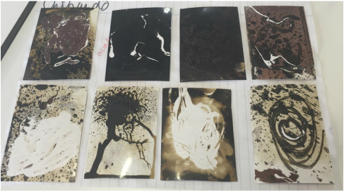
In the lesson we created chemigrams using chemicals that have been brought of from and experimented with them also using different types of lighting such as low light and natural daylight. When making these chemigrams, i first experimented with 2 pieces of light sensitive paper, so that i knew how the chemicals turned out and looked. I enjoyed the outcome of using flash bleach as it came out black and because it is liquid, it falls down and creates a type of running down effect and in one of my chemigrams, it turned out to look like a tree and it really like the way it came out. After leaving my chemigrams for 2 days the colour of them change to around a darker purple./ burgundy colour. These colour changes were a result of my chemigrams not being put in the developer, half of my chemigrams were put in the developer and the other half weren't and by doing this could compare them and see the difference. I also did the same with day light and low light in the class room. Allowing day light to expose on my chemigrams made the background lighter, while low day light made them black. The main chemicals that i used during the making of my chemigrams was flash bleach, white spirit, lotion and carpet cleaner. The best chemicals in my personal opinion would be the flash bleach and the white spirit. White spirit and a black background makes it look like a starry night and gives it a glowing effect which works well with the flash bleach. When creating my chemigrams, I didn't want them to develop for a long time, because I noticed that the colour of the chemigrams began to darken and loose majority of its definition and become monotone, I didn't want this so I left my chemigrams to develop for around 10-15 seconds. I decided not to fix all of my chemigrams, simply because I wanted to see how the colour would change after a while. Doing this I was really impressed with the outcome of some of my chemigrams, they went a beige and purple colour and doing this again, I now know which chemigrams I would like to fix and not, so that the effect would come out on a specific chemigram with a specific theme. |
|
|
Artist Research:
Marco Breuer is a German photographer is who is mostly known for his camera less photography work. He uses many types of materials and techniques to achieve beautiful pieces of work. These include burning, scratching and folding. Marco embeds a story into his pieces of work and majority of the time his theme is almost horror and almost science fiction with a whole universe impact. There are many views on what photography actually is but in my own opinion i believe that Marcos work is photography simply because he's expressing different themes in an image. All of his photographs seem to have a story. Most people may argue that this is not photographer due to the fact that they were not taken with an actual camera but in my own opinion using light to form an image with or without a camera is still photography. Marco breuer created his images without a camera and used light sensitive paper (how do they create images with/without a camera) (what materials do they use) |
|
Negative Prints
Homemade negative and prints:
I made three set of homemade negative slides using acetate and other ingredients and equipment to achieve this. I used salt, Vaseline and ink to produce these slides. While making these slides, I found out that I enjoyed the texture the salt created and made almost and micro mineral theme. While doing this activity I found it easy to create. I was really impressed on how fast and easy it was to create the slides. The only "difficult" thing during the process, was cutting the acetate and making fit into the slides as the had to the right size other wise the acetate will fall out and all of the work put into making the slide will be wasted. After making the slides, we went into the dark room and used the enlarger to make photograms with light sensitive paper with the negative slides. I placed my slide into
I made three set of homemade negative slides using acetate and other ingredients and equipment to achieve this. I used salt, Vaseline and ink to produce these slides. While making these slides, I found out that I enjoyed the texture the salt created and made almost and micro mineral theme. While doing this activity I found it easy to create. I was really impressed on how fast and easy it was to create the slides. The only "difficult" thing during the process, was cutting the acetate and making fit into the slides as the had to the right size other wise the acetate will fall out and all of the work put into making the slide will be wasted. After making the slides, we went into the dark room and used the enlarger to make photograms with light sensitive paper with the negative slides. I placed my slide into
Documentation of findings for prints:
When creating prints for my homemade negative slides, i found that making the f stop around 5.6 and exposing the paper for around 3 seconds, made the different types of textures and tones from the negative slides. I wanted the texture from the salt and the scratches to be seen clearly on the print. To get the different types of tones from the different colours of ink, i had to change the f stop meaning more light would be exposed for a shorter time. The reason why i experimented with the prints is to understand how long i should expose the prints to get texture or to get tone. I realised that to be able to get different elements the f stop needs to be different, that is why my prints seem to focus on different elements. The negative slide with salt and ink focuses more and texture and the scratches and different coloured inks focuses more on tone. Using this knowledge, i believe i am able to make different negative slides and make prints out of them.
Concerning the materiality with making the negative slides, it was very similar with making chemigrams due to the fact that i used salt and vaseline. I really enjoyed the effect of how salt turned out as it made the print look like micro zoomed piece of rock or another texture material. I noticed the longer i left the slide, it began to change especially concerning the ink as the colours mixed together and began to fade after some time. If i was to due to this process of making a handmade slide, i will make sure that i make the prints in the dark room immediately, so i get the specific and exact effect without it changing. Regarding salt and scratches, they didn't change but because they were used with ink, i will still make the prints immediately.
