FORMAL ELEMENTS
Timothy O'Sullivan
"Harvest of Death"
Gettysburg Pennsylvania
July, 1863
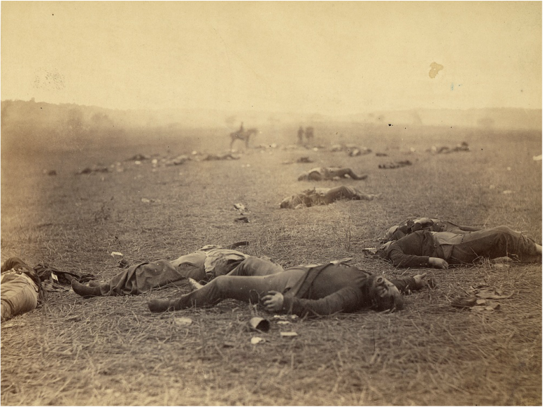
This photograph has been printed in "black and white", and also "sepia". from more research I had previously gathered. Both effects on the image, has given the whole setting of the photograph a dark and bleak feel. These effects were probably chosen to emphasise the fog in the atmosphere. The lack of different tones in the photograph reflects the bleak atmosphere. The tones seems more faded than tonal, creating a desolate and grim feel. This also reflects the dead soldiers laying on the ground. Lifeless. dark and empty. The lack of colour in the photograph tells the viewer that the meaning of the image should not be joyful and happy.
The genre of the image to be war, and the aftermath. From the photograph you can see corpses in their uniform. Which tells us they were soldiers who fought during the war and tragically died.. I also noticed in the image that they had no shoes on. With more research concerning the reason why they had no shoes. I found out that dead soldiers shoes were removed due to the lack of resources available during the war,
The scale of the image is very wide to exaggerate the amount of lives lost and forgotten during the war. Seeing vast amounts of dead corpses creates sympathy towards the viewer. At the far back of the image, men with horses can be seen. This may show how they are soldiers are neglected right after the war has dead.
Paul Outerbridge
"Triumph of the egg"
1932
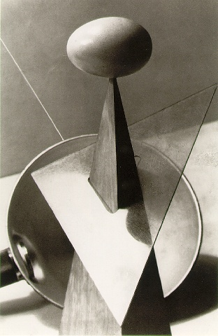
Paul Outerbridge edited this photo to be in "black and white" which enhances the different tones in the image. The filter used for the image allows certain objects in the photograph stand out more and make it almost 3d like in the image. The are many different ranges of tones in this image. Near the lower right hand side picture, it has to darkest tone of the whole image, this allows the there to be an illusion to image or the objects in the image to tilt, it seems to be tilting towards the viewer. There are many abstract and unique shapes in this image. Such as triangles and circles. As said previously this gives the photograph an abstract look. There is not much colour in this image due to the fact that it has been edited to be in "black and white". The scale of this image is very small, which tells us the photographer wanted the viewer to mainly focus on the egg and the objects supporting it us. This maybe because the egg maybe significant and if other things will be in the image, it will distract the viewer from the main viewpoint that he wanted the image to focus on. Lines are very prominent in this image as it creates cuts in the image, sharp cuts allows different sections in the image to be seen clearer and made easier to understand. Without the lines in the image, most of the objects and the photograph will blend together and loose meaning.
Francesca Woodman
Francesca Woodman was an American photographer best known for her black and white pictures featuring herself and female models.
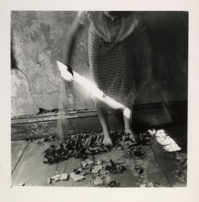
In this image, created by Francesca Woodman, it seems to be a self portrait. The light in the image seems to be coming opposite her, whether it is directly opposite her or diagonally from her. This is because the small light found in this image is straight across her legs. Francesca seems to be holding the light, due to the fact that her hands are clasped around the top of the light. As the light is diagonally across her legs, it seems to look like a blade or a sword and because her hand is clasped around the top of the light, its almost like Francesca is cutting herself. The light present in the image seems to natural light, as it seems to come from a window. The light is very prominent in the image due to the fact that the whole image is based around dark tones. Woodman probably intentionally created darker tones so that the light "blade" stands out, and is the main focus of the image.
There is a vast amount of texture in this image, laying on the floor, dried up leaves and pieces of brick are on the floor. By leaving these pieces of leaves and bricks on the floor during the image, Woodman probably wanted the whole theme and atmosphere of the photograph to be grim and imperfect. There's also texture on the walls that she is laying on. The walls seems to be broken, tattered and old, Which tells the viewer that it is fragile and delicate. Its not smooth, meaning there is a lot of different textures and feelings if you were to feel the wall. Francesca Woodman is shoeless, and her feet or on the dried up leaves, the leaves seems to burying her feel, and the darker tones of the image adds to the lack of us being able to see her left foot.
The sharp focus in the picture would have to be the blade of light, it pierces right through the image and his really hard to avoid, as the light has been exaggerated to be brighter than it actually is due to the darker tones in the rest of the photograph. Francesca Woodman has used selective focus as she has made the light very sharp and has blurred out majority of her upper half of her body so that the viewer mainly focuses on the sharp light against her legs.
The angel of view seems to be lower than Woodmans normal head height, because she is seen to be being her body over to look at the light, Her full body, if it was straight, would not be able to captured in this whole image, which tells us the the scale of the image is very close to Woodman and also is lower than her actual head height.
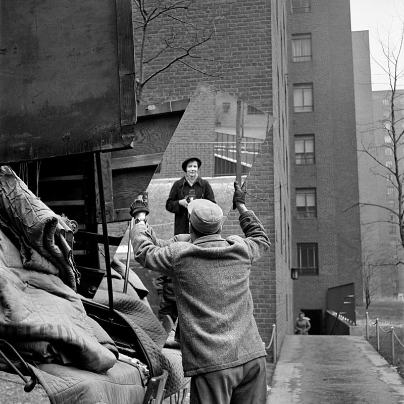
Vivian Maier
"Mirror Image"
Vivian Dorothy Maier was an American street photographer. Maier worked for about forty years as a nanny, mostly in Chicago's North Shore, pursuing photography during her spare time.
(Visual Elements)
As the photo has been captured in "black and white", light is not exactly prominent in the image. The light source that is used for the image would be natural light as the image is clearly seen to be taken outside. Vivian may have used flash from her camera because there seems to light coming out. The light source which is natural light seems to be just all over as there is no window to determine how much light will be perceived in the photograph. The light seems to be very soft, with no shadows.
Texture can be seen in this image from mattresses and other pieces of material on the side of the image. As it is material that is one of the main textures in this image, it won't be harsh or rough. There are some lighter and darker tones falling on the materials in the image which gives them more dimension and also makes them stand out more. A mirror can also be seen in this image which has a smooth surface but sharp edges, this could relate to someones inner being. They could look good and be smooth on the inside but maybe be sharp around the edges.
The main focus of this image would have to be the "working class" man holding the mirror in front of Vivian Maier. Reason why this would have to be the case because the mirror which has been cut through the image, is salient. Apart from the mirror including the man and the woman and the pile of material on the side, the other objects and the rest of the image are blurred out, which tells the viewer the Vivian wanted the main focus to be on her self and the man. This image could be argued as self portrait as she has taken part of a picture of herself in the mirror of which the man is holding. She could have also wanted the main focus to be herself. The mirror cutting through the image could represent how everyone is the same and we all reflect each other regardless of our status. There seems to be a lot of sharp detail in the image and a soft background, which allows us to unknowingly focus on what vivian wants us to focus on.
The angel of view of this image is mid way of her body as it can be easily seen in the mirror. She probably placed the camera so that she is able to capture her face. Vivian may have intact lowered the camera to seem higher than the man. May be showing the different levels in status through image.
Vivian has intentionally included her face is the image, this can be seen through the way that she has a little smirk in the image and she is directly looking the mirror at her self while taking the photo rather than looking else were such as the man infront of her. Even though she has included the housing in the background, she has blurred it out so that the main focus is her and then man with the mirror. By her keeping the buildings behind and blurring them she wanted the viewer to know what the environment was and also the atmosphere of the scenery.
There isn't colour in this image as it has been captured in black and white. This relates to how Vivian wanted minimum distraction, which may draw the viewers eye away from the main focus. Large amounts of colours can allow people to see irrelevant object unrelated to the meaning of the photo.
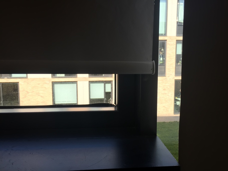
Photograph without a camera
In this visual photograph, the main light source is from the window, which is seen in the photograph. The direction of the natural light is coming directly in between the window sill and the curtain. This light can be seen in the image, as on the top left hand side of this image you can see the change in tone on the curtain. The direct top left of the curtain has the darkest tones, which tells us that, that part of the curtain has not been exposed to any type of light. Gradually the tones become lighter as the curtain gets closer to the window. Part of the curtain is exposed to light becomes there seems to be a gap between the two curtains, which can be seen in the image, and this allows part of the curtain to be exposed to light allowing a gradual tonal change. On the window sill, around the bottom left of the image, this part has also been exposed to light as there is a dramatic tone difference showing where the natural light from the window touches the window sill. This light that is in this photograph seems to diffused with soft and light shadows due to the fact that there is a lot of gradual tonal difference in this image from the natural light on the curtains and the window sill.
There aren’t that many objects in this photograph that show texture, the main texture throughout the whole photograph seems to be smooth and far from rough. The smooth and silky texture from the window sill and the curtain relate to diffusion of the soft and smooth shadows, making the image seem more gentle, soothing, uniform and tranquil. You can tell that the texture of the window sill is silky and smooth, as when the natural light from the window is placed on the window sill it reflects the light, and gives of a shiny effect and also reflects what is on the window sill, which is nothing.
Directly in the middle of the image is a gap of the window in between the curtains. This could be seen as the main focus due to the fact that there are darker tones from curtains which creates contrast and allows the viewer to mainly focus on the window as it is the most prominent part of the photograph. This could also be said as a sharp focus, due to the fact that it is very eye-catching and there is not gradual change to the window. The sharp and straight lines of the curtain creates a selective focus.
The angle of view of this image seems to be at eye-level if the viewer was to bend down or kneel down, so that they are level to window sill. It is directly in front of the window sill so that the main focus can be the curtains straight and sharp lines and also the window. The angel of view is to give a normal perspective of the window sill but zoomed in so that you can focus more on specific objects, because if the actual image was really spread out there would be a lot of distractions, which will move the viewer from the main focus.
Many things have been excluded from the frame of this image, for the simple fact that there can be one specific focus. Included in this image are parts of the sides of curtains around 2-3 inches, so the straight lines of the curtains can be seen to show the contrast in tone and focus. Objects that may have helped with the composition and framing of this image would have to be the window sill and the curtains. As they are darker in tones and straight lines, it naturally helps to create almost a square shape and also reduce the amount of distractions involved with the image.
The main colour in this image would be what can be barely seen in the image, such as the nude, beige colour of the building, the light green colour of the grass and also the dark brown or black frames of the windows on the other building. As majority of the image has very dark tones, this allows the viewer to mainly focus on the window and outside objects. Even though the curtains and the window sill of the image, they are darker to show contrast and allow more focus on the window.
Evaluation
The image above was taken by partner, using the description i wrote previously. The photography is almost to exactly the same to my description and how i imagined the photograph to be while writing the description. My partner included the different tones that i had previously mentioned "On the window sill, around the bottom left of the image, this part has also been exposed to light as there is a dramatic tone difference showing where the natural light from the window touches the window sill." This part of my description was caught perfectly because, the gradual tonal change can be seen in the bottom left hand side of the window sill and the top right hand corner of the curtain above the window. Lighting in this image seem to be brighter than how i imagined because, while writing up the description, the lights in the room were off, but while my partner took this picture the artificial lights from the fluorescent lights on the ceilings were on and may have altered the lighting a bit, but the overall view and shadows that i wanted and described had been captured perfectly.
The overall experience of writing this description without being able to actually take the photograph was very difficult, but i just stood in front of the image and visually captured the imaged in my mind. When i imagined the photograph, i made sure i knew what parts i wanted to include and how i wanted everything to be positioned. When this was done i made sure to include measurements, to make the description as accurate as possible. "Included in this image are parts of the sides of curtains around 2-3 inches, so the straight lines of the curtains can be seen to show the contrast in tone and focus."
The overall experience of writing this description without being able to actually take the photograph was very difficult, but i just stood in front of the image and visually captured the imaged in my mind. When i imagined the photograph, i made sure i knew what parts i wanted to include and how i wanted everything to be positioned. When this was done i made sure to include measurements, to make the description as accurate as possible. "Included in this image are parts of the sides of curtains around 2-3 inches, so the straight lines of the curtains can be seen to show the contrast in tone and focus."
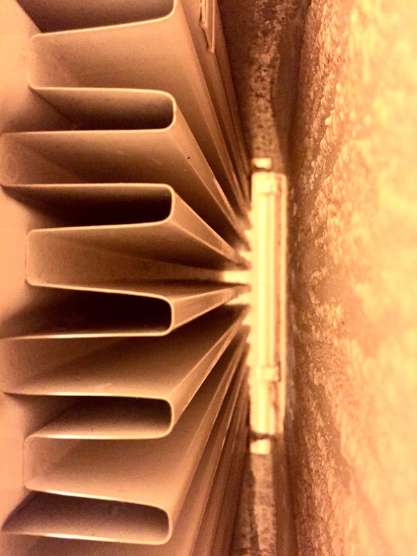
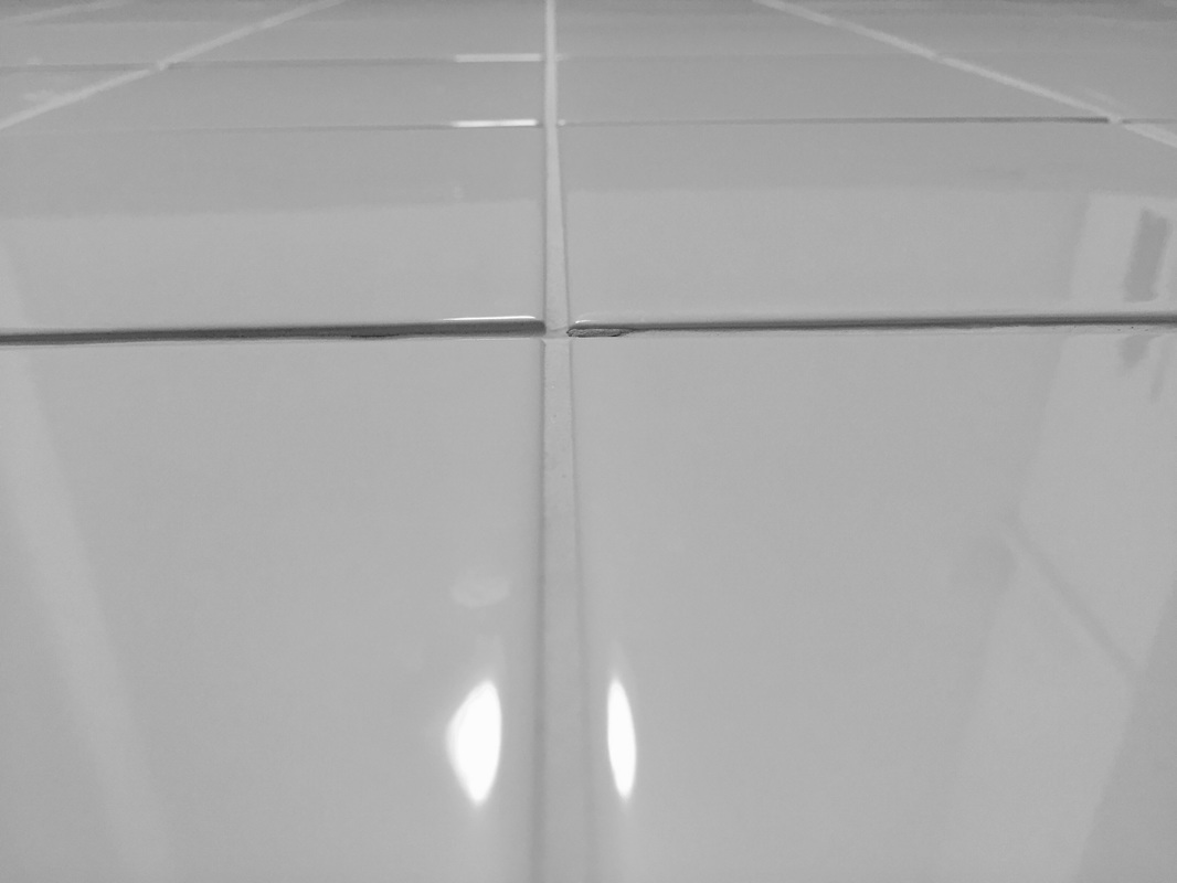
These responses were focusing on light and line, which we had to take at home. When taking these photos i made sure what was in the back and how each of the formal elements we are focusing on are the only things in the picture. I made sure to focus on the four corners of my images. Light was a hard thing to include into my images, simply because i was using my iPhone and i was in door, meaning that the main source of light was my artificial light at home. I edited these images by adding more contrast and adding more brightness and exposure to allow the lines to stand out more and be more prominent in the photo.
Re-fined images
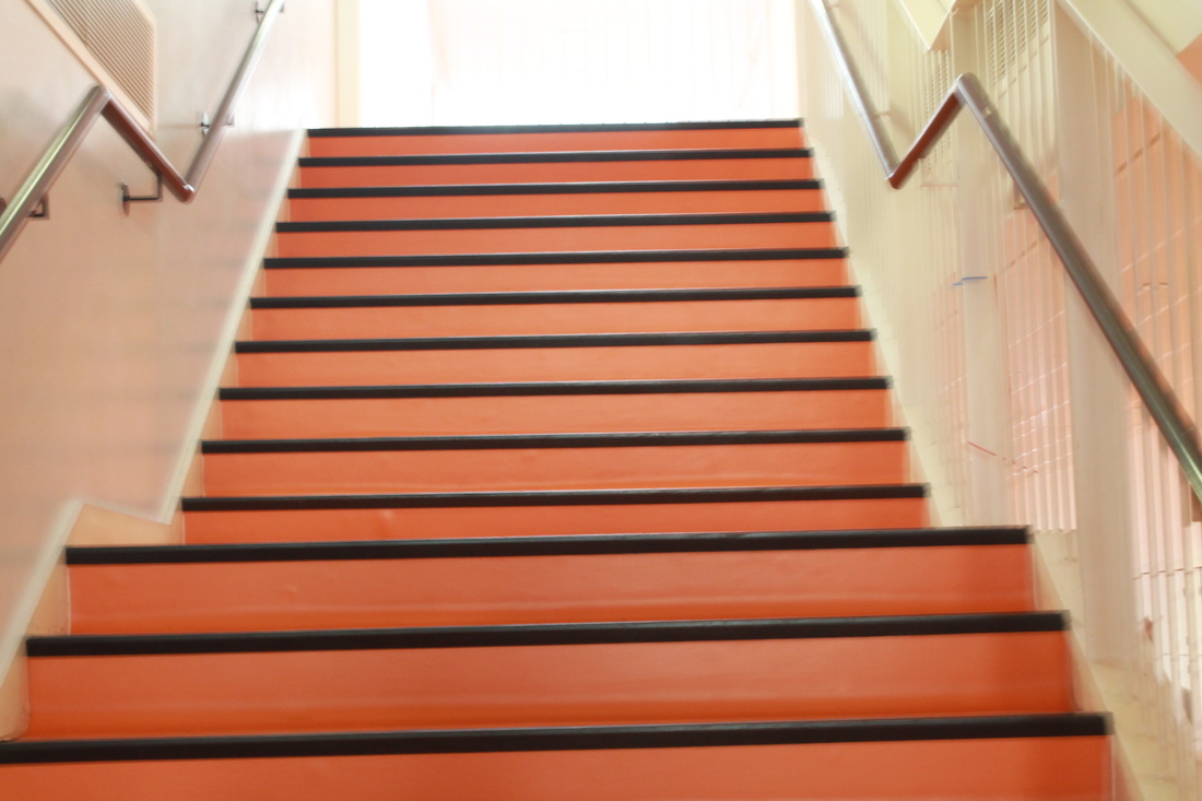
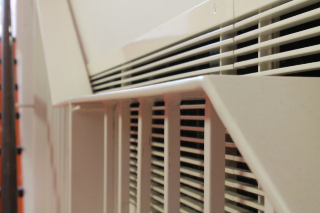
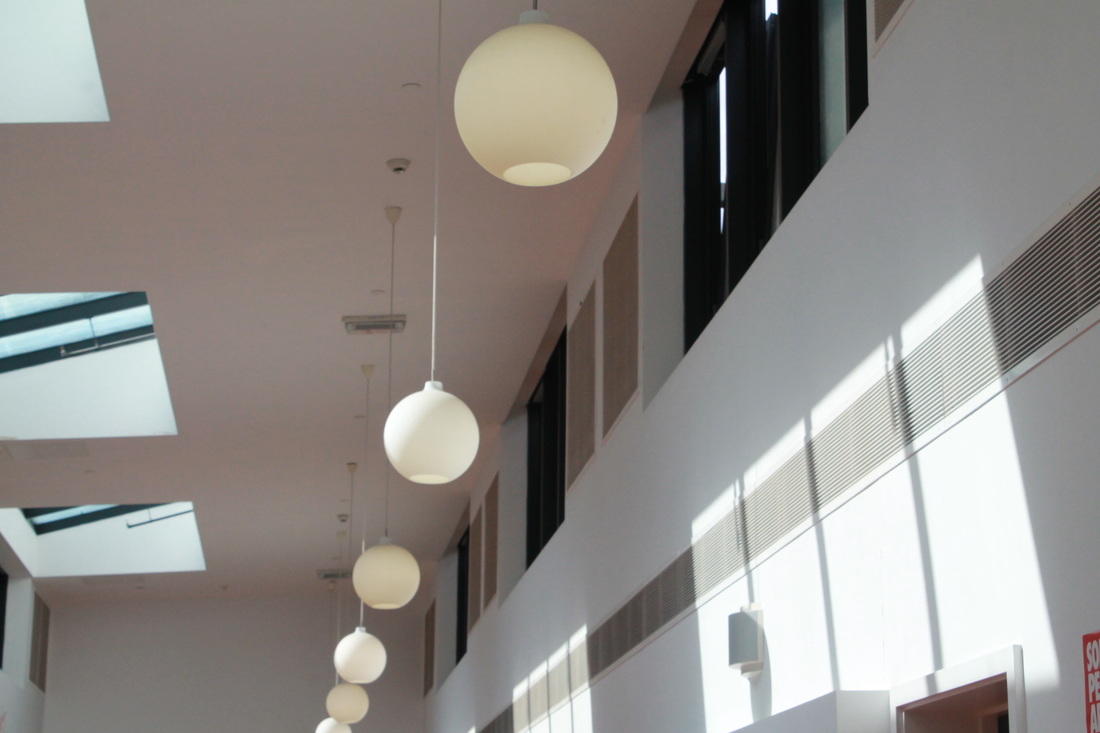
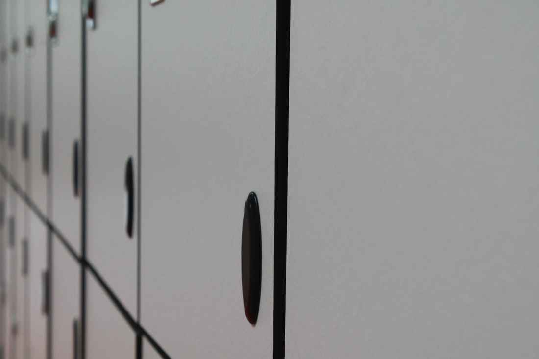
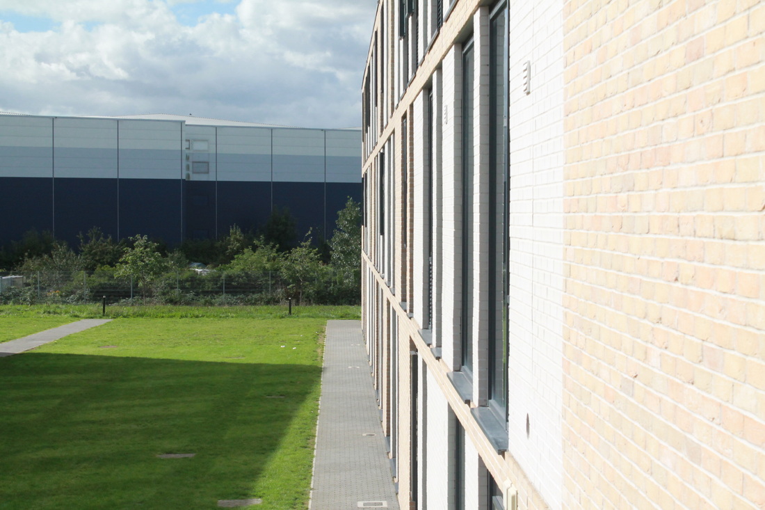
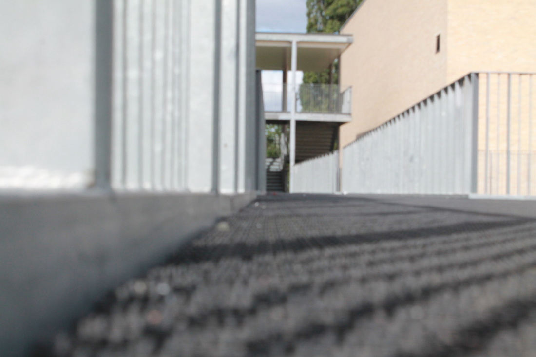
These images I took were confusing on the formal elements of line and light. Also trying to frame the image well, so that no irrelevant objects or other focuses are involved and distracting the viewer from the main focus. I tried to include both of those elements in all of the photos but on some, specific formal elements are focused more than the other.
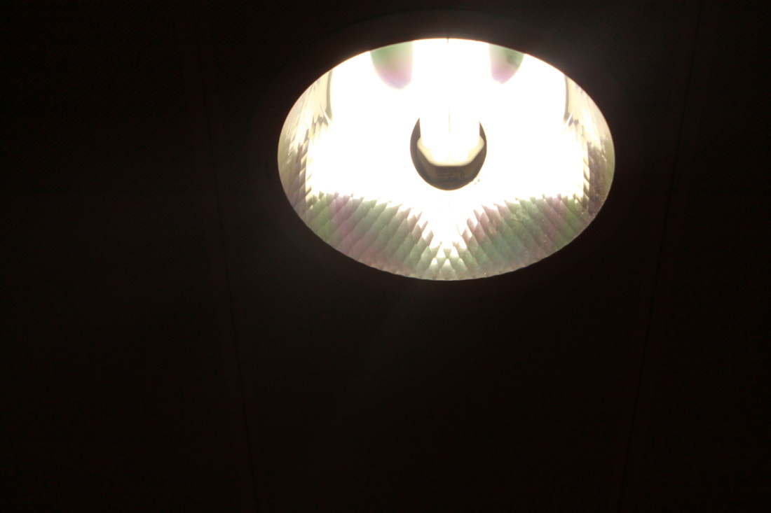
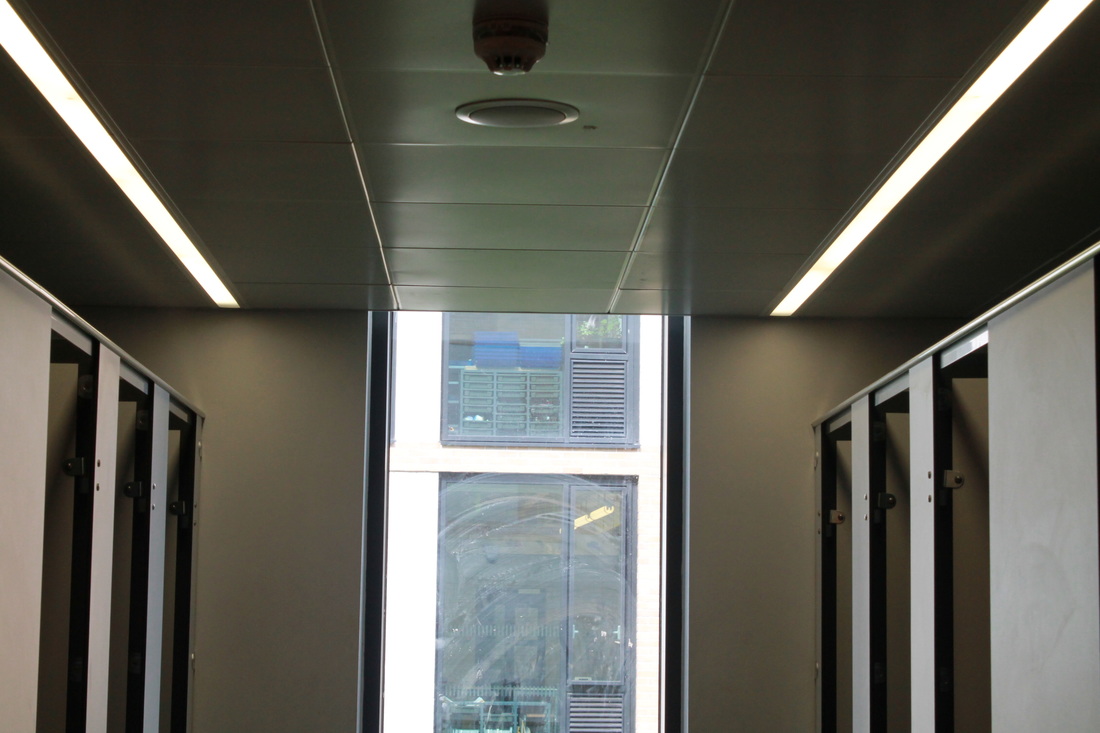
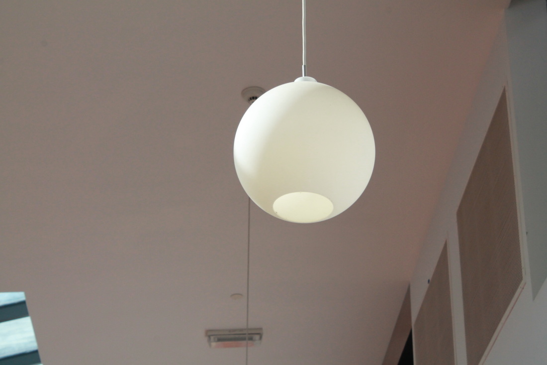
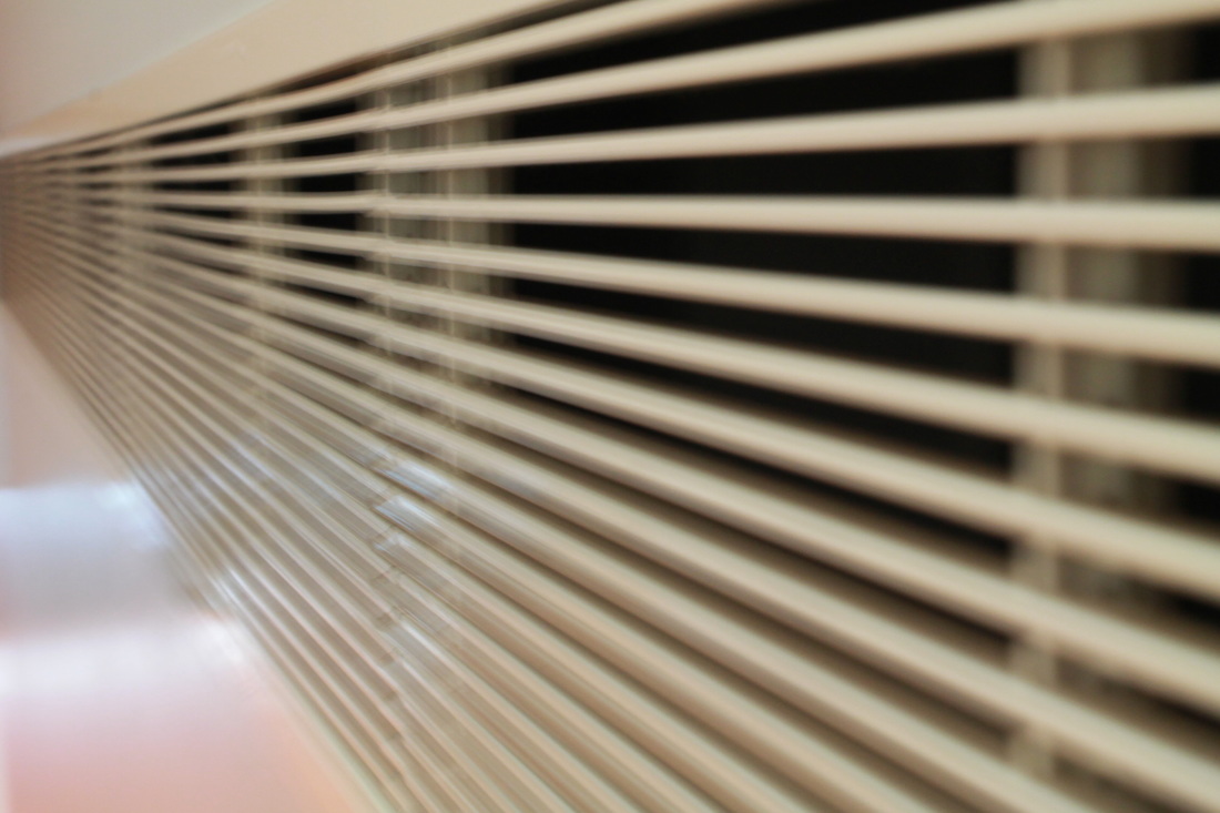
Top right hand image, this image allows the formal elements of line and light to be combined together. Straight lines are very vivid in this image, they can be seen through out the whole frame of the image such as doors, the window frames and the bathroom lights on the ceiling. There are two sources of light in this image=, which are the bathroom lights and the and the natural light from the window which is directly in the middle of the image, this can also be said to be the main focus of the image. Lines in the image are straight and precise, this allows there to be contrast in tone and light.
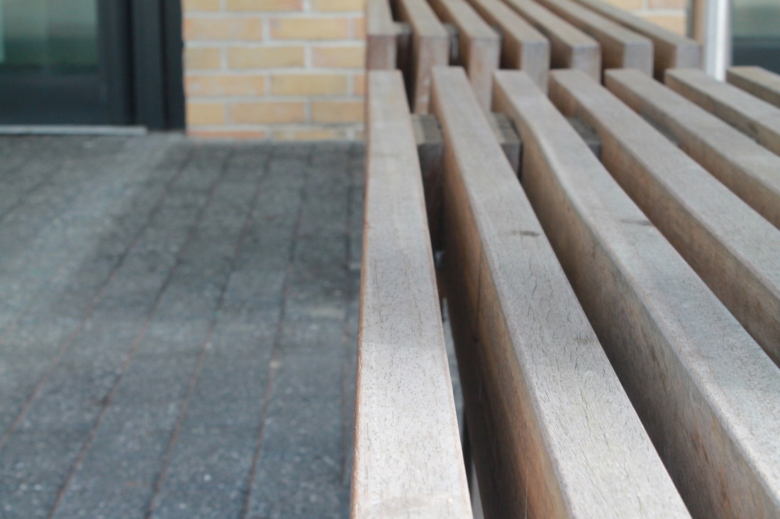
Middle bottom image, main light source would be natural light. This seems to be directly in front of the chairs, simply because there is a light and small tonal change. Near the end and back of the chairs are darker and gradually gets lighter towards the front and the camera. Lines are the main focus in this image because the chairs are rectangular and sharp. Soft shadows can be seen in the middle of these rectangles, creating a 3d illusion and allowing the viewer to see the different dimensions of the rectangular blocks of the chair.
Top right hand image, this image allows the formal elements of line and light to be combined together. Straight lines are very vivid in this image, they can be seen through out the whole frame of the image such as doors, the window frames and the bathroom lights on the ceiling. There are two sources of light in this image=, which are the bathroom lights and the and the natural light from the window which is directly in the middle of the image, this can also be said to be the main focus of the image. Lines in the image are straight and precise, this allows there to be contrast in tone and light.
Middle bottom image, main light source would be natural light. This seems to be directly in front of the chairs, simply because there is a light and small tonal change. Near the end and back of the chairs are darker and gradually gets lighter towards the front and the camera. Lines are the main focus in this image because the chairs are rectangular and sharp. Soft shadows can be seen in the middle of these rectangles, creating a 3d illusion and allowing the viewer to see the different dimensions of the rectangular blocks of the chair.
